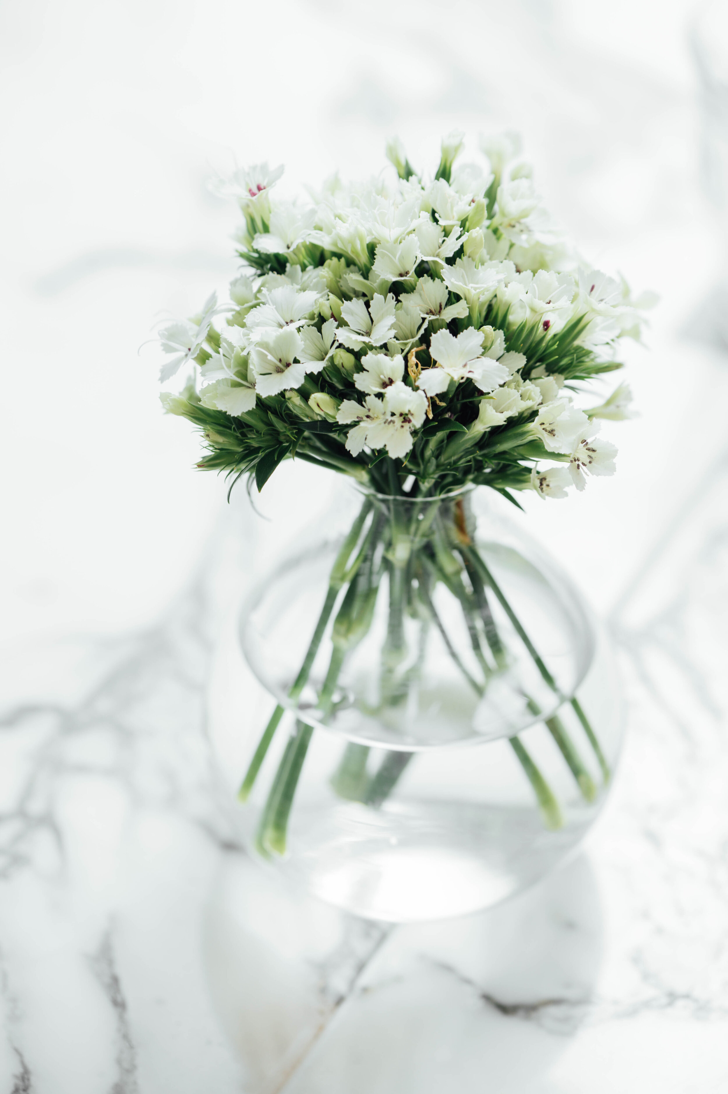
Why Handmade Designs Are the Bee's Knees

There's nothing quite like having company over and receiving compliments on a unique decor item you have in your home. Owning a piece of handmade craftsmanship is like owning someone's true passion and skill. Being the only one in the world with their unique design has its specialness, too. 

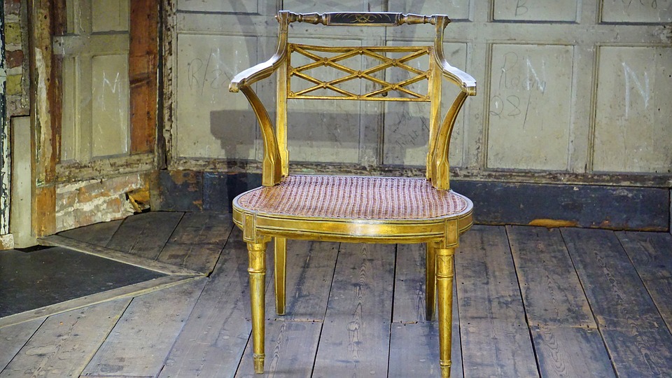
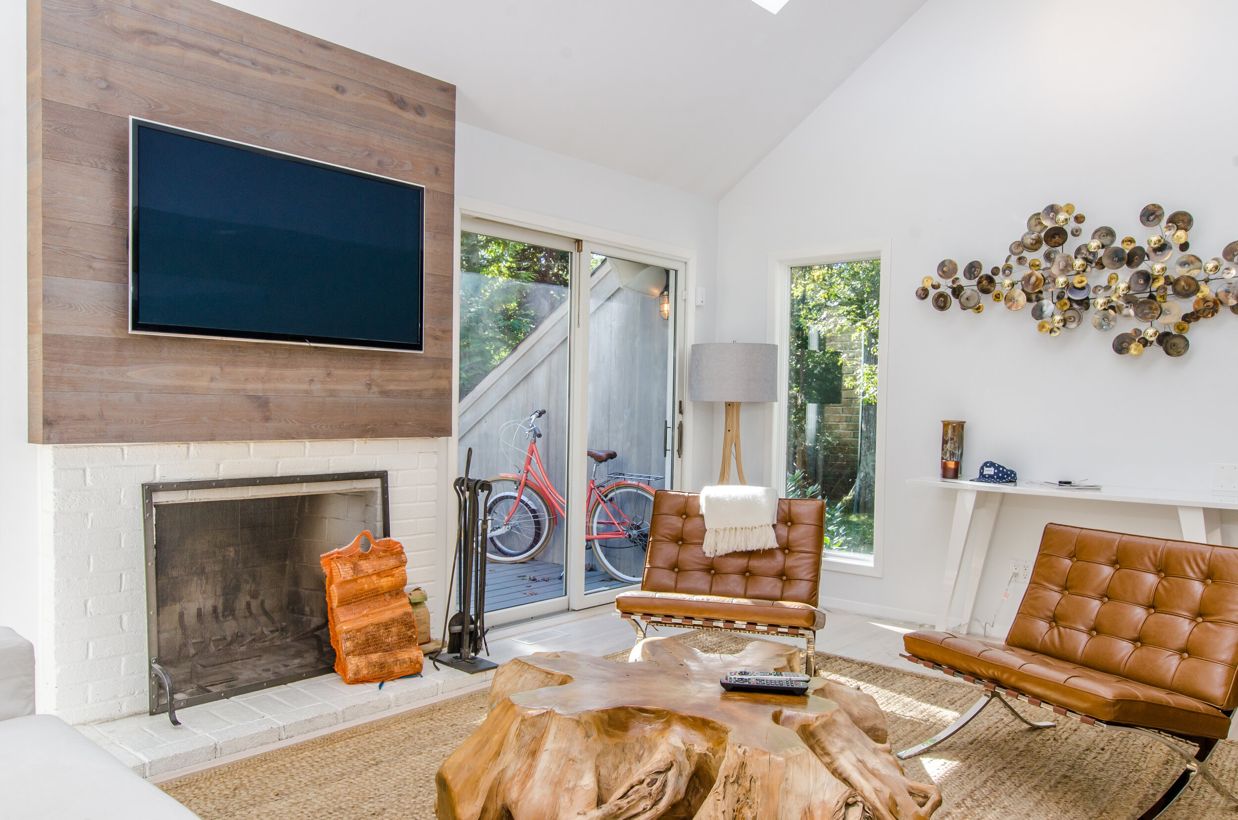
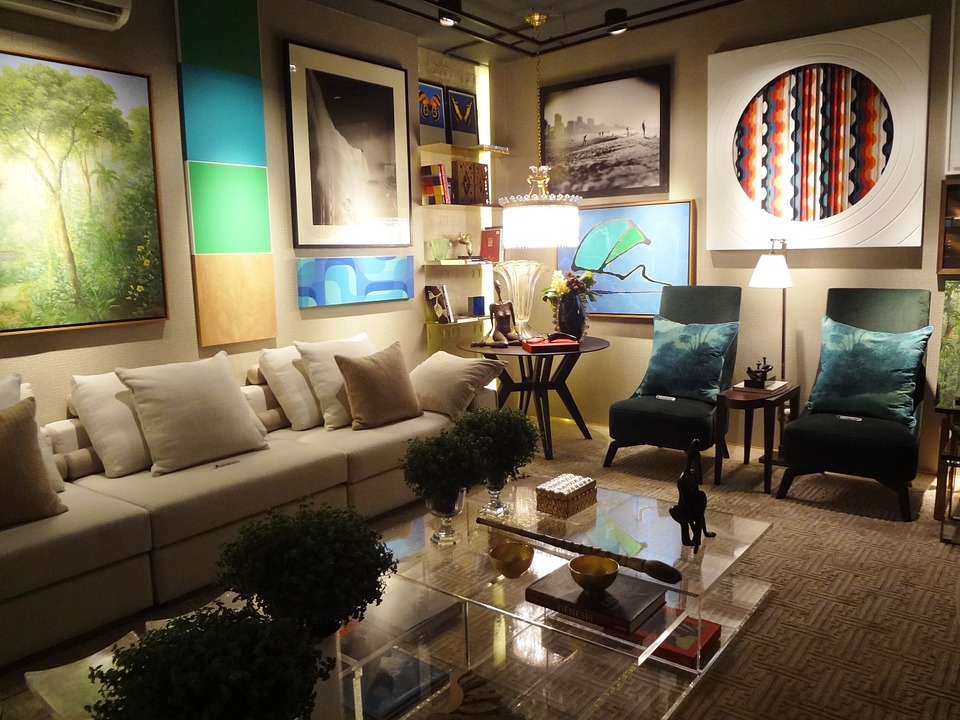
It's all the rage at Highpoint this year to own live edge tables and other furnishings reminiscent of their prior organic state, and we can see why. These beautiful unique pieces are not only a conversation piece, they are elegant, timeless, and well, natural.  Finding a local artisan who can design these beautiful products isn't always easy; you can however, find unique pieces that aren't custom made for your space all over online. Gotta thank technology!

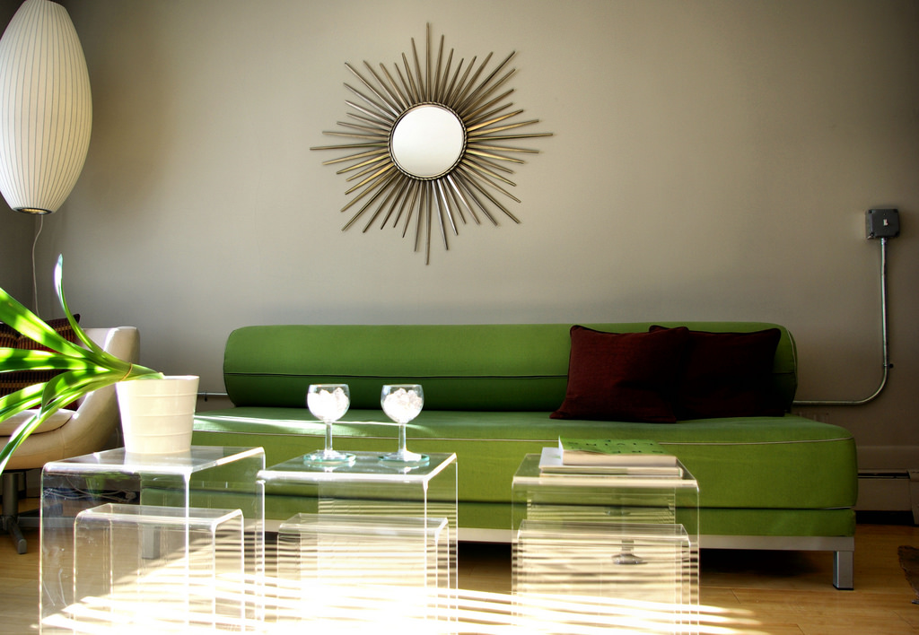
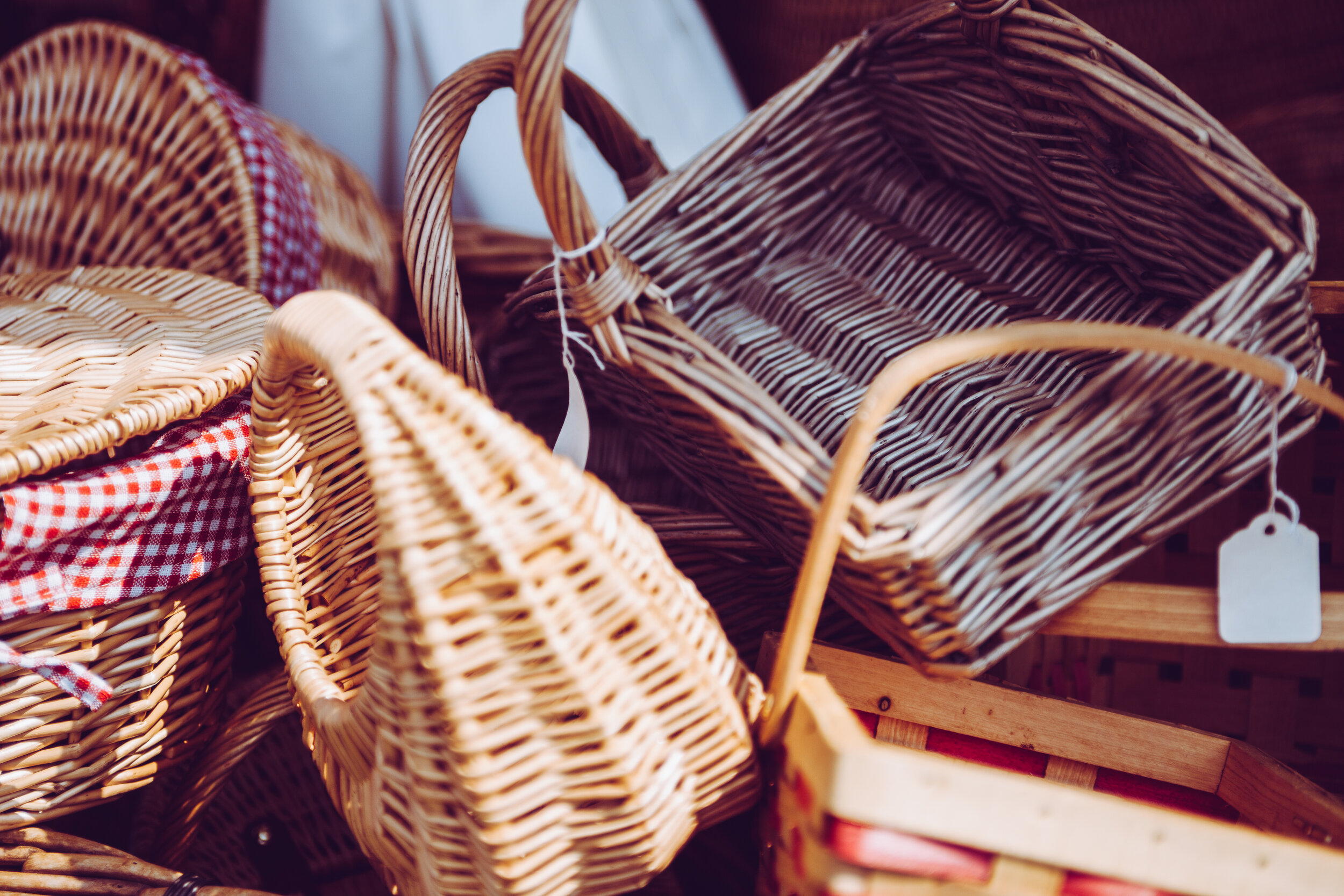
There are unique pieces like the ones pictured above that are both elegant and timeless and won't break the bank . You can find crafts like these at your local art fairs and farmers markets. Etsy is a great place to find unique artisan pieces as well.

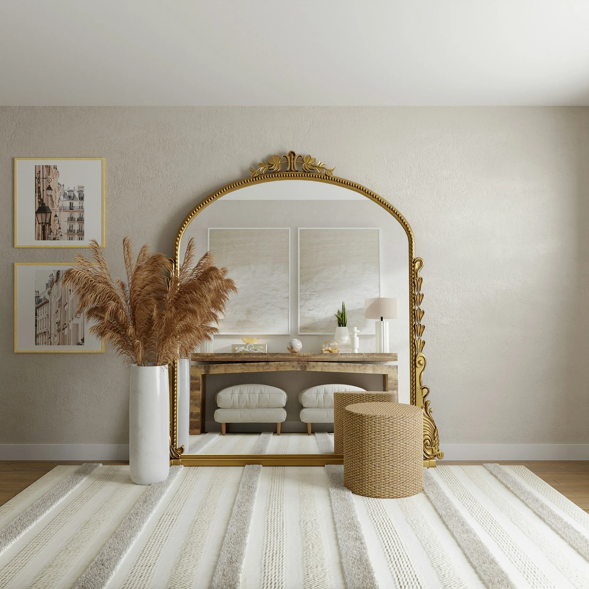
Living in the Pacific Northwest allows us to find pieces of artisan work reminiscent of our natural surroundings. Driftwood frames like the one pictured above are a beautiful beachy way to bring the outdoors in.

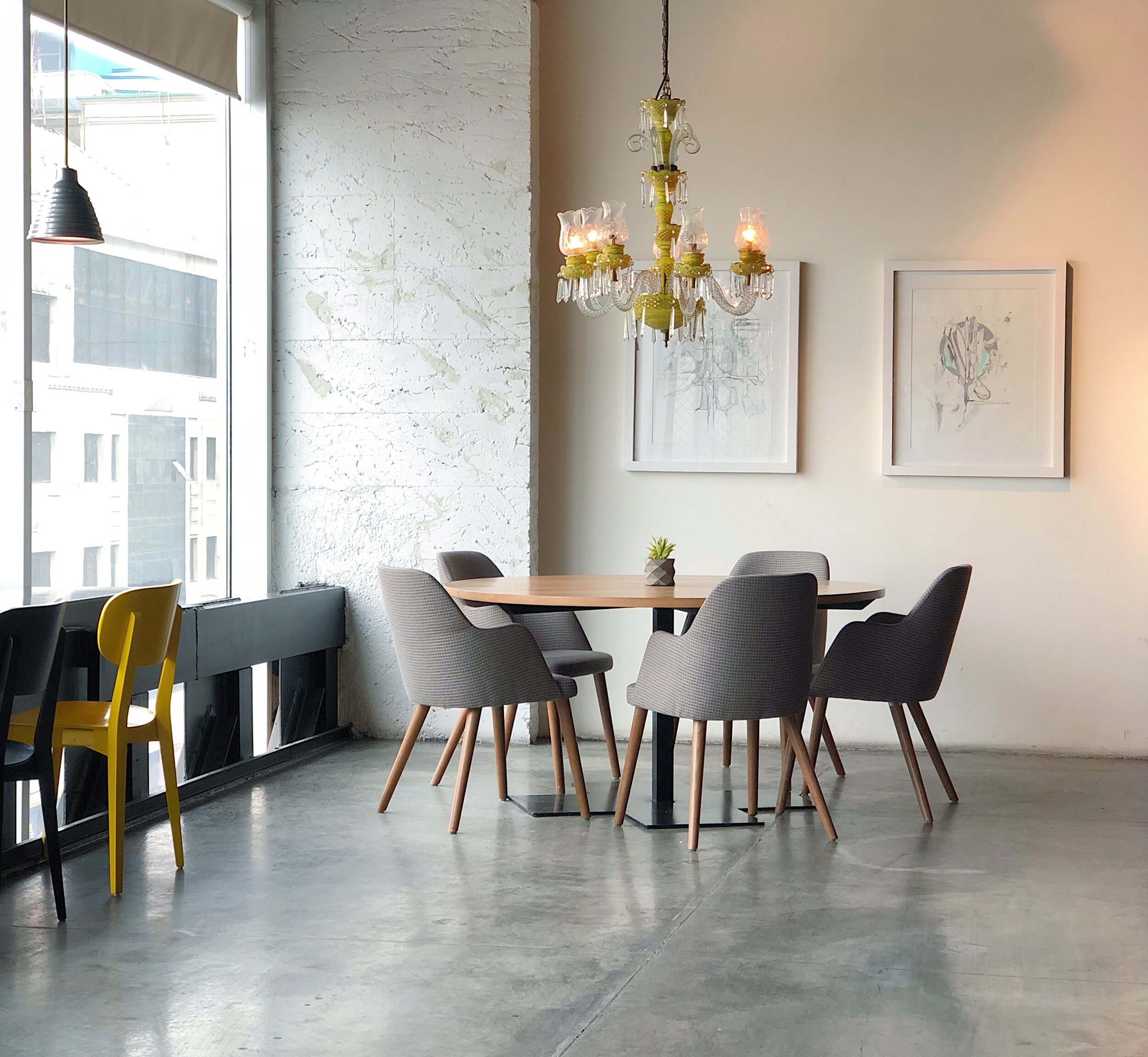
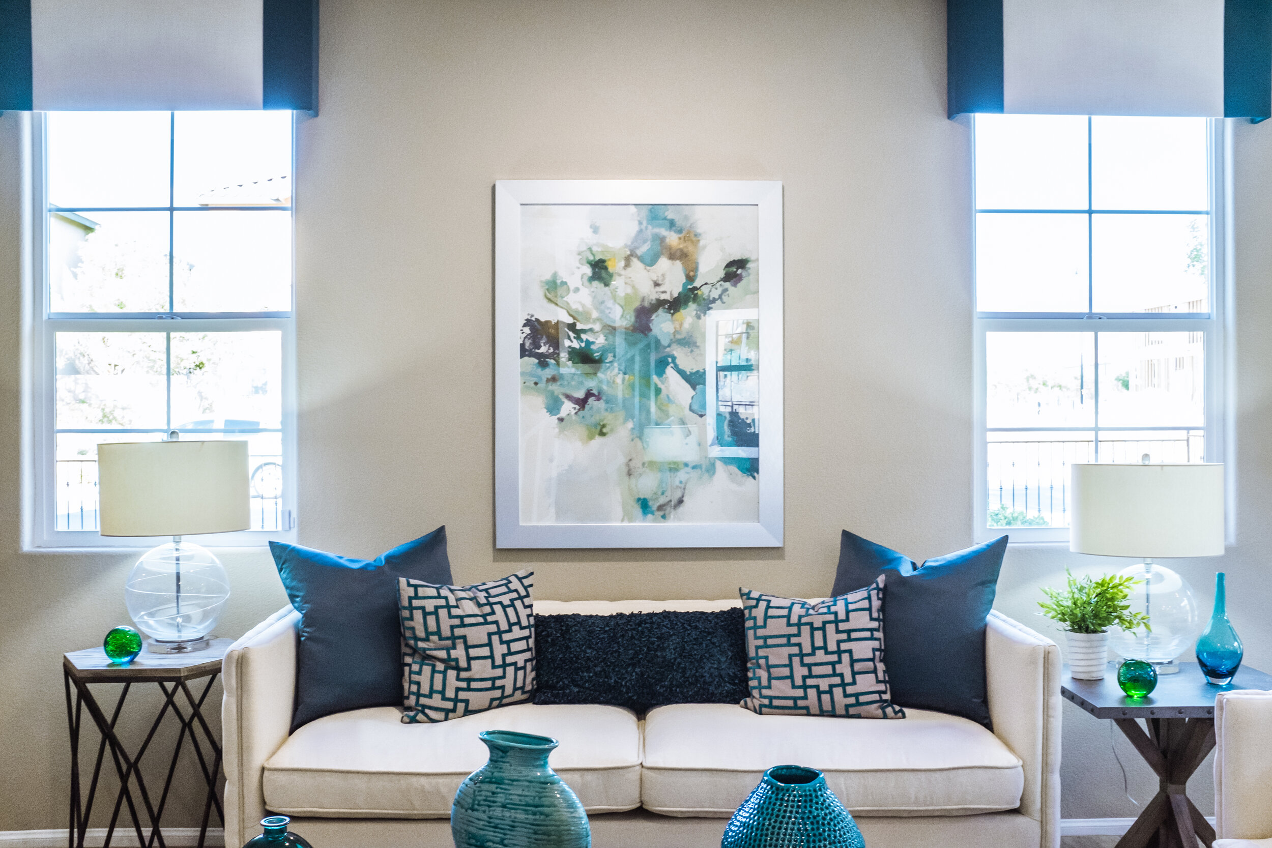
Having a unique piece of handmade craftsmanship is not only a special way to add a focal point to your space, it helps support your local craftsmen as well!

Brass is Back! Where We're Seeing It in the Design World

Remember when brass was considered dated, old and 80's-90's? Well, this is no longer the case. We thought we would never see this shiny metallic make its comeback, we were wrong, and it's made its comeback stronger than ever! We're seeing it applied to all surfaces, large and small in some of the most elegant ways.

Accessorizing with brass and gold colors truly makes an elegant statement against the current color palettes that are trending. While we remember seeing brass hardware against forest green and burgundy backdrops in the 90's, we are now seeing it paired in conjunction with beautiful blues, grays, and even orange hues.

It's not just shiny, polished metallics we are seeing on the forefront. Rustic metals reminiscent of earlier years. Beautiful lighting fixtures, photo frames and accessories with aged finishes make for an elegant timeless look and will never date themselves as time progresses.

Plumbing and cabinet hardware are definitely leaning towards the warmer metallic tones and we can see why. This gorgeous bathroom fixture truly makes a statement that is classic, sophisticated, and elegant.

Simple, Elegant Flower Arrangements

There is something about having fresh flowers within our space that makes us feel happy. Psychological studies have shown that having bright foliage within your space reduces stress and brings forth a sense of peace in our minds. Here are some simple flower arrangements that you can create for your space!

Color Trends of 2017- What's Haute

Vibrant blues and warm colors are what's trending in the design world, according to ELLE Decor and we can see why. The more saturated a paint color is with white trim or details, the more it seems to pop and the more intense of a focal point it creates.

As you can see in the above interior, a vibrant complementary color scheme really makes a statement that is both elegant, sophisticated and timeless.  We're seeing brass and gold as accessories make their return to the design front, and they pair beautifully with the color schemes that are trending.

Warmer color palettes consisting of reds, browns and oranges are making their comeback as well. While the common gray interior is still very popular, we are seeing the design world take a turn into warmer schematics and colors.

Vibrant blues and greens reminiscent of color palettes in the 1930s are debuting on the design front. Peacock color schemes are trending and make a gorgeous statement in all types of interiors. 

The Psychology Behind Color!

The color of something really never registers to us far beyond the fact we recognize the color, at least not on a surface level. Did you know subconsciously the colors you are exposed to on a daily basis play an important role in your mood and emotions? There are certain colors that are said to invoke certain moods or make you feel certain ways. You wouldn’t believe how powerful color can be, which is why when you are considering painting your home’s interior you want colors that will promote happiness, calmness, and comfort. So, then now that we understand the role colors play in our moods let’s take a look at some colors that could benefit you when you use them.

Color Psychology:

·         Red – said to stimulate your body and mind and helps increase circulation

·         Yellow – said to stimulate your nerves and even help purify the body

·         Orange – has been used to heal the lungs and help boost energy levels

·         Blue – helps soothe illnesses and even help alleviate pain

·         Indigo – has been known to help alleviate skin issues

Now, let’s take a look at a few examples of which colors would be best where in your home. As with anything you have the choice to pain your home however you like, please simply know this can be used as a guide.

The color Green at times can signify money or finances which is why the color itself helps you become more productive. Green also produces the least amount of eyestrain which makes this color a wonderful choice for a computer desk. Give your eyes a break from the computer screen ever so often and gaze upon the lovely green shade of your desk.

The work out room could benefit you more if it was painted orange. Orange is said to help increase stimulation as well as enthusiasm. Orange is also said to help increase oxygen supply to the brain and stimulate the brain activity. If you can’t paint a whole room orange then try opting for orange work out attire instead.

Avoid overusing the color grey if you can or if you prefer grey, pair it with a more upbeat color because grey by itself can inspire people to be more passive, have a lack of energy and become uninvolved, but if you pair it with a bolder, brighter more upbeat color you can counteract the psychological effects make a gorgeous statement!

Colors may seem like such a small aspect when you are thinking about your home and how aspects of your home effect you but truth be told color is one of the largest influences on us and when we spent so much time in our home don’t we owe it to ourselves to used colors that will promote health and happiness rather than dulling and sad colors?

Decorating with Fresh Florals!

Florals!

Interior Design is one way of making the house look amazing by any standards, so it is important that we understand  how best to incorporate floral additions in the house and there are various strategies for doing so in an elegant and beautiful way! Spring is one season when the addition of flowers can easily freshen your space and bring the outdoors in.

Here Are Some of Our Favorite Uses of Flowers in Design:

Simple Daisies. Placing a variety of colored daisies in an understated vase will bring you joy!

Green Hydrangeas. There is no more elegant a look than fresh green hydrangeas placed in an organic vase like the one pictured here. 

Shabby Chic. By placing your favorite flowers in a rustic vase like this one, you are sure to make a statement reminiscent of old farm houses.

Tailored Elegance. One trick to getting the perfect floral arrangement is to consider the shape of it as a whole. I like to trim the stems down and full the vase fully. Place in a silver plated vase, and viola!

Bright and Off Centered. A look that is trending in floral arrangements today is the off-centered look- placing the flowers in a non symmetrical way.

Unclutter! The First Step to Welcoming Spring

Unclutter! The First Step To Welcoming Spring


Many homes around the world do spring cleaning because this is the perfect time to clean from top to bottom. However, nothing will ever feel clean if it is still cluttered because it is difficult to get all the dirt out if there is clutter in your way. So to unclutter is the first step to truly clean your home and is environmentally friendly at the same time. 
To start with, focus on the small space and organize it before you go to the larger space. Start by removing items in this space and create four piles of the clutter, the ones you want to: keep, donate, recycle and toss. Consider to:


Compost
When you start to unclutter, you will find that there are many items you can compose. Items like cardboard and shredded papers can be composted. If you don’t have a bin in your home, you can take them to your local compost centers.


Donate
Your used items can be of much help to others than throwing them. Donating them help in keeping them out of landfills and they can be of value to another person. Consider things like furniture, linen, clothes, electronics and more when sorting out your clutter.


Scan Files
Instead of storing too many files, clutter them scan and store the important one digitally. Use tools like Neatdesk for organizing your files. It eliminates clutter, saves time and eco-friendly.


Repurpose
As you are cluttering, can you repurpose some items? Can you use them for other needs in your home? This saves you some few dollars you would spend on new items that will add more clutter to your home later. Old cans can make a great pen holder or paper clip storage, you can use a cardboard box as a file storage or shoe box to organize your pantry.


Recycle
Just having a good look at your clutter, you might be surprised by how much you can recycle. Use your local recycling center for things like batteries, scrap metal, electronics, papers or plastics.


Once you have uncluttered your clutter in an environmentally friendly way, it’s time to get down and do the dirty work. There are chemical you can use for this work, but it's good if you use natural cleaners for safety and stay healthy. With clutter gone, clean your home from top to bottom to have a refreshed, renewed home and be ready for the warmer months.


Our Predictions 2017: What's Next in the Design World

We never thought that the oh-so-popular burgundy walls of the 90's would ever see the end of their popularity. We sometimes forget when we design our spaces to consider whether or not designs will be timeless- visions that will not seem dated later on. 

On that note, we thought it would be fun to try and predict what will become in style this year in the world of Interior Design... here are the six things we believe will make their debut this year!

1. Pale Color Palettes. While we have seen pastels in Interiors since the beginning of time, we are already seeing them make a major comeback in both modern and traditional spaces. Pale pinks paired with grays and blues are seen all over the design world right now!

2. Green is the New Gray. Considering "Greenery" has been chosen as Pantone's Color of the Year, it only makes sense that their marketing campaigns will be flashing this gorgeous hue all over the design world!

3. Streamlined molding not painted white. We are already seeing this new trend. Baseboards and molding that are simple in style, not ornate. Painting these details a light gray color, or any other color than the traditional white is already becoming very popular in the design scene.

4. Navy Blue! Beautiful variations of dark blue are being used in newly designed spaces. This timeless hue gives your space a classic, rich, bold and sophisticated look. 

5. Bold Accent Pieces. We love scouring through Pinterest to see what the latest is when it comes to decor. There is nothing more beautiful than a non-traditional color being showcased in a neutral space.

6. Eclectic Wallpaper. There is nothing more visually fun than a room adorning an eclectic wall pattern. We are seeing gorgeous wall coverings reminiscent of past times all over the design market, and we can see why!

Top 5 Interior Design Trends to Watch in 2017

Top 5 Interior Design Trends to Watch in 2017

The New Year is here and so is the new Interior Design trend for 2017! Designer and trend forecasters are already thinking well into 2017 and they have a big shake up of interior design trends!  Whether your taste is in neutral schemes or saturated and plush, here are some that will inspire you.


Timeless terracotta
In 2016 white and cool tones were popular interior designs that people loved, but this is about to change as terracotta tiles are the theme for 2017. Terracotta is a warm material that has been around for a long time. It is completely natural gives a modern interior a unique, more grounded and elegant appeal. In more traditional settings, terracotta takes on a rustic vibe.

Glamorous green
Darker shades of green are becoming popular and people are already treating it as a must have interior color as they say goodbye to midnight and navy blues. Glamorous green brings in the outdoor colors and they communicate with a sense of balance, harmony and peace!

Jewel tones
Brilliant colors such as emerald, sapphire, citrine, and amethyst are still going strong, but jewel tones are inspired by space, star, clouds cosmos, and metals. You can create an exotic mood by applying attractive colors. Think elegant quilted sofas, ornate mirror, and drapes as well as luxurious soft furnishings!


Upholstered headboards
In 2017,  the upholstered headboard is set to replace timber bed frames that were popular in 2016. Choose the right headboard as a focal point and upgrade it to look extra attractive by using texture and fabrics. This is one of the hottest trends!

Quirky cork
Using a stylish material like cork adds texture to a room. Many designers are choosing it because it is versatile. Cork furniture, upholstery, and floor coverings are growing in popularity.

Whether you are upgrading, renovating or staging your home for sale and you are looking for inspiration, you can never go wrong with the above trends!

2017 Pantone Color of the Year: Greenery

We can all say good bye to Rose Quartz and Serenity, because the Pantone Color Institute just announced their pick for the 2017 Color of the Year. It's fresh, it's organic and it's name is "Greenery."

image.jpg

While Rose Quartz and Serenity encouraged peacefulness, calm and relaxation, this earthy hue epitomizes movement and fresh starts.

As Pantone puts it:

"Greenery is a fresh and zesty yellow-green shade that evokes the first days of spring when nature's greens revive, restore and renew. Illustrative of flourishing foliage and the lushness of the great outdoors, the fortifying attributes of Greenery signals consumers to take a deep breath, oxygenate and reinvigorate."

Here are our favorite interiors showcasing this gorgeous hue:


Timeless Master Bath

The homeowner wanted the lighter color palette and traditional feel throughout the home continued into their Master bath. The Carrara marble was a timeless selection – perfect for a master bathroom.  The decorative floor mosaic makes a beautiful first impression upon entering the bathroom while the Bombay chest, that was refinished and painted in the Authentic Home Champagne on Ice paint color, was re-fitted to become the vanity.

The beautiful soaking tub was in the home already and the addition of a new Victoria & Albert telephone tub filler and faucet truly makes this a tub area transformed.  The Authentic Home Dove Grey paint color adorns the walls while new custom made roman shades, a vanity bar light and a beveled decorative vanity mirror were added as the finishing touches for the perfectly timeless master bathroom.

Vanity Before and After

Shower Before and After

Master Bath Before and After

We've Got the Blues! Our Favorite Blue Interiors

Is it accurate to say that you are searching for another design for your home, and you truly adore the blue color? Fortunately we live in a world with endless options, but here are our favorites! You can integrate Blues into any interior, but the use of blue paint is another story!

If your desire is to have your living room to feel welcoming and full of life, then a highly saturated, vibrant blue would be a great choice for you. It will bring a sense of calmness to your space, while being intense enough to be a conversation piece.

If blue is your absolute favorite, you should go all out.  This type of blue cabinetry gives off a happy, light-hearted vibe. We are seeing a lot of split colored cabinetry in design now- a key piece of advice: keep the darker color on the bottom. This will make your kitchen feel larger!

Here’s another cutting edge kitchen- this one featuring all blue cabinetry.  The use of a warm wood like shown, balances the coolness of the blue, giving this kitchen a welcoming, warm vibe.

This charming restroom is by all accounts intended for a person of sophistication. The clawfoot tub, with its blue color and white legs recreates something reminiscent of the past with a hint of bohemian charm.

Navy blue is as classic as it gets. This rich, sophisticated color will bring a sense of intrigue while evoking a sense of peace and richness. The use of a high gloss paint creates a reflective surface that also makes the room appear larger.

If you are looking to add a blue hue to your space, always consider your environment. Rooms in climates that don’t receive a lot of sunlight can look depressed and unwelcoming if there is too much blue. Stick with blue colors that aren’t too warm, however; these can be over-stimulating and create a sense of anxiety.

It's in the Little Things: Tiny Houses!

The tiny house movement has taken the world by storm in the past couple of years, and there’s a reason for it. The architects and builders of the modern day tiny house have figured out ways in which to implement all of the bells and whistles of today’s designs while maintaining the charm and efficiency of living small. We have done our research, and here are our favorite tiny houses– both old and new.

It’s in the Little Things: Our Favorite Tiny Houses

1. This gorgeous Southern style tiny house was designed and built by Palm Harbor Homes. Since the beginning of the recent tiny house movement, builders have taken the simple streamlined “boxes,” and turned them into elegant, charming floor plans with upscale and quality features.

2. Who says you can’t have a gorgeous tudor home in a beautiful garden setting? This home has all of the bells and whistles, while maintaining the classic look and feel of a tudor style home. This would make the perfect back yard stay-cation or mother-in-law casita.

3. You are never too old to have a tree house. This beautiful home features an open floor plan, bright and airy color scheme and a beautiful park like setting. The lower patio area is perfect for barbecues, reading a book, and enjoying the fresh air of the outdoors. The interior features a small kitchenette, a living room and a lofted bedroom.

4. Contemporary chic describes this one. This house has the perfect combination of functionality and fun. The main living areas and master bedroom breath in plenty of light with this open space concept. Each and every room and closet is efficient enough to allow for an open, airy, spacious feel.

Metallics- Reflecting Sophistication

There is something so rich and sophisticated about mixing and matching metallics in your Interior. Beautiful metallic decor has been making its debuts at High Point Market- it’s not only trending, but it truly is a timeless way to bring beauty and sparkle into your space.

Images Source: Pexels

Metallic Decor- Our Favorite Designs

1. Gold Accents.  Mixing and matching various gold accent pieces can really give a sense of cohesivity and eclectic vibes to your space. Creating a photo collage with unique frames, all in gold hues give a rich, smart feel to the wall space. To really emphasize the metallic theme in your decor, implement a metallic pouf, or throw pillows to make the smaller accents really “pop.”

3254413157_68e6f0a018_b.jpg

2. Rustic Meets Organic. Combining natural elements with rustic pieces brings forth a level of nostalgia and eclecticism like no other. Scour your local flea market or antique mall for original, one-of-a-kind rustic metal decor, and pair it with unfinished woods and other organic elements.

3. Reflective Surfaces and Finishes. There is no such thing as too many metallics in a space. Well, maybe– but we have yet to see it. Beautiful mirrored furniture pieces paired with gold and bronze accents will surely bring glamour and sophistication to any space. Geometric patterned metallic throw pillows, and simple metallic poufs can really bring forth a level of beauty to a space.

4.  A Fun Project for You! Put on your boots and get some fresh air. Some of the best decor out there is the kind you find in nature. Have a vase sitting around? Go outside, find some beautiful branches or twigs, and paint away! A metallic centerpiece will give your space a rich, classic, and warm accent.


Kathy Turns an Unused Space into A Wine Room

Kathy’s client had a room at the bottom of their stairwell that was not being used by the household very often. The members of the family were delighted to see her work magic in this tiny space; creating a beautiful wine room, perfect for entertaining and relaxation.

Pictured Here: the bottom of the stairway with the entrance into the space. (BEFORE)

Wine-Room-Door-Before-e1472158495547-768x1029.jpg

Beautiful stone flooring, a custom made metal door with ornate detailing, and fresh paint adorn the new space. What a difference it makes! (AFTER)

The interior of the space before was stark and uninspired. It had a cave-like feel and was rarely used by members of the household. (Below)

Wine-Room-Before-e1472158215684-768x1029.jpg

The client wanted to create a bistro-like setting, reminiscent of their travels to Europe. Kathy chose a beautiful silver leaf table set that worked perfectly with the color palette of the final design. Gorgeous Cararra marble countertops, a commercial wine refrigerator, and Authentic Home’s Crystal Blue  paint from her Elegant Color Palette add sophistication to the space. The lattice patterned wine racks are reminiscent of old world wine rooms seen in Europe. The bright trim and ceiling give the space a larger feel, while the stone flooring gives a rustic touch to the final design.

This space now has plenty of storage for both wine, but for entertaining guests when they come to visit this gorgeous home.

Seeking design assistance? Contact Kathy Banak today!

Grand Master Bedroom

The beautifully ornament silver leaf bed makes a dramatic first impression and is the focal point of the master bedroom.  The Authentic Home Dove Grey paint color and the custom wood carpet in a light grey color tone definitely brighten up the room.  The crystal bedside lamps and chandelier are the finishing touches that make this bedroom a truly restful sanctuary for the homeowner.

Master Bedroom Before & After

Master Closet

The new master closet is now bright and spacious with the replacement of the fluorescent lights with  a Swarovski crystal ceiling mount light and several recessed can lights.  The Authentic Home Pink Grapefruit paint color adorns the walls and a new closet organization system by Organized Spaces and custom wool carpet in a light grey color tone make this narrow closet feel much larger and the perfect place to start one’s day.

Before & After

Functional Laundry Room

The laundry was remodeled to provide more efficiency to the space.  A new stackable washer and dryer and custom cabinets with a Carrara marble countertop transform this space into a functional laundry room.

Before & After