
Decorating with Warm and Cool Colors
/Periwinkle Cool - Purple is a cool color, but a lighter shade creates a cozy atmosphere in this plant-filled living room.

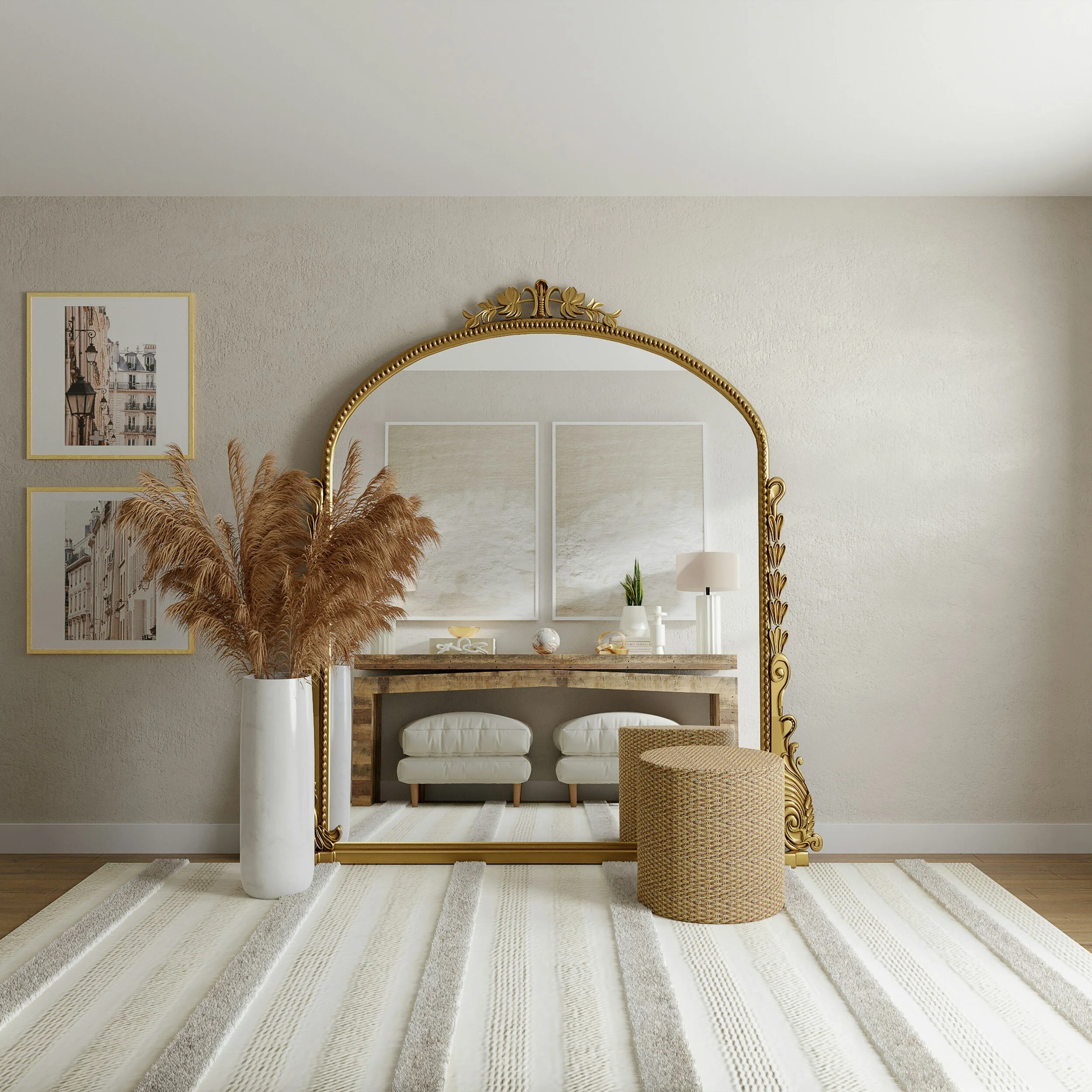
Earth Tones - Pops of color aren't required to indicate whether a room is warm or cool. Subtle earth tones of brass, taupe, and cognac brown create a warm space devoid of red or orange.

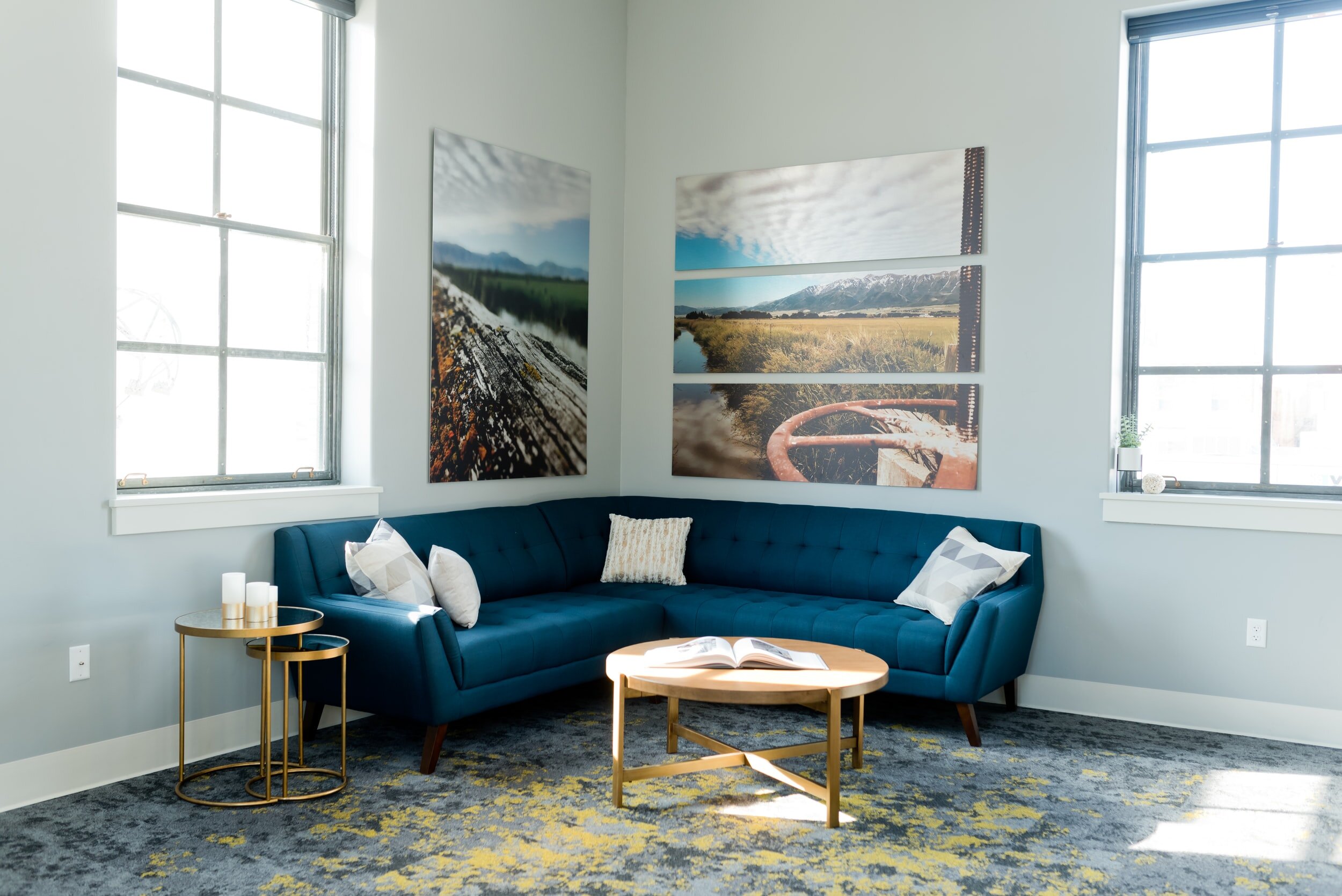
Bring the Blues - Bright blues combined with neutral whites are calming, focusing, and soothing, making them ideal paint colors.
Fade The Line - To use warm and cool colors effectively throughout your home, consider the flow of your room and overall space. When choosing paint colors, consider the influences of adjacent rooms as well as the attributes and shortcomings of each individual space, such as light sources and size constraints. Highlight features like built-in bookcases by combining appealing color contrasts like the warmth of vanilla woodwork set against the cooling effect of adjacent navy-colored walls. Keep in mind that each new color changes the color dynamics of the space. A room that embraces the entire color spectrum is visually appealing and supports both warm and cool tones.

Using Brown - Brown has a natural feel to it, and in the world of design, this can be enough to make a space feel warm and inviting. It is not a single color, but rather a blend of black, yellow, red, orange, green, and even purple.
As a result, brown is considered a neutral color that conjures up images of pleasant things (chocolate, coffee, etc.) and nature. Psychologically, brown is a relaxing color that makes us feel safe and secure, which is why it is commonly used in the home.
Warmer brown solutions are used because of their welcoming nature, similar to polished, beautiful parquet that will reveal your welcoming spirit and excellent taste. Unpolished wood or similar textures are acceptable.

Balancing - You should not limit yourself to just one type of color, either warm or cool. To improve visual balance in cozy and homey spaces where warm colors predominate, at least one cool shade should be present.
The same is true in the inverse situation, for both balances and contrasts.
Consider the overall flow of your space when applying both warm and cool colors. Estimate the impact of adjoining rooms, their specific shortcomings and characteristics, access to light, and size constraints.
Make the experience more enjoyable by using appealing contrasts, such as a warm vanilla wooden shelf against a navy-painted wall.

Color Psychology - Color psychology may appear complicated now, but it is one of the things that people remember most fondly from the days when they decorated their homes. The same is true for the basic distinction between warm and cool colors, as well as the hybrid results that can be obtained when they are mixed.
Understanding the fundamental principles of color psychology is critical for creating a space that evokes the emotions we want to experience while spending time there.
