Earthy Elegance: The Resurgence of Browns and Earth Tones in Interior Design

In the ever-evolving world of interior design, trends come and go, but some classics stand the test of time. In 2024, we're witnessing a delightful comeback of Browns and Earth Tones, redefining spaces with warmth, sophistication, and a connection to the natural world. Let's delve into the rich palette of earthy hues that is reshaping the way we think about interior design!

  1. A Symphony of Neutrals:

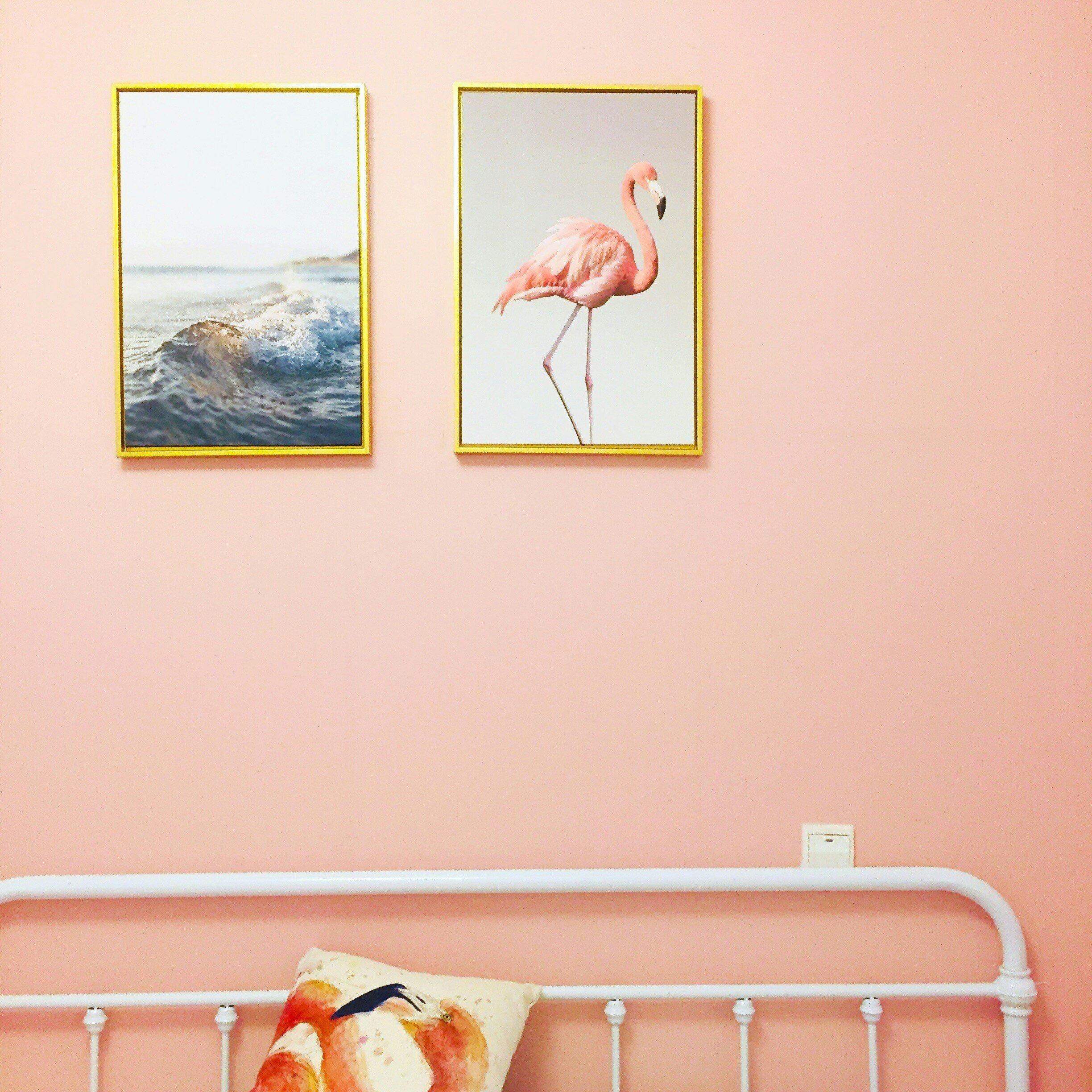
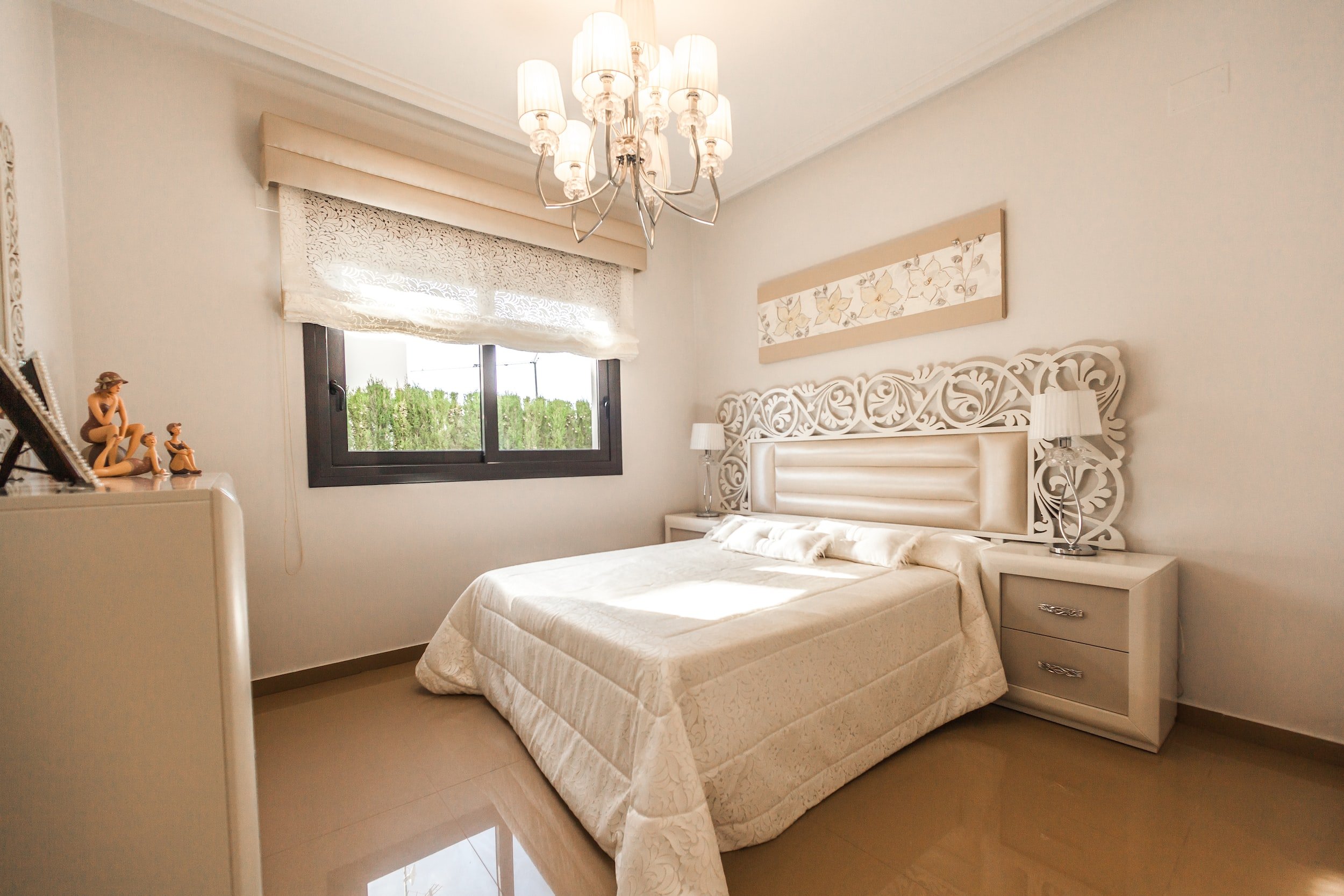
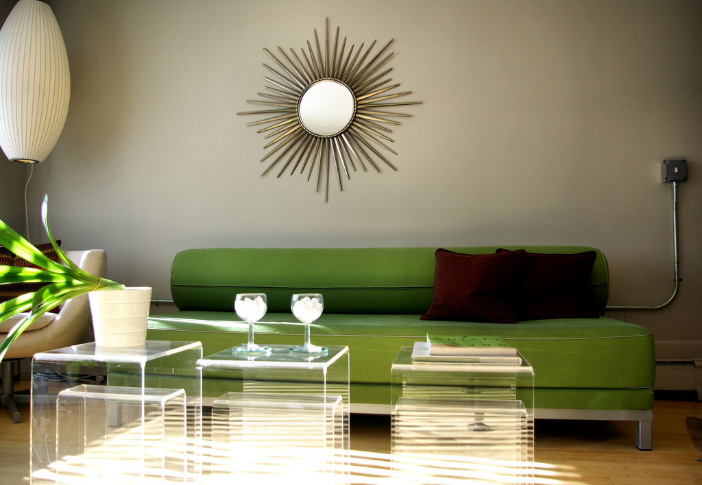
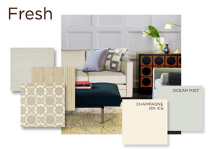
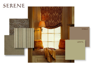
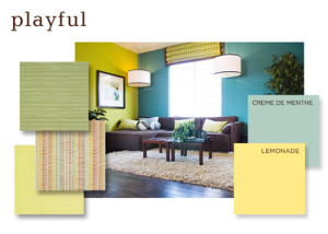
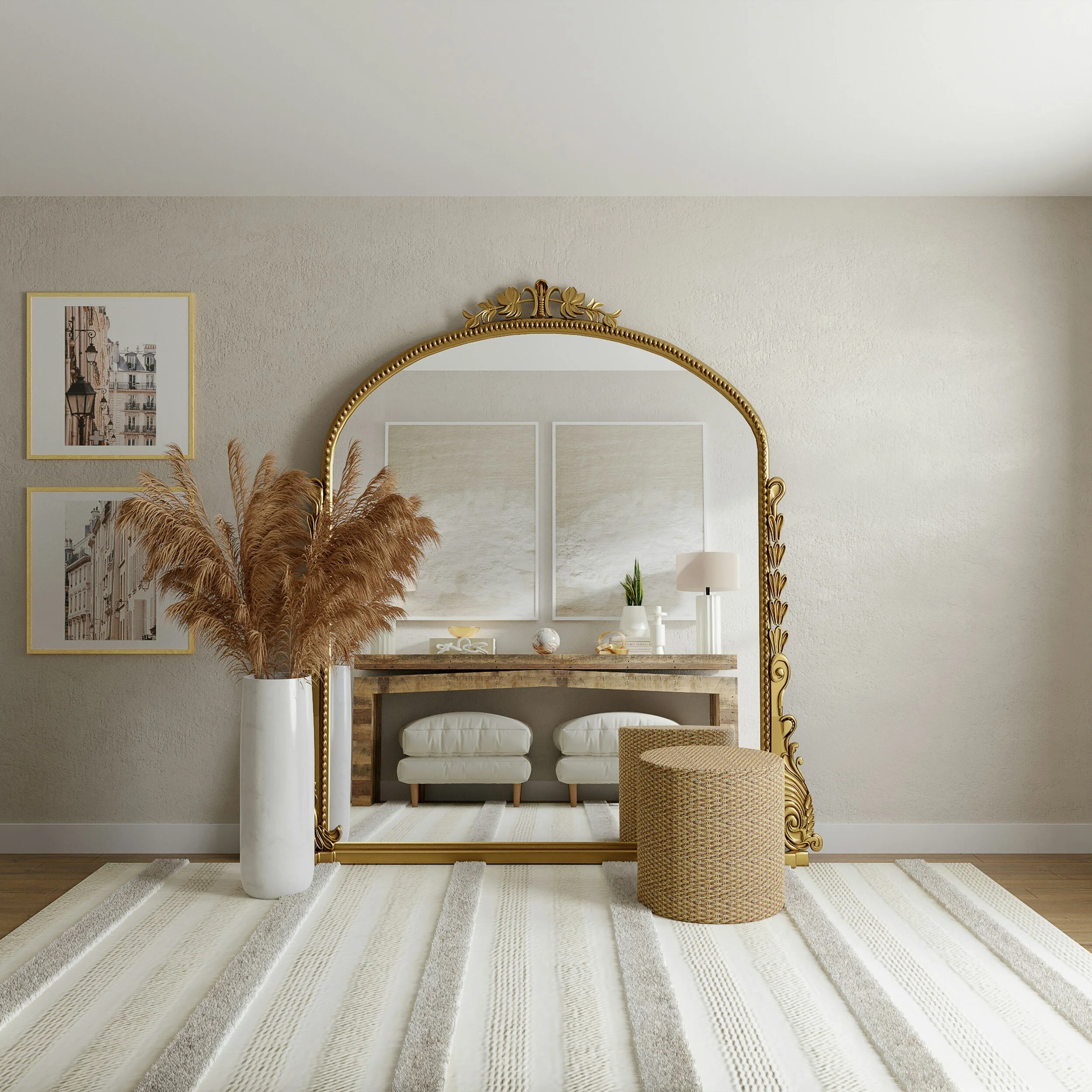
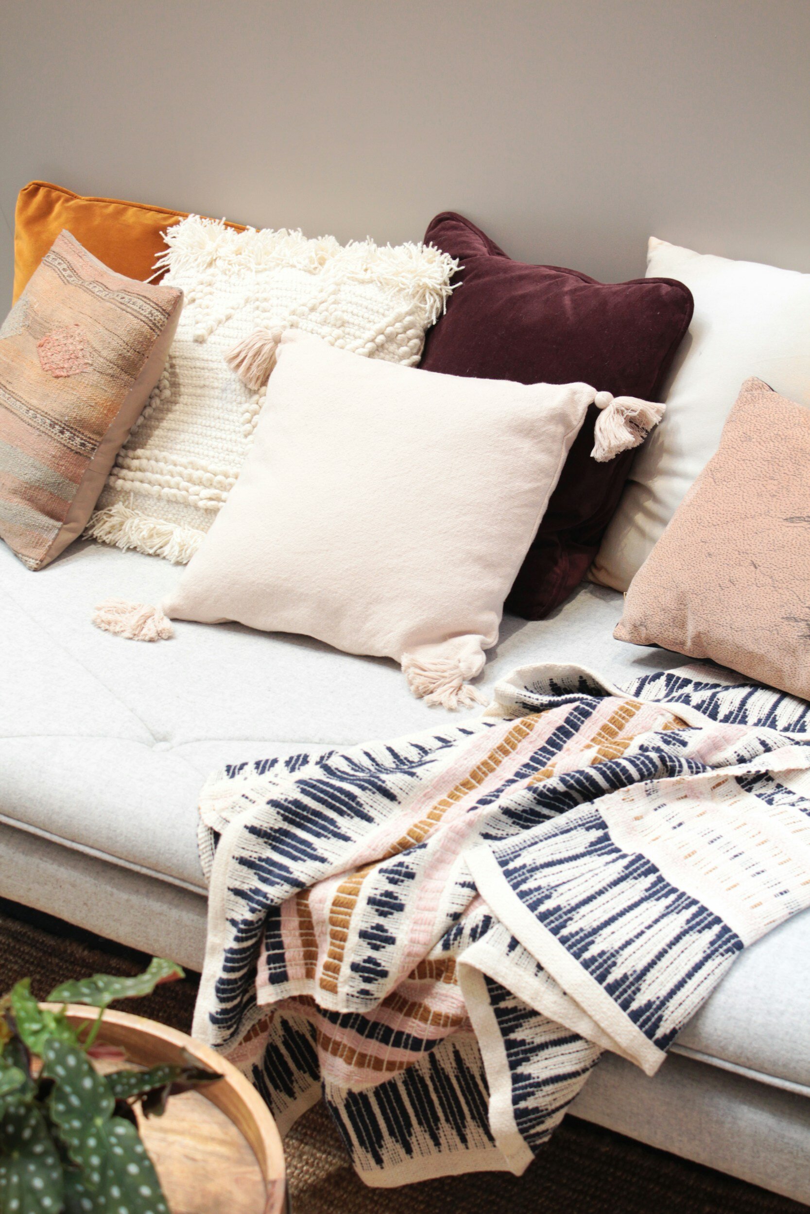
    • Browns, beiges, and other earthy neutrals are taking center stage, creating a harmonious symphony of colors that provides a neutral backdrop for various design elements. This palette offers a timeless elegance that effortlessly complements diverse styles and aesthetics.

  2. Warmth and Coziness:

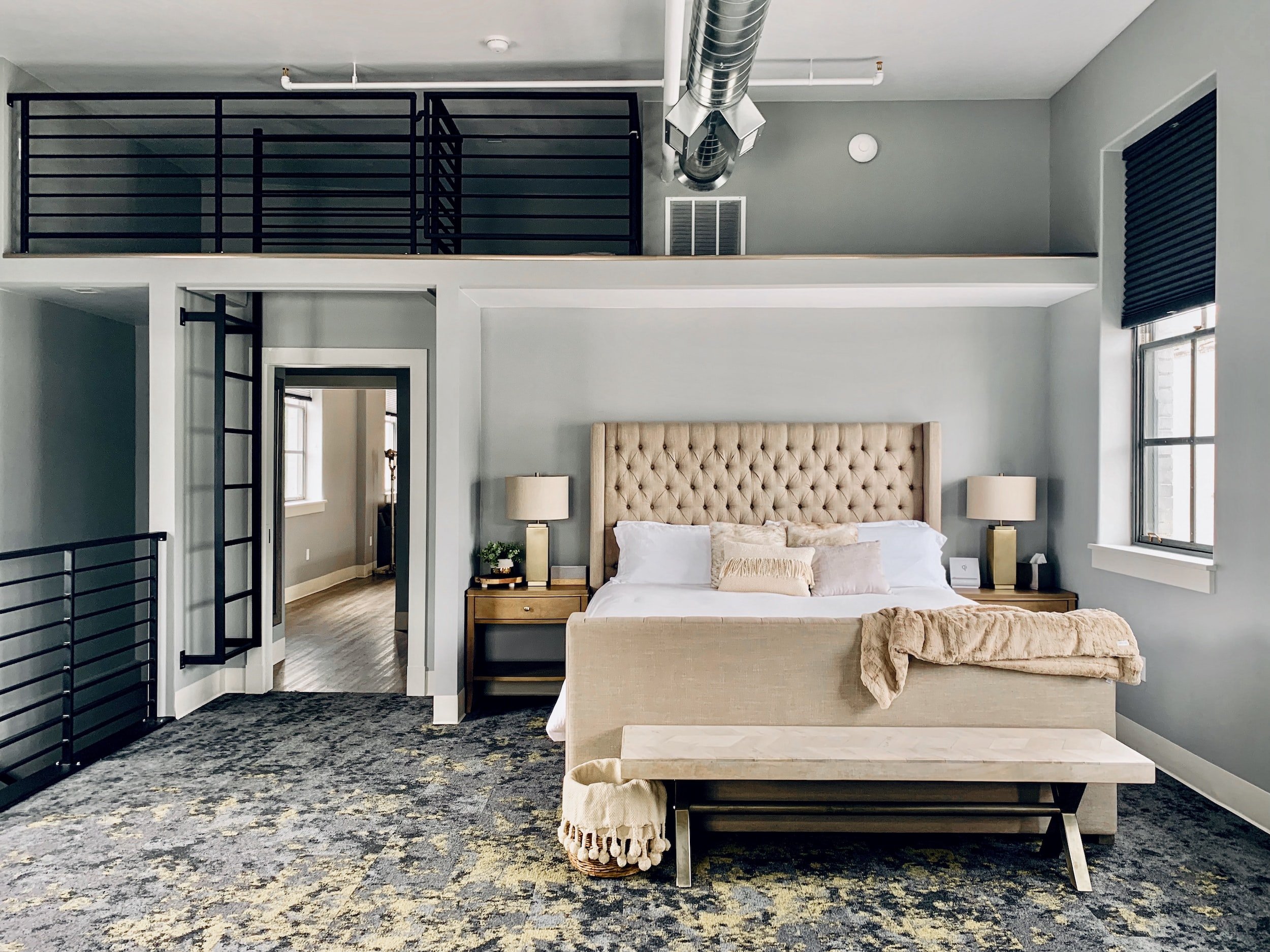
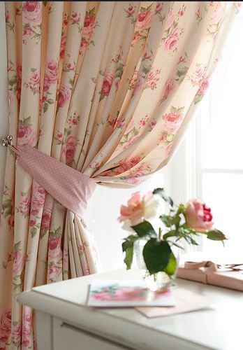
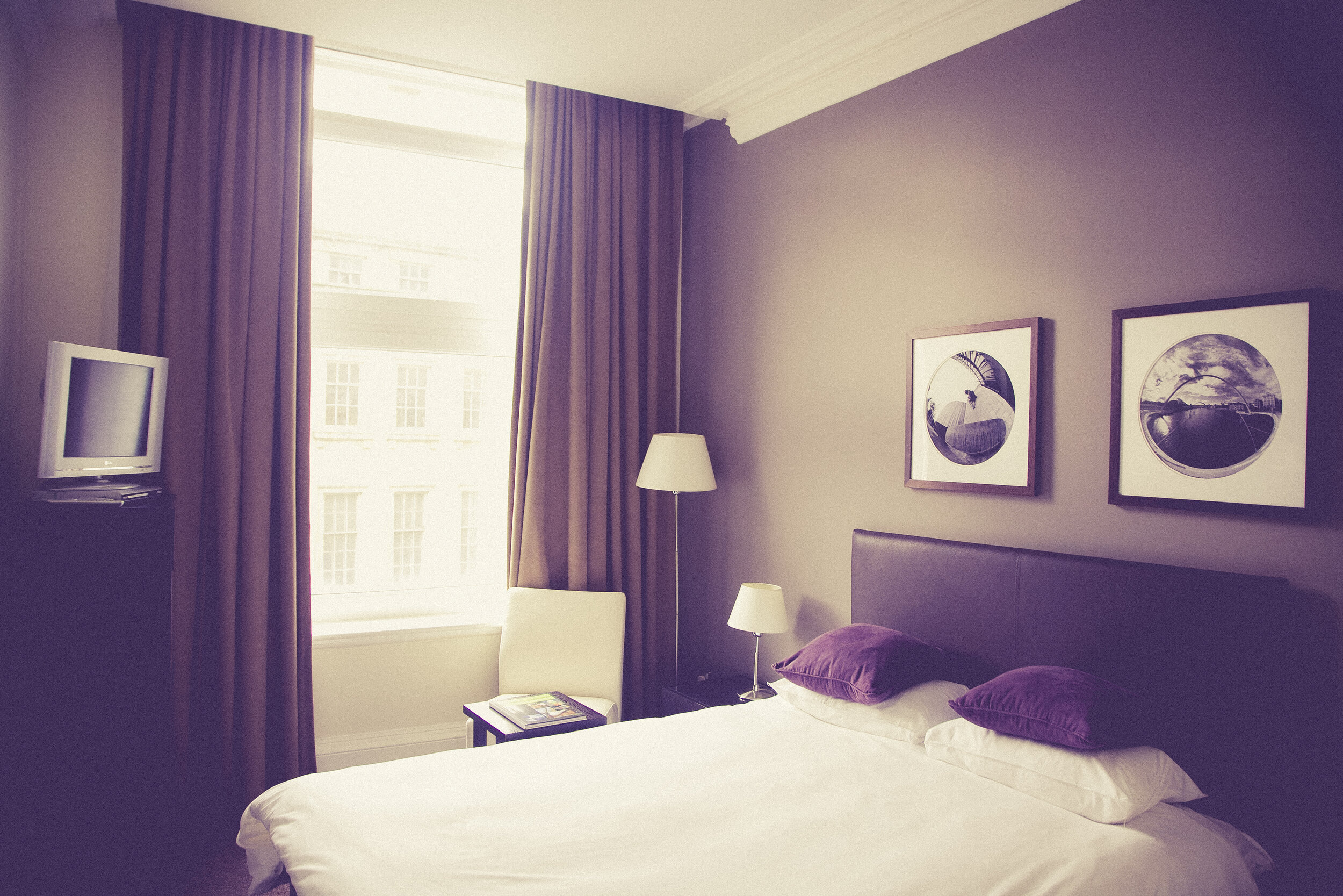
    • Earth tones evoke a sense of warmth and coziness that is unparalleled. From deep chocolate browns to warm terracottas, these hues infuse spaces with a welcoming ambiance, making rooms feel instantly comfortable and inviting.

  3. Natural Connection:

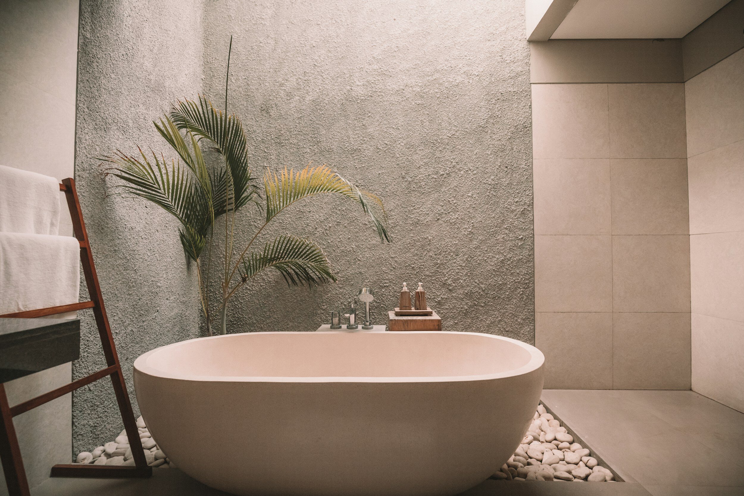
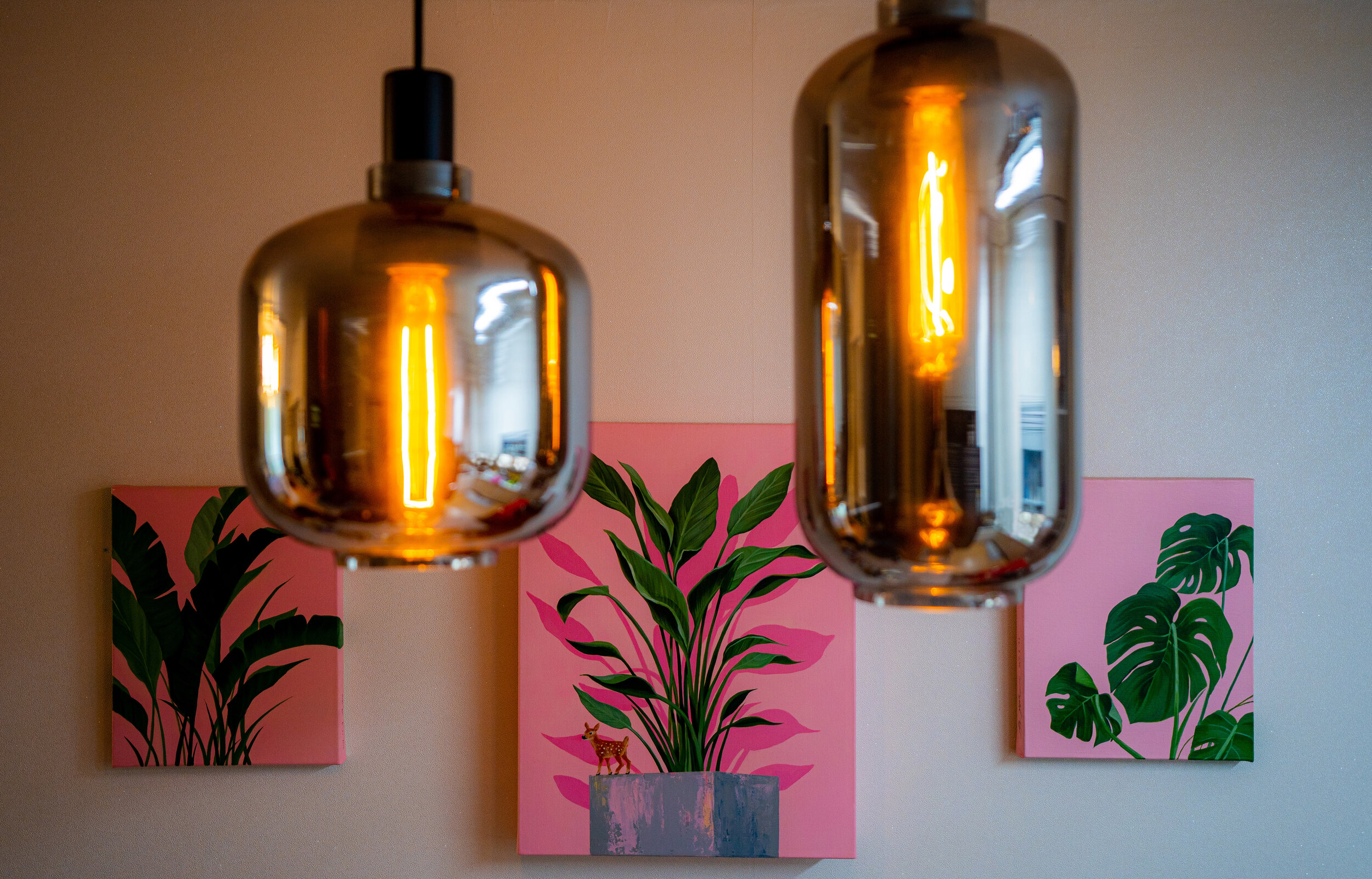
    • Browns and earth tones establish a strong connection to the natural world. Inspired by the earth's landscapes, designers are incorporating these hues to bring a touch of the outdoors inside. This natural connection creates a serene environment that promotes well-being and relaxation.

  4. Versatility in Design Styles:

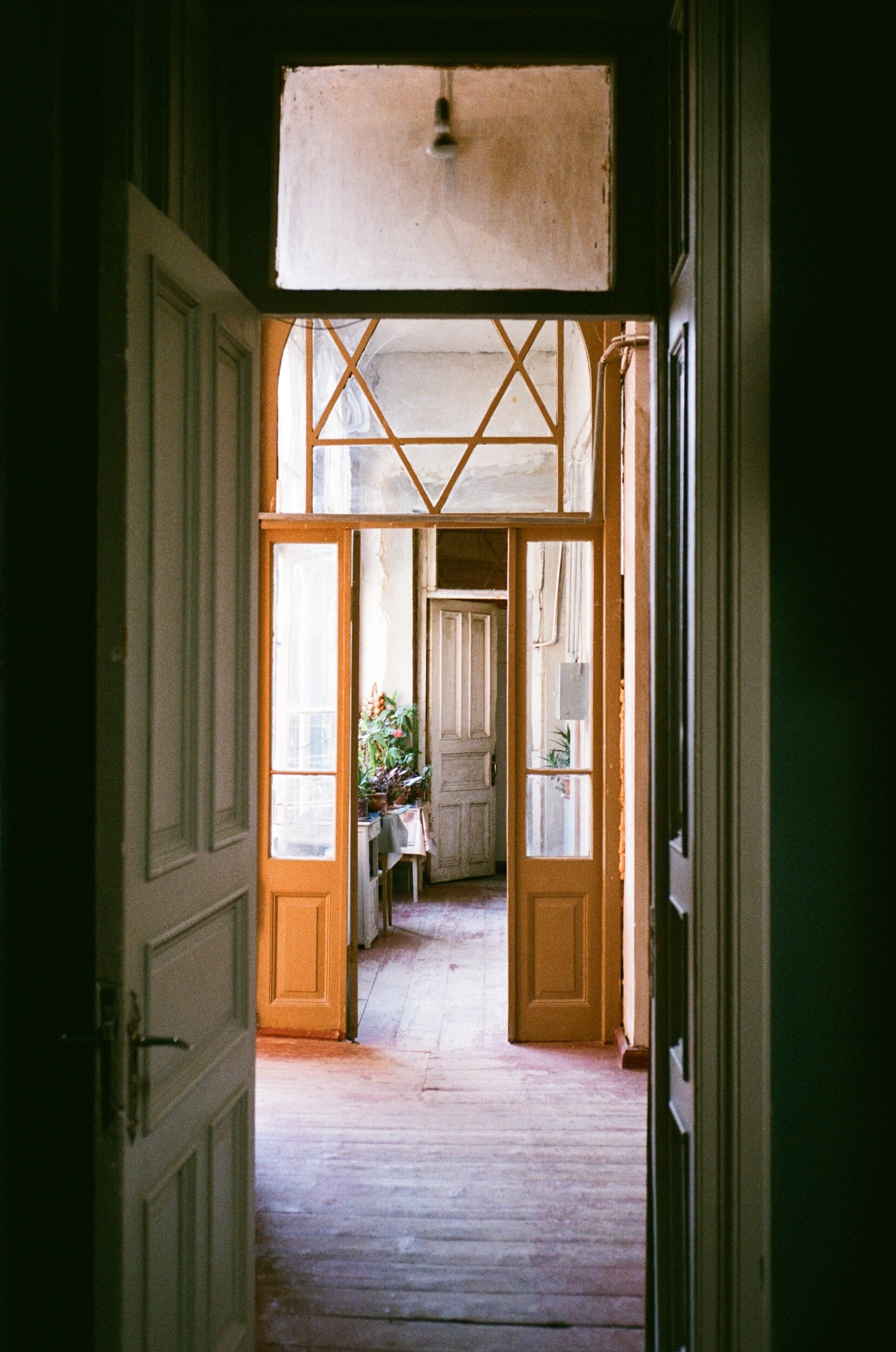
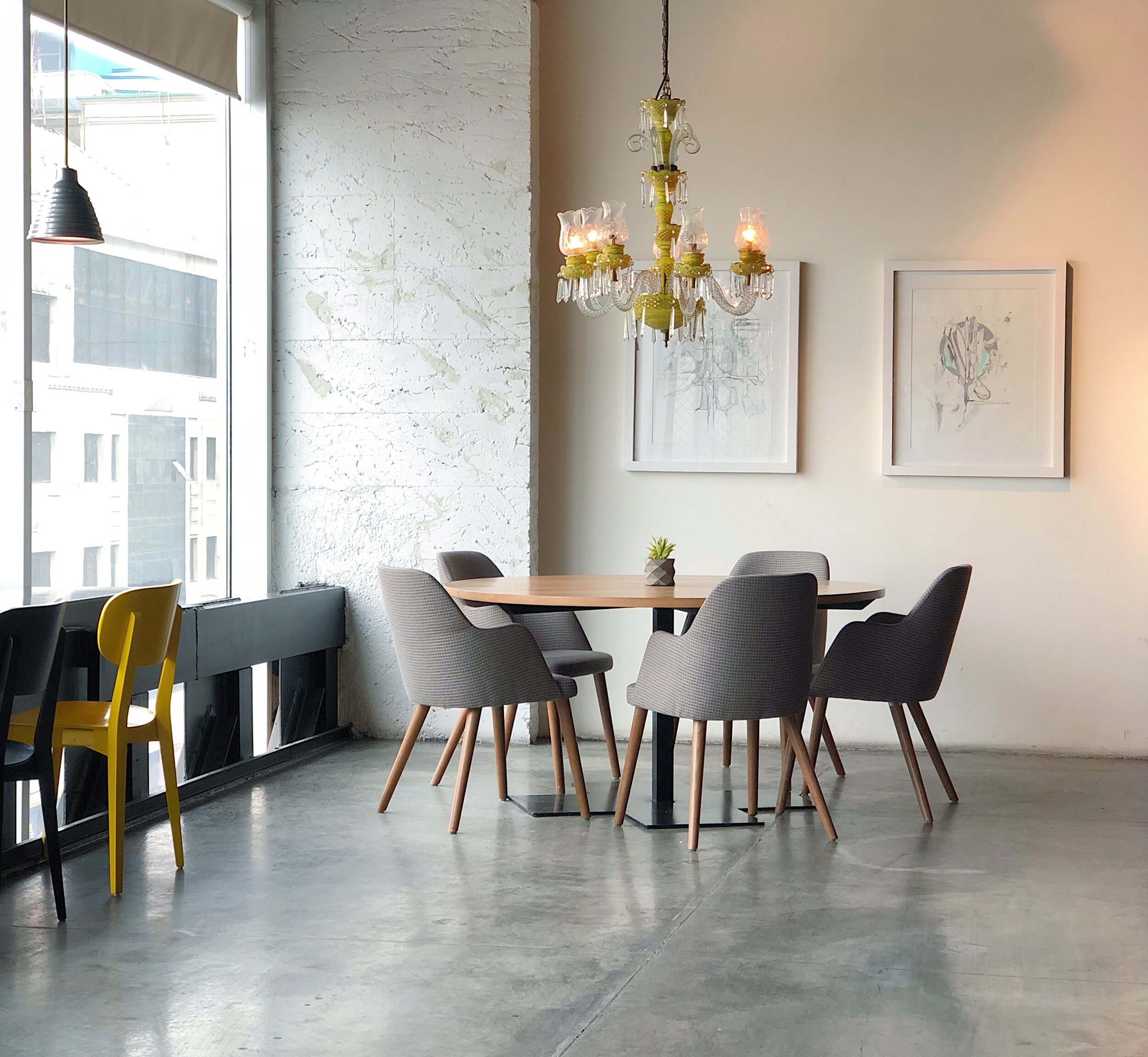
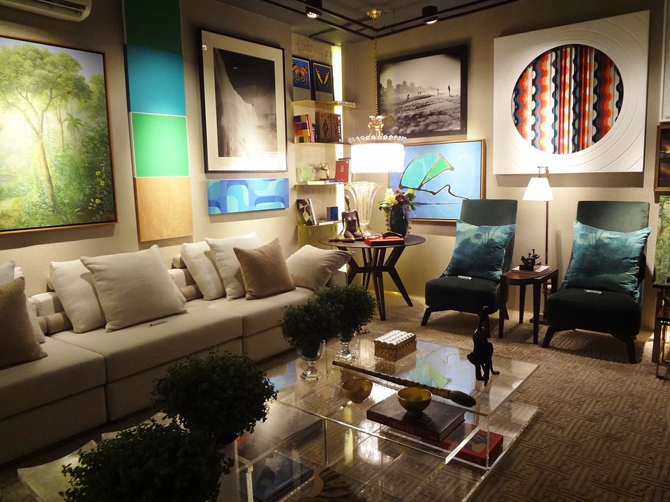
    • One of the remarkable aspects of browns and earth tones is their versatility. Whether adorning modern minimalist spaces or traditional interiors, these colors seamlessly integrate into various design styles, offering flexibility and adaptability.

  5. Texture and Layering:

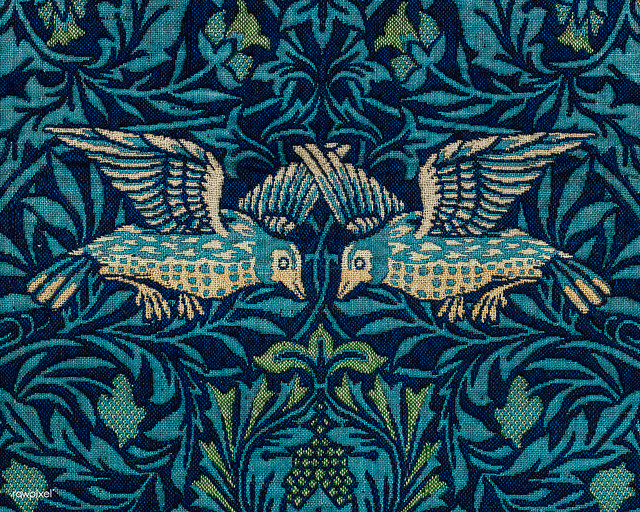
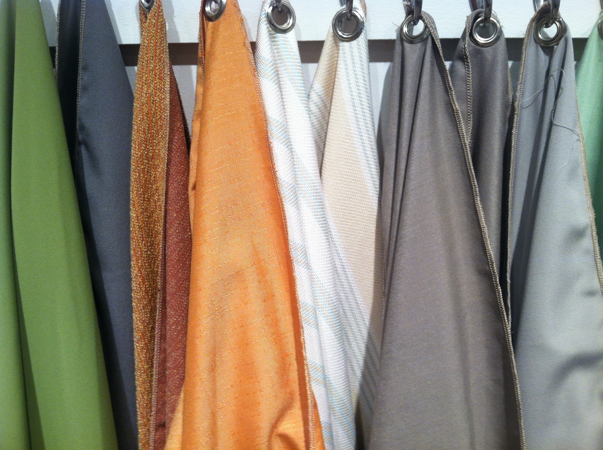
    • Earthy hues provide an excellent canvas for playing with texture and layering. From rich leather furniture to woven textiles and natural stone finishes, the depth and richness of browns amplify the tactile experience within a space.

  6. Balancing Bold Accents:

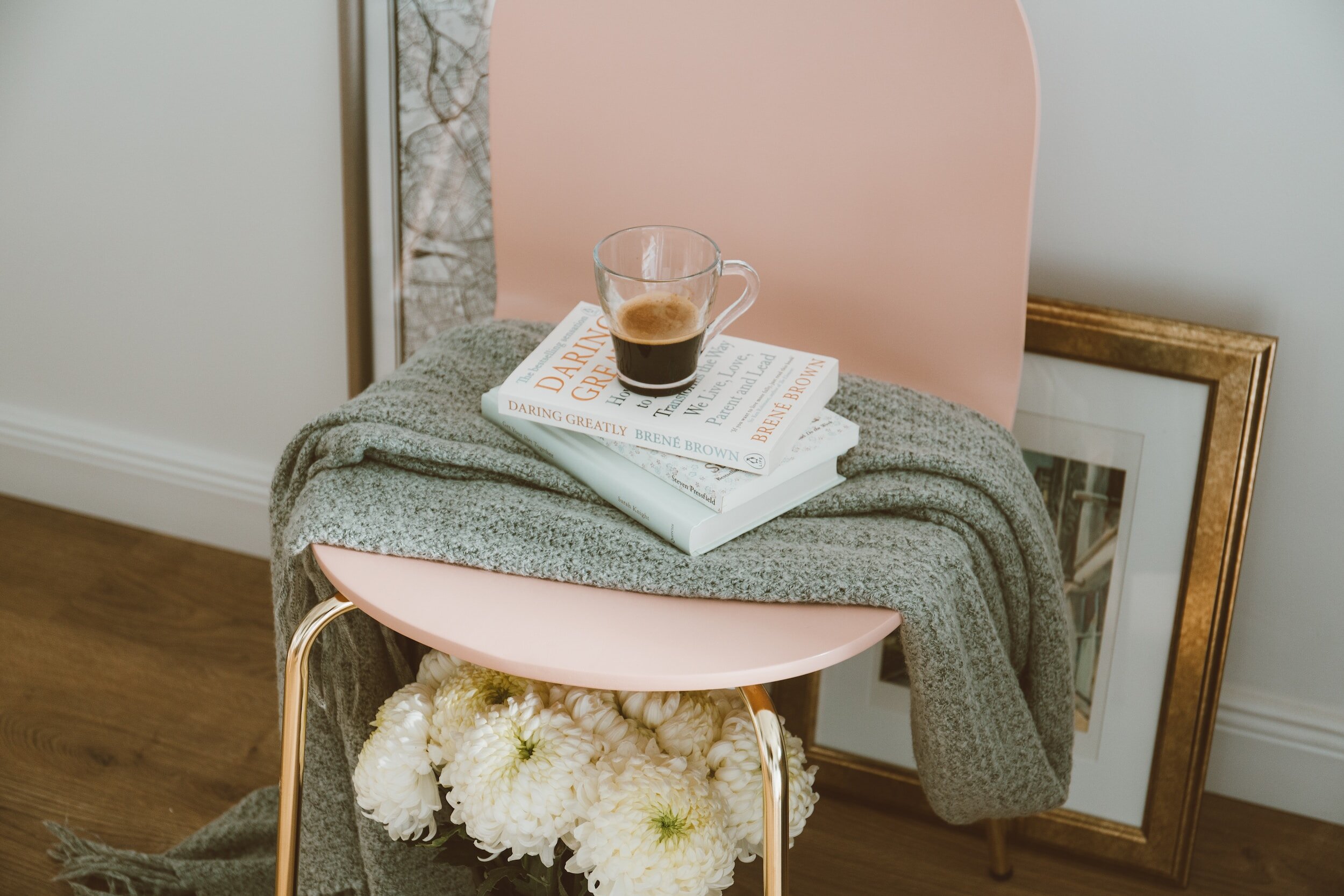
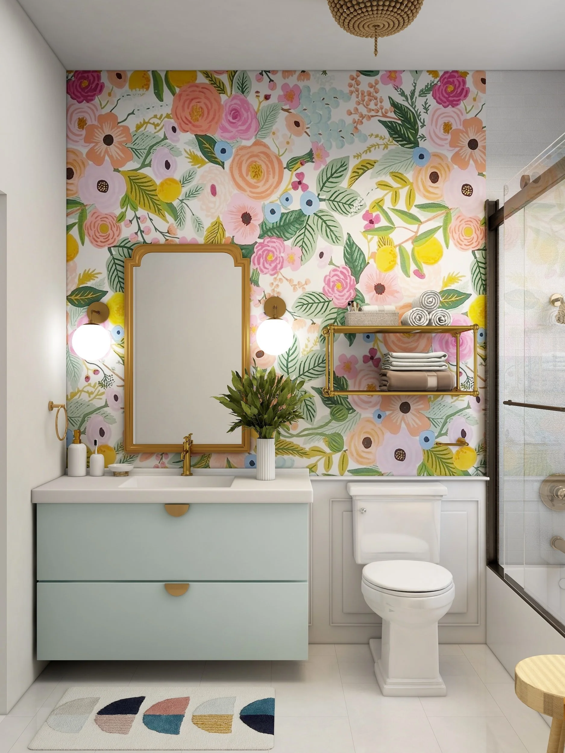
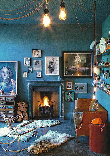
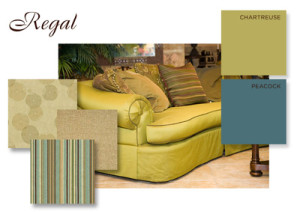
    • Browns serve as an ideal backdrop for incorporating bold accents. Whether it's vibrant artworks, jewel-toned accessories, or metallic finishes, the earthy base allows these accents to pop, creating a visually dynamic and balanced interior.

  7. Timeless Elegance:

    • Unlike fleeting trends, browns and earth tones exude a timeless elegance. They have the power to transform a space into a sanctuary of comfort and style that remains relevant year after year.

As we embrace the resurgence of browns and earth tones in interior design, we celebrate the enduring beauty of these colors. From creating a natural connection to offering versatility, warmth, and timeless elegance, earthy hues have once again proven their ability to redefine and elevate our living spaces. Whether used in subtle accents or as the primary palette, the trend of Browns and Earth Tones is a testament to the enduring charm of nature-inspired design!


Peach Fuzz Perfection: Unveiling the 2024 Pantone Color of the Year

As the calendar turns a new page, the design world eagerly anticipates the announcement of Pantone's Color of the Year, a hue that sets the tone for creative expression across various industries. In 2024, we find ourselves immersed in the delightful and comforting embrace of Peach Fuzz – a color that promises to bring warmth, sophistication, and a touch of nostalgia to our lives.

The Allure of Peach Fuzz: Peach Fuzz, a soft and inviting shade that falls somewhere between blush and apricot, captivates with its understated elegance. It embodies the spirit of tranquility, evoking memories of sun-kissed summer afternoons and the gentle embrace of a cozy blanket. This versatile hue brings a sense of calm and sophistication to any space it graces.

Incorporating Peach Fuzz into Design:

  1. Home Interiors:

    • Peach Fuzz is the perfect choice for creating serene and inviting living spaces. From accent walls to furnishings, this color effortlessly pairs with a variety of neutrals, whites, and metallics, creating a harmonious and timeless ambiance

  2. Fashion Forward:

    • The fashion industry is sure to embrace Peach Fuzz for its versatility and universally flattering appeal. Expect to see this hue adorning runways and making a statement in everything from casual wear to elegant evening ensembles

  3. Graphic Design and Branding:

    • Peach Fuzz's gentle and sophisticated nature makes it an excellent choice for graphic design and branding. Its soft tones convey a sense of approachability and elegance, making it ideal for businesses seeking to create a welcoming and memorable identity.

  4. Artistic Expressions:

    • Artists and creatives will find inspiration in Peach Fuzz, exploring its potential in various mediums. Its calming and comforting aura lends itself well to artistic expressions, offering a canvas for both subtle and bold creations

  5. Event Design:

    • Peach Fuzz introduces a touch of sweetness to events and celebrations. Whether incorporated into floral arrangements, table settings, or event invitations, this color sets the stage for a serene and memorable experience!

As Peach Fuzz takes its well-deserved place as the 2024 Pantone Color of the Year, it invites us to infuse our lives with a sense of calm, sophistication, and nostalgia. Whether adorning our homes, enhancing our wardrobes, or inspiring creative projects, this delightful hue promises to leave an enduring mark on design trends throughout the year. Let's embrace Peach Fuzz and celebrate the timeless beauty it brings to our aesthetic experiences!

Seamless Harmony: The Trend of Painting Door Frames and Baseboards in Wall Colors

In the ever-evolving world of interior design, trends come and go, shaping the way we perceive and decorate our living spaces. One recent trend that has gained popularity is the practice of painting door frames and baseboards the same color as the walls. This departure from the traditional white trim creates a seamless and cohesive look that transforms the way we perceive boundaries within our homes. In this blog, we'll explore the reasons behind this trend and offer insights on how to successfully embrace this harmonious approach!

  1. The End of Contrast: Historically, white trim has been a go-to choice for creating a visual contrast with colored walls. However, the trend of painting door frames and baseboards in the same color as the walls challenges this convention. By eliminating the stark contrast, this approach fosters a sense of continuity and flow throughout a room.

  2. Visual Continuity and Space Perception: Painting trim the same color as the walls creates a visual continuity that tricks the eye into perceiving space differently. The absence of distinct lines between walls and trim allows for a smoother transition from one surface to another, making rooms appear larger and more open.

  3. Modern Elegance: The trend aligns with the modern design aesthetic, where simplicity and clean lines take center stage. By unifying the color palette, the overall effect is one of modern elegance. This approach allows other design elements and furnishings to stand out, making a bold statement without the distraction of contrasting trim.

  4. Embracing Minimalism: For those drawn to minimalism, painting door frames and baseboards the same color as the walls is a natural choice. This approach eliminates visual clutter, creating a serene and uncluttered atmosphere. The focus shifts to the essentials, emphasizing the beauty of simplicity.

  5. Choosing the Right Color: While the trend promotes unity in color, selecting the right hue is crucial. Neutral tones like soft grays, warm beiges, or muted pastels work well for achieving a seamless look. Experiment with samples in different lighting conditions to find a color that complements your overall design scheme.

  6. Professional Execution: Achieving a flawless look requires careful execution. Proper preparation, including sanding and priming, ensures a smooth finish. Use high-quality paint to enhance durability and longevity. Consider seeking professional help if you're unsure about tackling the project yourself.

  7. Accenting with Furnishings and Decor: With the trim blending into the walls, furnishings and decor become key players in defining the room's character. Introduce accent pieces, artwork, and textiles to add pops of color and interest. This allows you to personalize the space without the distraction of contrasting trim.

    The trend of painting door frames and baseboards the same color as the walls challenges traditional design norms, offering a fresh and modern approach to interior aesthetics. Whether you're drawn to the visual continuity, the illusion of expanded space, or the elegance of minimalism, this trend provides a canvas for creating a harmonious and personalized home. Consider experimenting with this approach in your space and discover how it transforms the way you experience and enjoy your living environment.

Pretty in Pink! The Latest Design Craze

Are you looking to give your home a new and trendy makeover? Look no further than the latest interior design trend - pink! Pink has been making its way into homes throughout the world, and it's here to stay. In this article, we take a look at how to decorate your home with this beautiful color. From furniture pieces to accent walls and more, find out how to incorporate pink into your home in style!


Introduction to Interior Design Trend: Pink

If you're looking to add a touch of glamour to your home décor, consider incorporating the latest interior design trend: pink! Whether you opt for a subtle blush hue or a bold fuchsia, pink is sure to make a statement in any space. Not sure how to get started? Here are some tips on how to decorate your home with this trendy color:

1. Paint your walls: One of the easiest ways to add pink to your décor is by painting one or more walls in the hue of your choice. This will instantly brighten up any room and create a focal point for your overall design.

2. Incorporate pink accents: If you're not ready to commit to an entire wall of pink, consider adding smaller accents throughout your home instead. This could include throw pillows, rugs, artwork, and even small accent pieces like vases and candles.

3. Go for bold: If you really want to make a statement, go for bolder shades of pink like fuchsia or hot pink. These hues can be used sparingly as accents or incorporated more fully into your overall design scheme.

4. Balance with neutrals: Pink can be a very versatile color, but it's important to balance it with neutral tones so as not to overwhelm the space. Pairing pink with black, white, or gray will help create a more cohesive look.

Benefits of Decorating with Pink

When it comes to interior design, pink is having a moment. This popular color can be used in a variety of ways to create a fresh, stylish look in your home. Here are some of the benefits of decorating with pink:

Pink is versatile. It can be used as a statement color or as an accent.Whether you want to paint a wall pink or add some pink pillows to your sofa, there are endless possibilities.

Pink is cheerful and inviting. It’s the perfect color for creating a warm and welcoming space.

Pink can be gender-neutral. Pink is often associated with femininity, but it doesn’t have to be. Pink can work well in any room, regardless of the occupants’ genders.

Pink is timeless. Unlike some trends that come and go, pink has been popular for centuries and shows no signs of going out of style anytime soon.


Tips to Incorporate Pink in Your Room

If you're looking to add a touch of pink to your home décor, there are a few ways to do so without going overboard. Here are a few tips:

1. Use pink as an accent color: A little goes a long way when it comes to using pink as an accent color. Try adding a pop of pink with some throw pillows, artwork, or even a vase.


2. Go for blush tones: Blush tones are very popular right now and they can be incorporated into your décor in a variety of ways. From wall colors to furniture, there are plenty of ways to add blush tones into your home.

3. Mix and match: Don't be afraid to mix and match different shades of pink. You can create a unique and stylish look by pairing different shades together.

4. Add some texture: Texture is key when it comes to interior design trends. Adding some velvet or satin fabrics can really make your space pop.

5. Keep it simple: Sometimes less is more when it comes to décor trends. If you're not sure about going all-out with the trend, start small with just a few accent pieces here and there.

Decorating your home with the latest interior design trend of pink can be a great way to add some fun and unique flair to any space. Whether you choose to go all out or subtle, there are endless possibilities when it comes to decorating with pink. From adding pops of color through accent pieces or wallpaper, to embracing the full blush vibes in furniture and rugs, this is one trend that can truly transform any room into a masterpiece. So what are you waiting for? Get creative and start experimenting with ways to bring more pink into your living spaces!

Neutral Color Palettes Can Still "Pop!"

When you think of natural tones and interior design, you might picture a dull, builder's-beige home in the middle of a cookie-cutter suburb. All of the houses are identical, and there isn't a trace of personality to be found.

The truth is that, when done correctly, a color palette inspired by nature can be extremely appealing. Not only that, but inviting natural tones and textures into your space has real psychological benefits.

So, how do you make a natural-toned space that isn't boring? We've put together this guide to help you realize your neutral-home fantasies.

While technically nearly each coloration below the rainbow can be observed in nature, “natural tones” in the world of current indoors sketch & decor principally refer to impartial colorings and minimally-treated herbal substances like woods, rattans, leathers, and wools. Black, white, ivory, beige, grey, brown, ochre, and rust are all colorings that can be layered and blended besides lots threat of clashing or a format fake pas. Due to this flexibility and versatility of these colors, there’s little risk that these hues will go out of fashion or sense dated each time soon.

Although frequently omitted in favor of shiny pops of color, neutrals and herbal tones deserve their second in the spotlight, too. Here are some of the key advantages of adorning with herbal tones: Easy to mix and match: While you would possibly have had to carry a pattern of your present day sofa’s cloth to the paint save in the past, there’s little risk of deciding on clashing colorations when you deal with neutrals.

Longevity: That grey couch you make investments in this 12 months is not going to go out of fashion whenever soon. You can purchase it these days and experience assured that your preference will proceed to appear contemporary and updated for years to come. When you have a impartial backdrop such as this, you can change up your throw pillows and add-ons when you want a exchange — besides having to change the current couch you’ve already fallen in love with.

Uncluttered: Even if you fill your area with lots of outsized furniture, accessories, and artwork, herbal tones will maintain it from searching and feeling cluttered. When you format a room with a impartial palette, your eye is capable to take in the house except being distracted and overwhelmed with endless focal factors and visible clutter.

WARM HUES VS. COOL TONES Although it’s valid that 99% of organic tones will agree, there’s entity to recognize if you be going to take your room to a designer level. All shades are top-secret as either warm or cool, and experienced that is that can help you improve selections when it meets expectations forming your ideal room.

Warm normal tones, to a degree unsophisticated browns, smooth ivory, deep beiges, rich terracottas, and burnished color yellows increase ease and instant hominess to a scope when secondhand together.

When plotting your unrefined-muted in color scope, believe the type of impression you’re believing to stimulate. Feel free to join and equal warm and cool tones for a sense of contrast and balance, or charge individual color “hotness” palette to focal point your design aims.

2022: Spring & Summer Color Trends!

Colors that evoke hope and optimism are featured in the new spring/summer 2022 palette, highlighting our love for the fun and happiness that color can bring to our lives. This is how color patterns represent what we expected in our Post-Covid Trend "Playful Thinking," in which we identified a growing trend for artistic and playful spaces as a reaction to the times we live in.

unsplash-image-KuudDjBHIlA.jpg

We are energized by inspiration to produce new designs and to work diligently to ensure that such designs are consistent with our personal image or vision. We create the dynamism that represents our work when we are motivated. We need inspiration to brainstorm and plot out new ideas in order to bring these concepts to life. And it is our imagination that enables us to create new and innovative designs.

unsplash-image-hxkduwR6BuE.jpg

Pantone's range of Spring and Summer 2021 Colors for its Spring - Summer 2021 fashion trends study is exciting, inspiring, and joyful. The overarching trend seems to be renewal. Fresh greens and earthy tones paired with clean, white palettes bring forth a level of new life within Interior Spaces, which is something we definitely need after the chaos of 2020!

unsplash-image--snb3XRJk-E.jpg

The biggest color patterns for 2021 are taking cues from the previous turbulent year and providing people with a sense of hope, excitement, and the much-needed refresh.

Over the last two months, the Pantone Color Institute and Shutterstock have published their color trend forecasts for 2021, selecting vivid and calming colors that are inspired by nature. Pantone unveiled their new color palette in December: Illumating ( a soft yelow hue) and Ultimate Gray.

Image Source: https://creativemarket.com/blog/pantone-color-of-the-year-2021

Image Source: https://creativemarket.com/blog/pantone-color-of-the-year-2021

All White Interiors: Clean & Timeless

11100934144_096e64915b_z.jpg

Well, it's been a long winter-- but we are on the cusp of Spring, I just feel it! It's that time of year when you want to freshen up your space- making it brighter, airier, and uncluttered. Which is why I thought it would be fun to share some gorgeous white interiors to inspire you!

living-room-2605530_960_720.jpg

This beautiful neutral color palette features white in a classic, timeless manner. In the 90's, we were so afraid of white walls, but rest assured-- you can have a gorgeous space with a mostly white color palette that is as sophisticated as it gets!

Implementing metallics and fresh plants is an easy way to pull together a white color palette. There is something so fresh and inviting when designing with this scheme. Another beautiful perk of a neutral color palette, is that is emphasizes the beautiful details of your home's architecture.

stay-2132344_960_720.jpg


All white color palettes work in both traditional design as well as modern, contemporary design. There is something so clean about a white palette- a look that has never and will never go out of style!

If you have a smaller space, a white color palette will make your space look larger. White reflects light, which gives your space an open, bright, airy feel. 


2020 Pantone Color of the Year | Classic Blue!

This year’s Color of the Year chosen by Pantone is as classic as it gets, no pun intended! Classic Blue is timeless hue that looks great in all styles of spaces and pairs well with many colors. Let’s get inspired by this chipper shade and see some interiors that will knock our socks off.

chair-3705529_960_720.jpg

Classic blue, reminiscent of coastal themes, gives interiors a classic, traditional, clean, fresh vibe that is sure to withstand time. A beautiful way to implement this color is through accents, and accent walls. If your space is primarily white or gray, Classic Blue accessories or furnishings are sure to pop and give your space that extra “wow” factor.

swordfish-3542787_1280.jpg

There is nothing more timeless than blue and white beach umbrellas. You can bring this Riviera look into your space with pops of Classic Blue and white accessories.

sunbeds-2669784_1280.jpg

Though this interior is not “Classic Blue”, so-to-speak, there are many various shades of blue that are also trending now, similar to this muted, slightly teal blue interior. Blue paired with whites and grays are as classic as it gets when it comes to color matching.

pexels-photo-3201763.jpeg

Did you know that adding blue to your interior can lower your stress levels? Studies have shown that cooler tones implemented into your space can create a calming effect, easing your mind and quieting the everyday “noise” we are all exposed to. A simple blue accent like this door can truly pop while bringing in a freshness and a sense of serenity.

Teal is Real: Our Favorite Interiors

Teal has been making its way through the Interior Design community for many years, but it seems to be debuting especially during the warmer months! There is a reason this gorgeous hue is so popular in Interior Design, and here are some of our favorite interiors featuring it.

Blues without the Blues

Well, it’s that time of year already again! The sun is about to go into hibernation (at least in the Pacific Northwest, that is)! But, there are ways you can make your interior still feel luxurious even in the darker months with an unassuming color- blue. Here are ways in which you can implement blues into your interiors without feeling blue.

Interior designers love working with colors that are trendy in order to create unique and stylish spaces that are beautiful. One of the most popular colors that designers are using right now is blue, so incorporating various shades of this hue into your home will bring a current vibe into it and psychologically impact qualities that are associated with blue. If you want to create a soothing environment that will stimulate your mind and improve your ability to think clearly, blue has been scientifically proven to put your mind at ease.

Mix and Match Blue Hues

Blue can be wither an intense color, or somewhat neutral when used throughout various spaces, so it is important to consider the size of your space before choosing blue as the main color. Mixing varying shades of blue is a gorgeous way to not only break up the monotony of a using one hue of blue, but also creates a more calming space. You can also use several patterns in your blue furniture, accents, and wallpaper so that you can provide enough contrast within a room while still keeping the blue color the focal point.

Use Dark Blue with Caution

Darker shades of blue are certainly rich and sophisticated, but they need to be used correctly. Too much dark blue in a room can make it feel colder and smaller than it actually is. Gold, yellow, and other bright hues pair perfectly with darker blues, so add these too offset the cool tone with furniture, accessories, window treatments, lighting. This is how you can truly bring out a darker blue hue in a classic way.

Also, if you are going to have darker blue walls, you may want to contrast them with light furniture or accessories. In the same way, if you have a lot of blue furniture in a room, try to add accessories that are paler or cream colored to break the darkness up while still maintaining the calming vibe.

If you would like to go in a different direction, you can also use dark brown wood to ground blue colors throughout a space. Just think of the color wheel- the opposite of blue is orange (it’s complement).

Making Purple Masculine

There tends to be a love-hate relationship with the color purple and it's sister hues. This is because it has been long associated with being considered a feminine color, unique only to girlish spaces. But we beg to differ. Purple can make an otherwise stark space feel big, bold, and even masculine! 

f3eda3182b4a336253314f85c356bca0.jpg


This gorgeous restaurant space is adorned with antique tufted sofas in place of booths. The purple upholstery gives it a more masculine feel in the way that the space is designed with industrial finishes, patterns and accessories.

Hotel-Room-Pillows-Frames-Furniture-Bed-Decor-2619509.jpg


When purple is used in clean, contemporary rooms, it definitely exudes a more masculine vibe. The simple purple, velvet throw pillows on the bed still have a streamlined feel, suited for a king!

In history, purple was a well-sought after color, as only royalty were able to get their hands on this pigment. You will often see purple adorning interiors from past times, as well as royalty dressed and accessorized in this color. 

Valtice-Czech-Republic-Interior-Castle-1862220.jpg

What is your relationship with the color purple? Most people either love it or highly dislike it-- either way; most people are unsure as to why or why not they would use this hue in their space

Ultra Violet: 2018 Pantone Color of the Year

Rich and pensive, Ultra Violet is reminiscent of existential energy, the mystery of what the future holds, and the new discoveries of the past and present. It reminds us of the night sky, dark but endless, full of mystery.

sunrise-phu-quoc-island-ocean.jpg

Why Pantone Chose this Color

With everything happening in our world at the present moment, Pantone color researchers thought it necessary to remind ourselves of our sheer presence on earth and the vast endlessness of our atmosphere. Ultra Violet is cosmic, rich, and timeless.

Our Favorite Ultra Voilet Uses in Interior Design

4454099117_7949e31f77_b.jpg

1. Using rich purples make a bold statement as an accent. This gorgeous bedding truly brings forth a timeless, rich look to this elegant bedroom. Rich purples tend to pop when placed in an otherwise neutral color scheme. 

29300383874_2b283ed8c5_k.jpg

2. Even the tiniest purple accents in a space can make a very bold statement. This otherwise very white bathroom stands out with just the pop of color of its hand towel. 

3. Ultra Voilet in Commercial Design. There's no doubt the guests who visit this elegant restaurant will never forget the gorgeous, sophisticated upholstery on the dining chairs. What a statement!

cafe_purple_retro_indoor_restaurant_design-483945 (1).jpg

Ultra Violet in Fashion

guy-2590809_960_720.jpg

Reminiscent of the Victorian Era followed by the 1920's rich purples always manage to make a fashion comeback. We are seeing this beautiful hue in every aspect of the runway, from hair color to couture. The beauty of this otherwise considered feminine color is that it truly works for both genders and truly makes a haute statement!

manuplation_flowers_beautiful_girl-1201506 (1).jpg

We're Blushing! The Color that's Coming Back...

Pale pinks were very popular in the past and tapered off up until recently. We are seeing beautiful rose colors, blushes and other feminine pink hues throughout the Interior Design world. Here are some of our favorite uses for blush tones.

1. Fabrics. Pale pink fabrics can truly bring elegance into a space. This beautiful blush Chesterfield sofa gives this room a sophisticated, classic look.

Pink-Chesterfield-by-Juell-Photography.jpg

2. Decor. There are many ways in which you can incorporate this feminine hue into your décor. Through the use of fabrics or throw pillows, you can give your space an extra pop. Fresh flowers are always a beautiful touch too!

pink-1207086_960_720.jpg

3. Paint. Beautiful pink hued walls bring a sense of warmth and classic feel to any space. This especially pink color creates a soft, welcoming, and elegant look.

Capture.JPG

4. Window Treatments. Pale pink window treatments can really complete a space. Incorporating beautiful florals and other patterns will give an otherwise basic room an extra focal point. 

Capture.JPG

Color Trends of 2017- What's Haute

Vibrant blues and warm colors are what's trending in the design world, according to ELLE Decor and we can see why. The more saturated a paint color is with white trim or details, the more it seems to pop and the more intense of a focal point it creates.

As you can see in the above interior, a vibrant complementary color scheme really makes a statement that is both elegant, sophisticated and timeless.  We're seeing brass and gold as accessories make their return to the design front, and they pair beautifully with the color schemes that are trending.

Warmer color palettes consisting of reds, browns and oranges are making their comeback as well. While the common gray interior is still very popular, we are seeing the design world take a turn into warmer schematics and colors.

Vibrant blues and greens reminiscent of color palettes in the 1930s are debuting on the design front. Peacock color schemes are trending and make a gorgeous statement in all types of interiors. 

The Psychology Behind Color!

The color of something really never registers to us far beyond the fact we recognize the color, at least not on a surface level. Did you know subconsciously the colors you are exposed to on a daily basis play an important role in your mood and emotions? There are certain colors that are said to invoke certain moods or make you feel certain ways. You wouldn’t believe how powerful color can be, which is why when you are considering painting your home’s interior you want colors that will promote happiness, calmness, and comfort. So, then now that we understand the role colors play in our moods let’s take a look at some colors that could benefit you when you use them.

Color Psychology:

·         Red – said to stimulate your body and mind and helps increase circulation

·         Yellow – said to stimulate your nerves and even help purify the body

·         Orange – has been used to heal the lungs and help boost energy levels

·         Blue – helps soothe illnesses and even help alleviate pain

·         Indigo – has been known to help alleviate skin issues

Now, let’s take a look at a few examples of which colors would be best where in your home. As with anything you have the choice to pain your home however you like, please simply know this can be used as a guide.

The color Green at times can signify money or finances which is why the color itself helps you become more productive. Green also produces the least amount of eyestrain which makes this color a wonderful choice for a computer desk. Give your eyes a break from the computer screen ever so often and gaze upon the lovely green shade of your desk.

The work out room could benefit you more if it was painted orange. Orange is said to help increase stimulation as well as enthusiasm. Orange is also said to help increase oxygen supply to the brain and stimulate the brain activity. If you can’t paint a whole room orange then try opting for orange work out attire instead.

Avoid overusing the color grey if you can or if you prefer grey, pair it with a more upbeat color because grey by itself can inspire people to be more passive, have a lack of energy and become uninvolved, but if you pair it with a bolder, brighter more upbeat color you can counteract the psychological effects make a gorgeous statement!

Colors may seem like such a small aspect when you are thinking about your home and how aspects of your home effect you but truth be told color is one of the largest influences on us and when we spent so much time in our home don’t we owe it to ourselves to used colors that will promote health and happiness rather than dulling and sad colors?

2017 Pantone Color of the Year: Greenery

We can all say good bye to Rose Quartz and Serenity, because the Pantone Color Institute just announced their pick for the 2017 Color of the Year. It's fresh, it's organic and it's name is "Greenery."

image.jpg

While Rose Quartz and Serenity encouraged peacefulness, calm and relaxation, this earthy hue epitomizes movement and fresh starts.

As Pantone puts it:

"Greenery is a fresh and zesty yellow-green shade that evokes the first days of spring when nature's greens revive, restore and renew. Illustrative of flourishing foliage and the lushness of the great outdoors, the fortifying attributes of Greenery signals consumers to take a deep breath, oxygenate and reinvigorate."

Here are our favorite interiors showcasing this gorgeous hue:


Timeless Study

The homeowner’s office was formerly a teenage boy’s bedroom and has since been transformed into a light and airy room with the use of the Authentic Home Pink Grapefruit paint color and custom wool carpet in a grey color tone.  The iron trundle bed and custom bedding coordinates beautifully with the custom roman shades.  The timeless writing desk and dresser were provided by the homeowner and add the perfect feminine touch to this pretty room.

Study Before & After

Authentic Home COLOR Paint


Choosing the perfect paint color is essential to creating spaces that speak to ones’ spirit. Once the paint COLOR foundation is in place, the other interior design and home décor accents easily come into focus. Selecting the right paint color can be an overwhelming process due to the unlimited number of paint color choices available.


Kathy recognized the  need to simplify the paint color selection process and created a fine-tuned selection of 75 home paint colors grouped by “mood” palette – FreshElegantSereneRegal, & Playful. Simply select the mood that speaks to you, then mix and match paint colors within that palette for fail proof results.


Need help selecting paint or creating your own Authentic Home?
Schedule your interior design or color consultation today!

CONTACT KATHY

Orange-October Paint Color of the Month


Orange is an obvious choice for October but there are other reasons why orange is a great color. Orange is associated with stability, reassurance, warmth, and is thought to aid digestion which is why it is great in a dining room.

Image Source: Pexels 

The color orange also radiates warmth and happiness, combining the physical energy and stimulation of red with the cheerfulness of yellow. Orange brings spontaneity and a positive outlook on life and relates to social communication, stimulating two way conversations. A warm and inviting color in a living room, it is both physically and mentally stimulating, so it gets people thinking and talking!


Simply painting your front door orange will let anyone know that your home is a happy and cheerful one. Orange is probably the most under-used color in decorating but young people do respond well to it as it has a degree of youthful to it. Painting a chair or table is another way to add that pop of color without going overboard.


Authentic Home COLOR Paint has three different shades of orange that will fit any project you decide to tackle in October. Email us at info@authentic-home.com or call (206)937-3070 to order your shade of orange today.