The Simplicity of Scandinavian Design
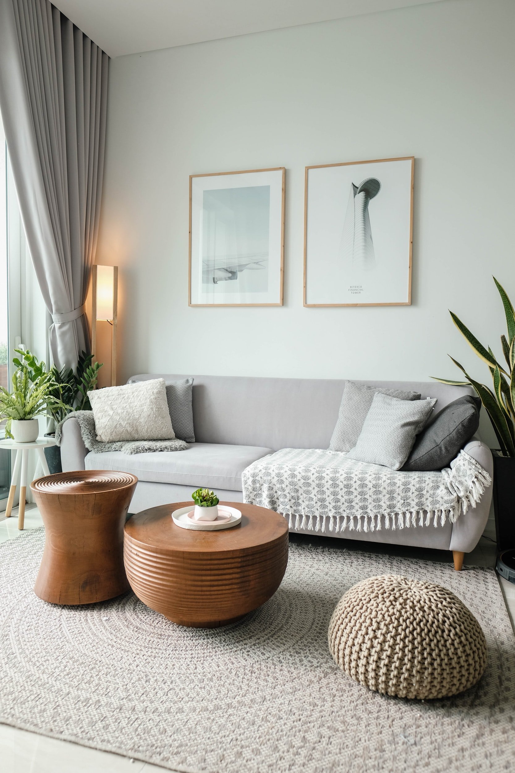
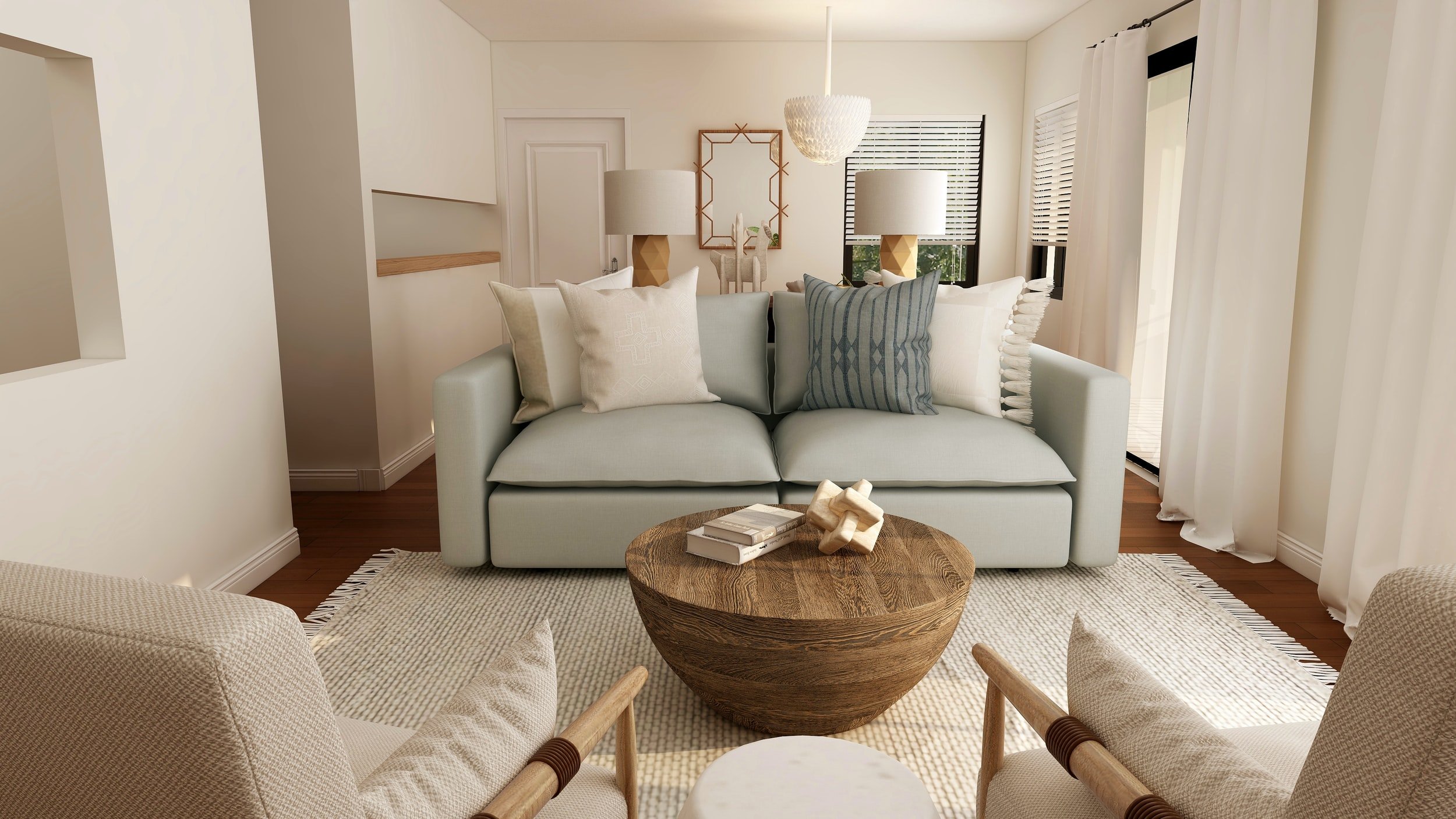
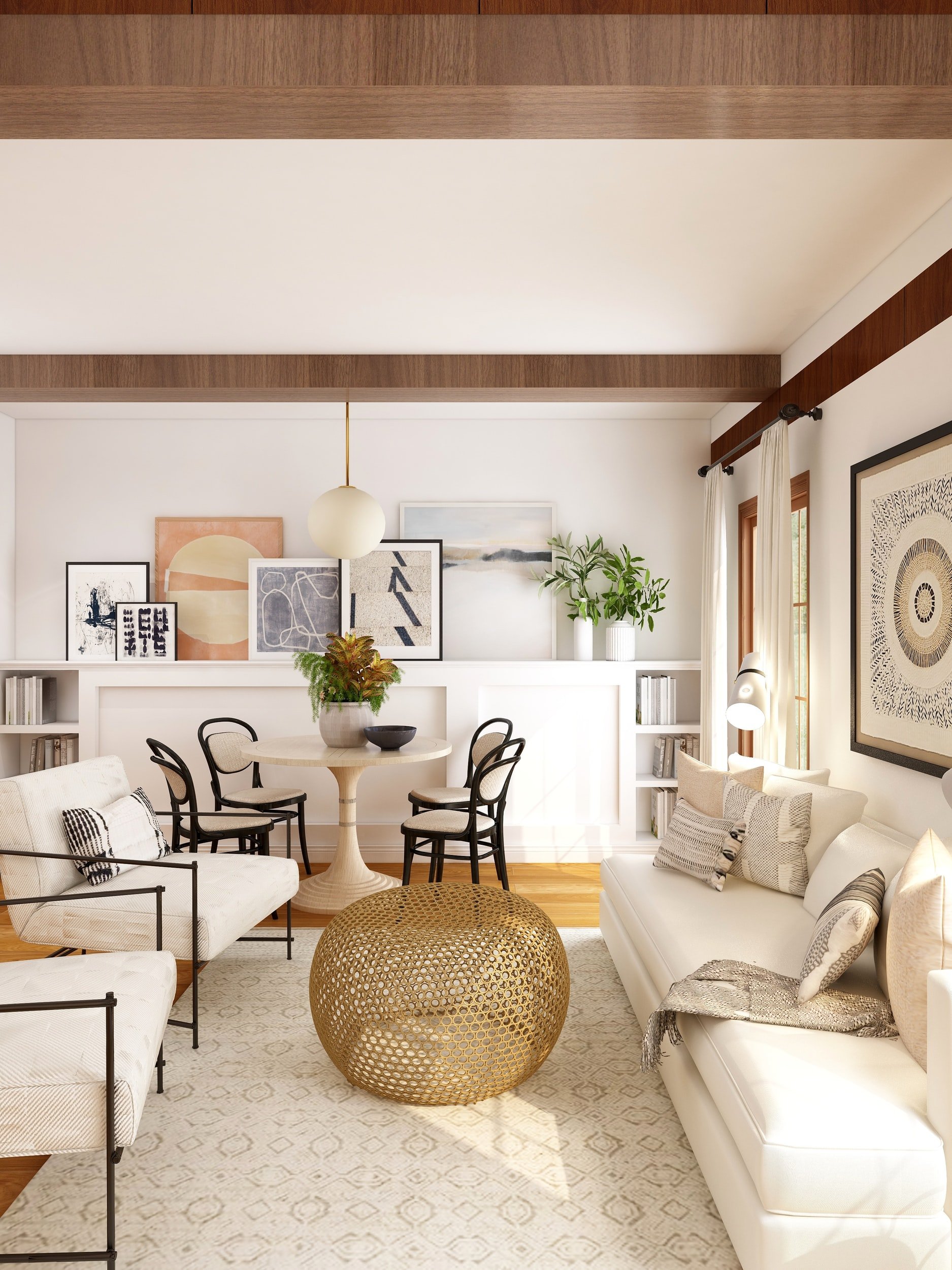
Scandinavian design has long been revered for its simplicity, functionality, and beauty. Originating in the Nordic countries of Denmark, Norway, Sweden, Finland, and Iceland, this design aesthetic emerged in the early 20th century and has since become a global phenomenon. Characterized by clean lines, minimalist forms, and a focus on natural materials, Scandinavian design is renowned for its timeless appeal and effortless blend of form and function!

One of the key principles of Scandinavian design is the emphasis on functionality. Furniture and home accessories are designed to be practical, with an emphasis on usability and comfort. This focus on functionality is evident in the design of iconic pieces such as the Egg Chair by Arne Jacobsen and the Paimio Chair by Alvar Aalto, both of which are celebrated for their innovative design and ergonomic features.

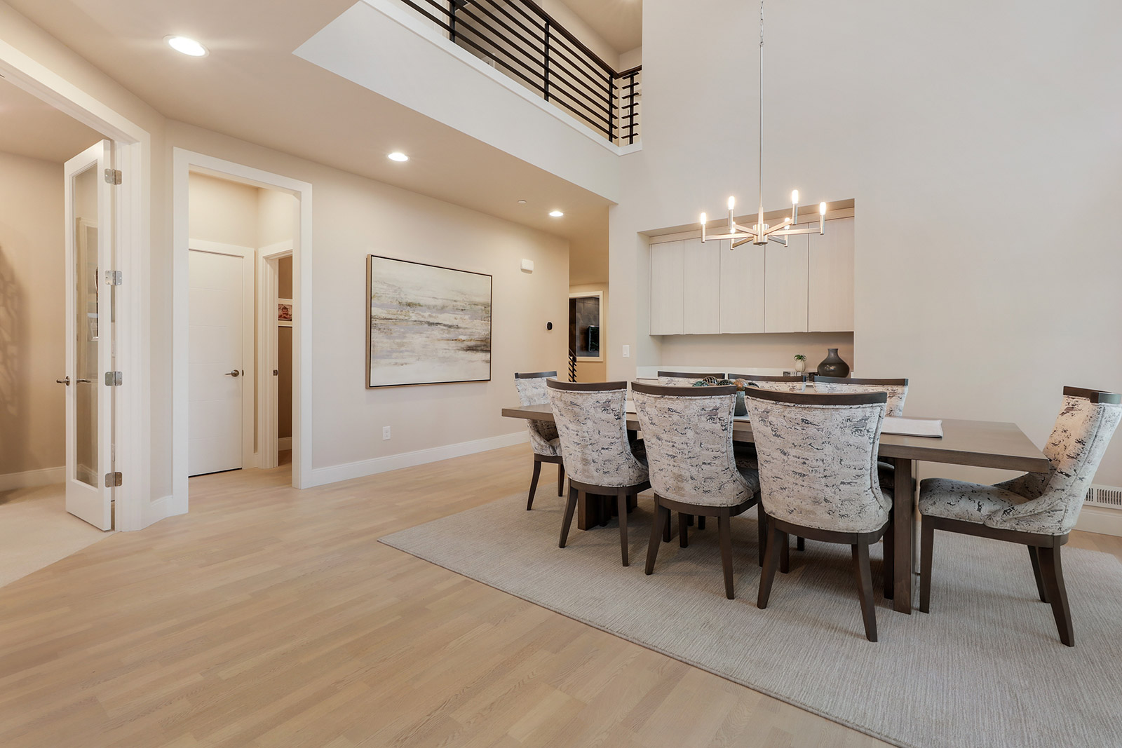
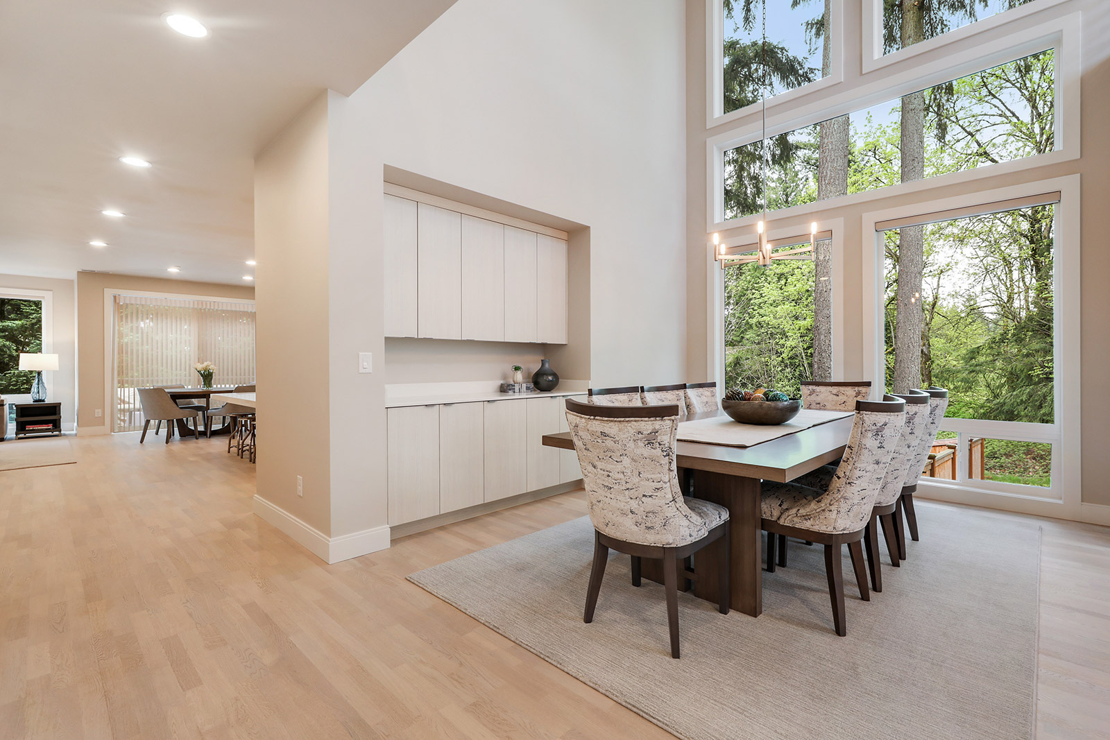
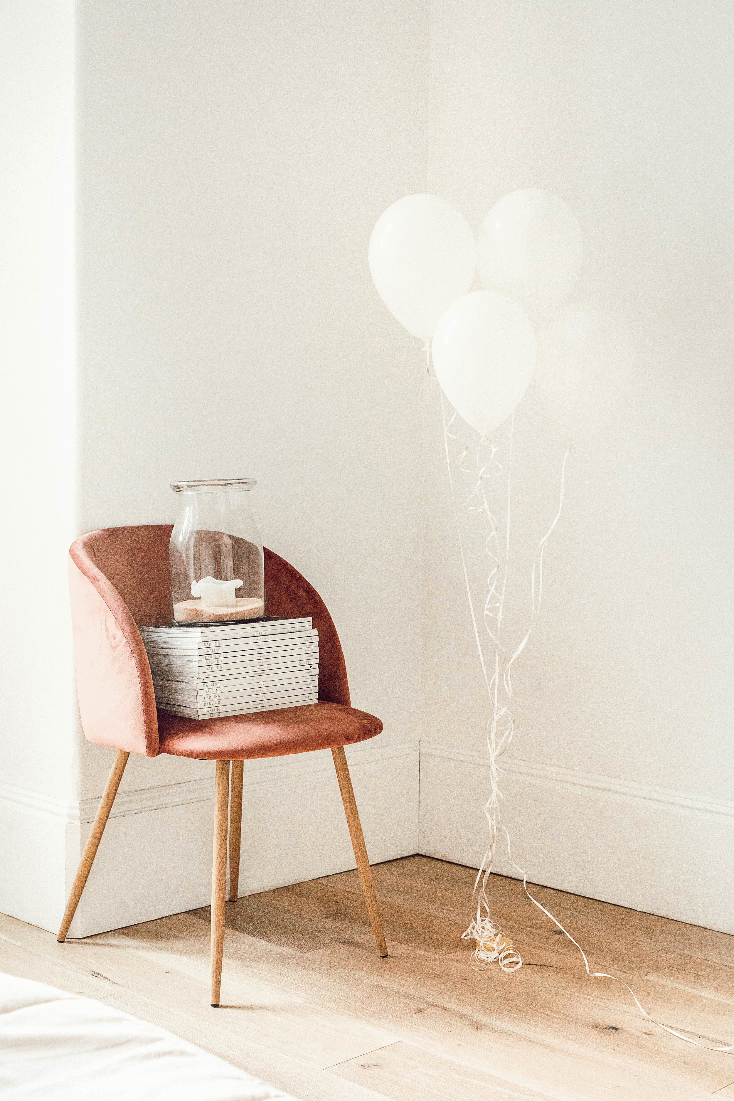
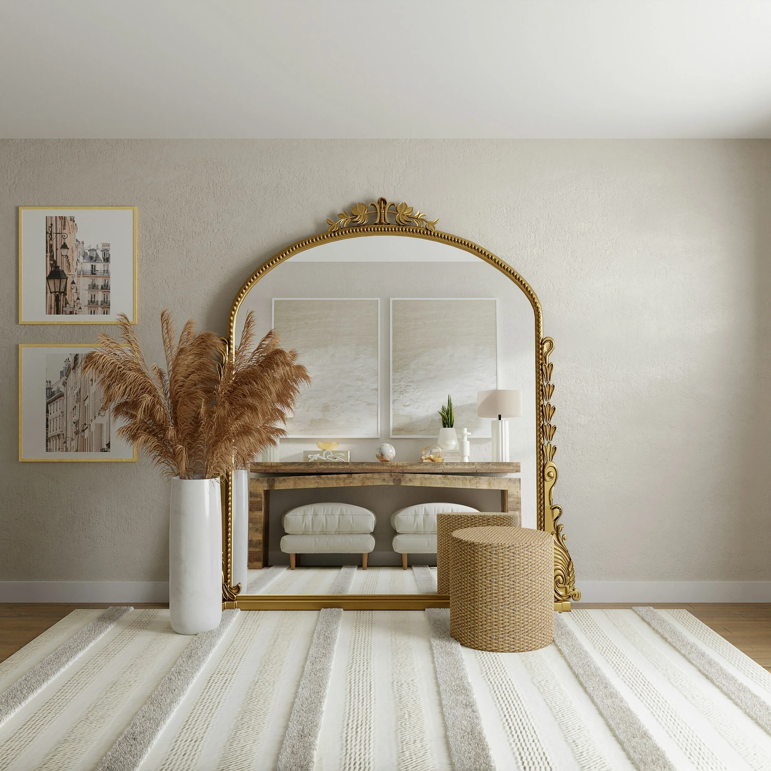
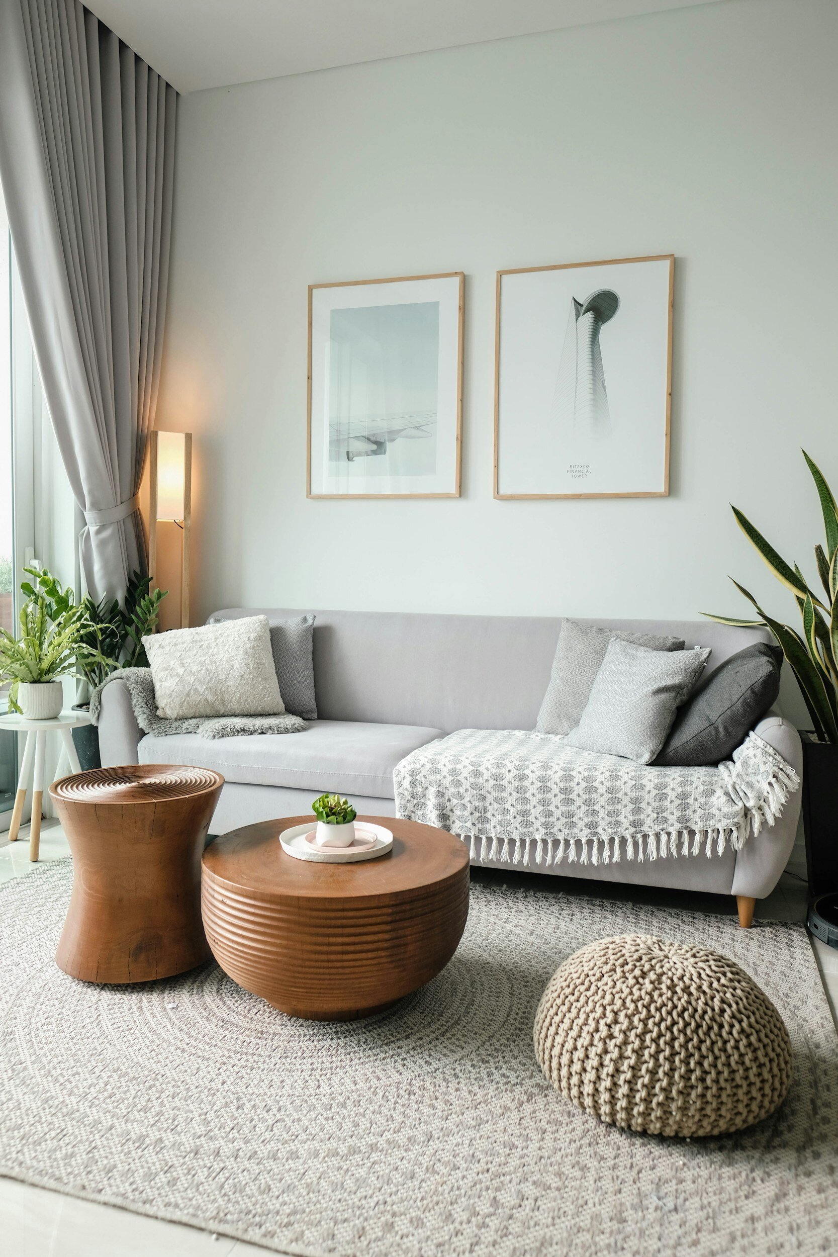
Another hallmark of Scandinavian design is its use of natural materials. Wood, in particular, is a popular choice, with light woods such as beech, birch, and pine being favored for their warmth and durability. These natural materials are often combined with soft, muted colors such as whites, grays, and earth tones, creating a calming and harmonious aesthetic.

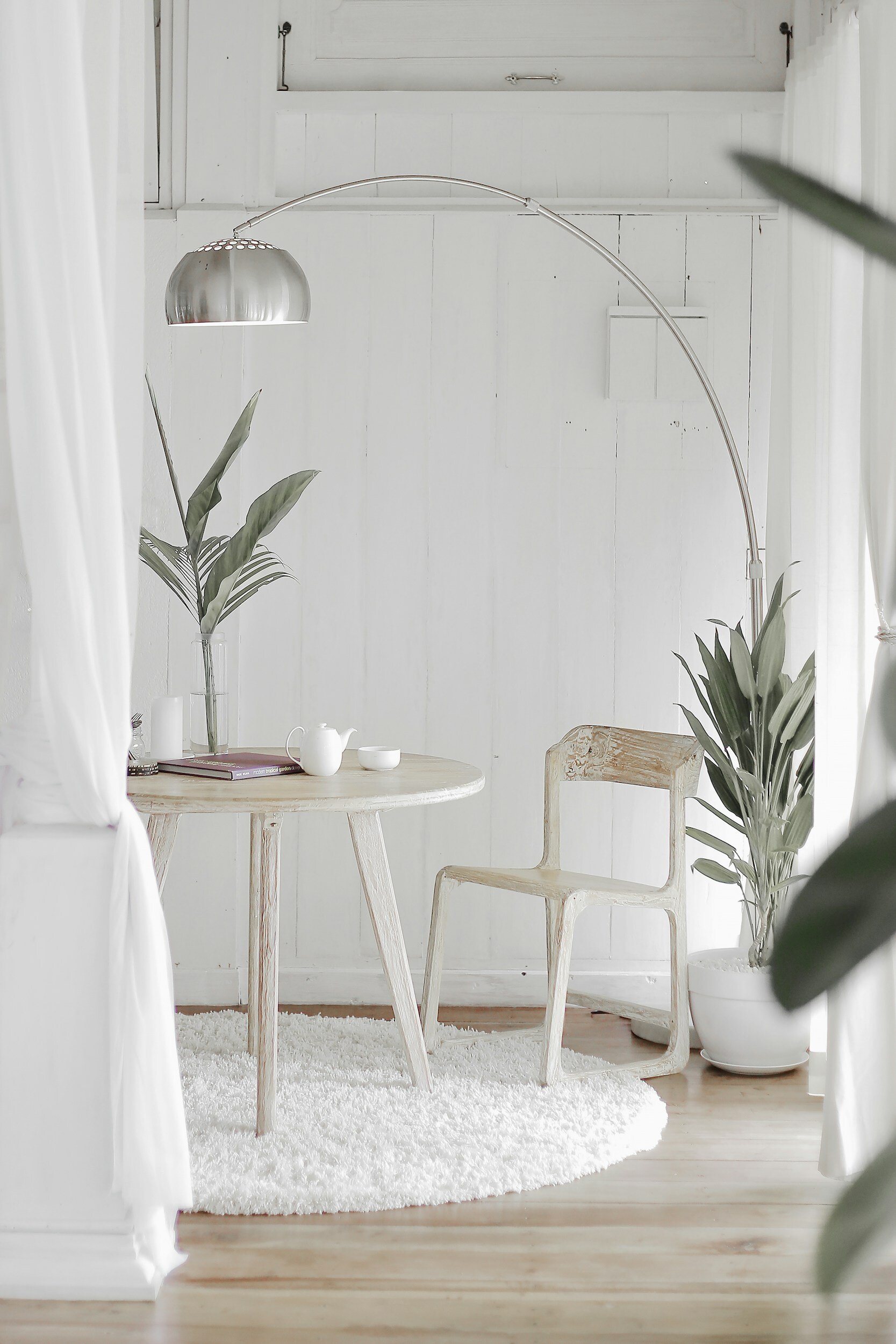
In addition to its focus on functionality and natural materials, Scandinavian design is also known for its emphasis on light. Large windows, skylights, and light-colored walls are common features of Scandinavian homes, allowing natural light to flood the space and create a bright and airy atmosphere. This use of light not only enhances the visual appeal of the space but also has a positive impact on mood and well-being.

Overall, Scandinavian design is a testament to the beauty of simplicity and the power of thoughtful design. With its emphasis on functionality, natural materials, and light, this design aesthetic continues to inspire designers and homeowners around the world, proving that good design is truly timeless.

Beautiful Summer Decor

There are many ways in which you can bring the sunny brightness of summer into your interior. We are now seeing white as a common color theme in design, and the reason for this is because white is as clean a palette as it gets and it can make your space feel larger!

Here are Ways in Which You Can Bring Summer into Your Space

1. Color. One of the easiest ways in which to make your home feel light and airy is through the use of color. As mentioned, white has made a comeback in the Interior Design world, but punches of teal and burnt orange are a beautiful way to give off a summertime vibe within your space.

2. Natural Textures. Wicker and tweed are reminiscent of tropical places, so by implementing them into your interior, you are bringing an organic, fresh touch into your space, giving a beachy feel.

3. Artwork. Beautiful colorful artwork is a gorgeous way in which to make your interior pop with a summertime feel. Gorgeous organic prints and patterns will give your space that extra fresh look.

4. Foliage. It's the time of year when beautiful fresh flowers are plentiful right in our yards! Pull out those clippers and bring a little bit of that freshness in! The brighter the color, the more summery your space will feel! 


4 Beautiful Foyers

Your foyer is the first room in your home that makes an impression to guests that visit. It's the best way to express your style, sophistication, and welcome your guests into your space. Many people forget to put thought into their foyer design, but studies have shown that a good first impression sets the tone for your guests right off the bat. On that note, here are some gorgeous foyer designs to get inspired by!

All White Interiors: Clean & Timeless

11100934144_096e64915b_z.jpg

Well, it's been a long winter-- but we are on the cusp of Spring, I just feel it! It's that time of year when you want to freshen up your space- making it brighter, airier, and uncluttered. Which is why I thought it would be fun to share some gorgeous white interiors to inspire you!

living-room-2605530_960_720.jpg

This beautiful neutral color palette features white in a classic, timeless manner. In the 90's, we were so afraid of white walls, but rest assured-- you can have a gorgeous space with a mostly white color palette that is as sophisticated as it gets!

Implementing metallics and fresh plants is an easy way to pull together a white color palette. There is something so fresh and inviting when designing with this scheme. Another beautiful perk of a neutral color palette, is that is emphasizes the beautiful details of your home's architecture.

stay-2132344_960_720.jpg


All white color palettes work in both traditional design as well as modern, contemporary design. There is something so clean about a white palette- a look that has never and will never go out of style!

If you have a smaller space, a white color palette will make your space look larger. White reflects light, which gives your space an open, bright, airy feel. 


Cozy Up! How to Warm Up Your Interior for Winter

candle-2400240_960_720.jpg
winter-1971088_960_720.jpg

It's that time of year- when nesting begins; you start lighting candles and fires and curling up in plush blankets. It's the time of year when we want to snuggle up with a good book and celebrate being away from the elements. 

Here are some ways in which you can make your space more cozy during the colder months. 

1. Candles and sparkle lighting. I always love to put white holiday lights on topiaries and drape them in otherwise darker places in my home. This gives your space a glow and sense of coziness.

2. Blankets and Soft Fabrics. Drape your furnishings with plush throws and pillows. This creates both a visual warmth as well as an acoustic one within your space. It's always nice to have something to curl up with when relaxing.

3. 

Contemporary Living Room

My client’s custom built a stunning contemporary home on the beautiful coast of the Puget Sound in West Seattle after living in the area for over the past two decades.  They both always wanted to live on the water and finally moved into their two building compound after a two a half year construction. The architect designed the home to take advantage of the water views and the home has over forty windows so to experience every aspect of each day.

Living Room View After.jpg

They love to entertain so the main floor has a large kitchen and living room area with access out to a water front balcony.  I wanted to keep the coloring of all the furnishings in the spaces neutral yet with some interest and to not detract from the beautiful scenery.  My clients travel a great deal and their artwork and sculptures also were part of the overall design of the spaces.  The custom bar stools by Trica and dining table and chairs by Old Biscayne Designs provide enough sitting for all of their gatherings. 

The main focal point of the living room is the black slate fireplace which is directly opposite the dining and kitchen areas.  The custom Vanguard sofa with a tweed Pindler fabric has a sweeping view of the Puget Sound while the two Charleston Forge sitting chairs are centered off the fireplace.  A custom day bed was design for both sitting and lounging while viewing all of the daily sea life.  All of the wool custom area rugs are by Antrim.

Living Room Stairs After.jpg

The entry of the home is dramatic with the steel staircase and wood slat walls that were designed on all three levels of the house.

Entry After.jpg

BEFORE

Living Room Before

Living Room Before

Kitchen Before

Kitchen Before

Entry Before

Entry Before

Dining in Elegance- A Before & After

This home was completed in spring of 2018 and my client’s family decided it was their dream home so to create long term memories and it was in the perfect location since their 10 year old son didn’t have to change schools nor friends and they all love the clean modern aesthetic.  The couple has stressful careers and wanted a sanctuary to retreat to after a long day. They love to entertain and the eight and a half foot long custom Old Biscayne dining table can sit several friends and family comfortably. The Pindler modern chenille upholstery fabric is the star of the room and the wood Antrim custom area rug sets off the entire table and chairs!

The Best Interior Design Trends for Spring & Summer 2018

We are always seeing the trends change in the design world, but for this season, we are definitely seeing some timeless, fun, elegant designs worth considering:

Pastels! It seems ironic, but we are seeing bold, saturated pastels make their debut all over the map in both the design and fashion worlds. Bright pops of pastel pinks and blues truly make a statement in your interior- bringing fun and lightness to the space.

home-wall-color-living-room-room-interior-design-137766-pxhere.com.jpg

Foliage! At one point, houseplants were seen as a dated way to decorate. But they're back! Different from your typical spider plant, you are seeing unique and distinct uses of foliage in interiors that surely make a room pop.

table-grass-plant-wood-flower-still-life-1410569-pxhere.com.jpg

Turquoise! Turquoise is one of those colors that ebbs and flows- one day it's all the rage; the next, it's seen as antiquated. But, there are ways in which you can implement this beautiful hue into your space that are both timeless and classic.

table-vintage-chair-interior-wall-green-631273-pxhere.com.jpg

Gold! Remember in the early 2000's when we were all trying to replace our brass knobs and hardware with brushed nickel? Well, gold is back in at full speed. But not the shiny brass we saw everywhere in the 90s- a more rustic look is what is trending. 

landscape-architecture-street-mansion-house-window-1051948-pxhere.com.jpg

Metallic Floors! Such a statement! We are seeing designers all over the world painting concrete floors with metallic paints. We are seeing small flecks of silver and gold in carpet patterns. We are seeing metallics all over the flooring industry and they surely make a statement!

Get Your Home Ready for Spring!

We have all been hold our breath waiting for the sunshine to come back, the birds to start singing cheery songs, and blossoms- yes, blossoms galore! But then the sun starts shining, and the seasons start changing, we start to notice that our homes may feel somewhat in need of extra love moving into the new months.

Here is How You Can Get Your Home Ready for Spring!

magnolia-trees-springtime-blossoms-spring-38910.jpeg

Bring the Outdoors In! By placing fresh, seasonal flowers throughout your space, you will come to find that your mood is uplifted, your home has an extra pop of color, and things just feel overall a bit more polished in your interior. There's really no such thing as too many fresh flowers! 

pexels-photo-413707.jpeg

Update Your Linens and Bedding.  There is nothing more refreshing than clean white towels, beautiful fresh sheets and bright, airy linens. You will find that putting your winter bedding away and replacing with fabrics reminiscent of Spring, you will be in the spirit!

pexels-photo-12679.jpeg

Set Up Your Outdoor Space. Now that you can enjoy the outdoors and take in the sunshine and fresh air, make your outdoor seating area the best it can be. We love to update old upholstery on outdoor furniture, implement bright colorful pillows, and add fresh potted plants. Viola- an outdoor oasis worthy of your favorite book.

pexels-photo-271815.jpeg

Clean those Closets! It is so easy to acquire extra clutter and unneeded items over the winter months as we are burrowed away from the harsh elements. Put those unused sweaters neatly away and get organized and ready to flaunt your bright, light, clean clothes.

pexels-photo-250288.jpeg

Ultra Violet: 2018 Pantone Color of the Year

Rich and pensive, Ultra Violet is reminiscent of existential energy, the mystery of what the future holds, and the new discoveries of the past and present. It reminds us of the night sky, dark but endless, full of mystery.

sunrise-phu-quoc-island-ocean.jpg

Why Pantone Chose this Color

With everything happening in our world at the present moment, Pantone color researchers thought it necessary to remind ourselves of our sheer presence on earth and the vast endlessness of our atmosphere. Ultra Violet is cosmic, rich, and timeless.

Our Favorite Ultra Voilet Uses in Interior Design

4454099117_7949e31f77_b.jpg

1. Using rich purples make a bold statement as an accent. This gorgeous bedding truly brings forth a timeless, rich look to this elegant bedroom. Rich purples tend to pop when placed in an otherwise neutral color scheme. 

29300383874_2b283ed8c5_k.jpg

2. Even the tiniest purple accents in a space can make a very bold statement. This otherwise very white bathroom stands out with just the pop of color of its hand towel. 

3. Ultra Voilet in Commercial Design. There's no doubt the guests who visit this elegant restaurant will never forget the gorgeous, sophisticated upholstery on the dining chairs. What a statement!

cafe_purple_retro_indoor_restaurant_design-483945 (1).jpg

Ultra Violet in Fashion

guy-2590809_960_720.jpg

Reminiscent of the Victorian Era followed by the 1920's rich purples always manage to make a fashion comeback. We are seeing this beautiful hue in every aspect of the runway, from hair color to couture. The beauty of this otherwise considered feminine color is that it truly works for both genders and truly makes a haute statement!

manuplation_flowers_beautiful_girl-1201506 (1).jpg

Fall Decor Trends 2017

Well, it's officially Fall! We are seeing that some trends that were making their debut last year are now going out of style, and new ones coming in. There are many design trends that we will see this year, starting in the fall and here they are.

1. Dark Paint.  There is nothing richer or more classic than a saturated, darker color palette, specifically when applied to a wall color or furnishings. We are also seeing beautiful dark cabinetry, window treatments and decor that really make a statement!

2. Woven Textures. Wicker, wool, and other woven textures will give your space a warm, welcoming and organic appeal. Baskets and woven decor bring the outdoors in and create a rustic, traditional look.

3. Velvet. Velvet is a classic as it gets. The easiest way to incorporate this plush upholstery into your interior is through furnishings and window treatments. Velvet has been around for centuries and creates a timeless, sophisticated look.

4. Blush Color.  Soft blush colors are being seen all over the design community and there's a reason why. Soft pinks have a calming effect and create a both feminine and elegant look for an interior space.

5. Brass. Brass is back! We are seeing it presented in more of a bronzed, brushed style as opposed to the shiny golden that was so popular in the 80's and 90's. It seems that this time around, designers have mastered how to incorporate this beautiful finish into their themes.

Brass is Back! Where We're Seeing It in the Design World

Remember when brass was considered dated, old and 80's-90's? Well, this is no longer the case. We thought we would never see this shiny metallic make its comeback, we were wrong, and it's made its comeback stronger than ever! We're seeing it applied to all surfaces, large and small in some of the most elegant ways.

Accessorizing with brass and gold colors truly makes an elegant statement against the current color palettes that are trending. While we remember seeing brass hardware against forest green and burgundy backdrops in the 90's, we are now seeing it paired in conjunction with beautiful blues, grays, and even orange hues.

It's not just shiny, polished metallics we are seeing on the forefront. Rustic metals reminiscent of earlier years. Beautiful lighting fixtures, photo frames and accessories with aged finishes make for an elegant timeless look and will never date themselves as time progresses.

Plumbing and cabinet hardware are definitely leaning towards the warmer metallic tones and we can see why. This gorgeous bathroom fixture truly makes a statement that is classic, sophisticated, and elegant.