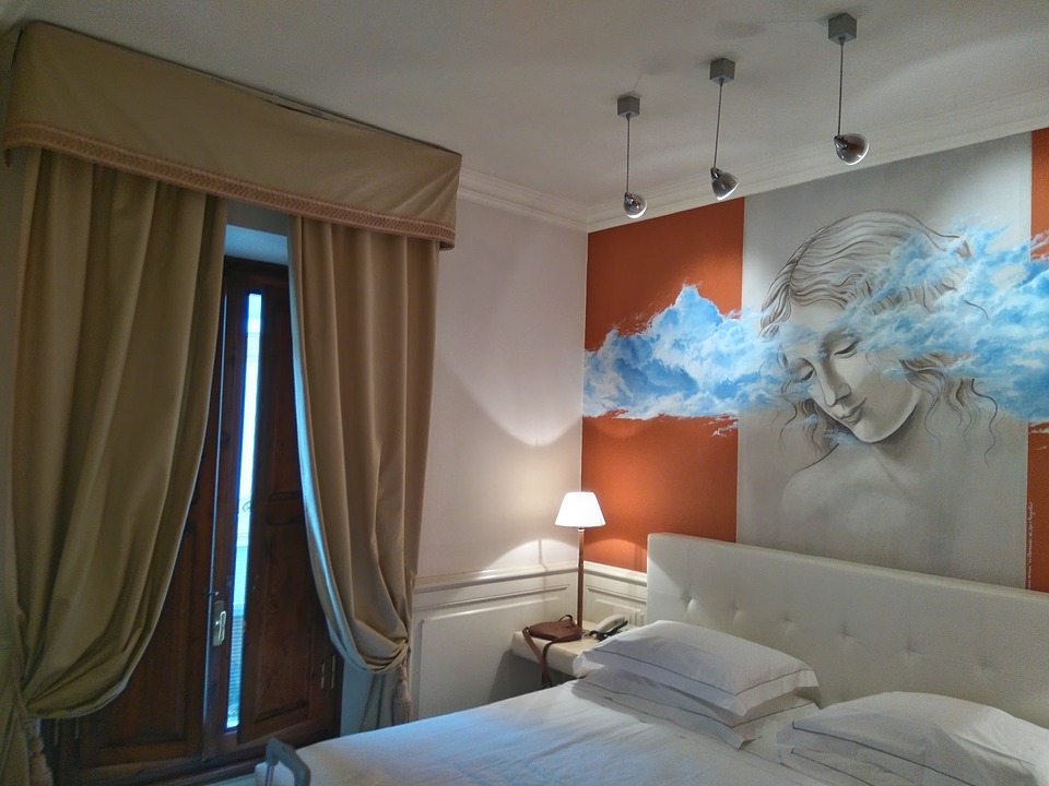
Another question to ask is “Who in the relationship is more afraid of color”? “Who in the relationship is afraid of change”? “Are you both ready for a transformation of your homes aesthetics and yourselves”? These answers will help uncover some blocks to creating your home of your dreams, your own Authentic Home.
5 Easy Steps To Selecting The Right Paint Colors For Your Home
After a decade of creating custom paint color palettes for clients, my answer to this question is yes! Selecting the right paint color for your home is often an overwhelming experience and then add in a couples differences of how they want a particular room or an entire home to look and feel. Finding the balance between the masculine and feminine when it comes to paint colors is often a give and take process just like any relationship. I have experienced all types of people living in a variety of homes and have witnessed a range of frustration and anxiety that often comes with selecting the right paint colors.
From the novice or “DYI” homeowner to the busy mom who is passionate about home decor, everyone wants to find a paint color they love and that works in their space. Yet there are so many paint color choices available that it is overwhelming and a frustrating process.
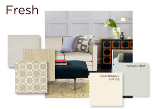
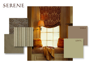
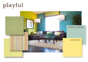
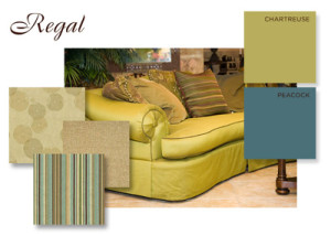
My goal is to help people overcome the obstacles that often times takes over when selecting paint colors. I’ve created the Authentic Home COLOR Paint tm line that is minimal paint color palette consisting of 75 colors. I’ve arranged my colors into 5 “mood” palettes for easy selection and arranging. Since color evokes moods and feelings I thought it makes sense to have a starting paint of the 5 mood palettes each consisting of just 15 colors per palette. Viewing 15 compatible paint colors is not as overwhelming as looking through a fan deck of 3,000 paint chips as your eye can experience each of the 15 colors since they all are of similar color tones.
1. Feel First
Determine how you want to feel in your space first. This will help you stay focused on your overall look of the space you are about to paint. Review the Authentic Home COLOR Paint “mood” palettes.
2. Review your home’s existing elements
It is important to understand your homes natural flow, or lack thereof, when trying to create a cohesive look and feel. Being aware of the architectural elements that you want emphasize or detract from is important and needs to be taken into consideration.
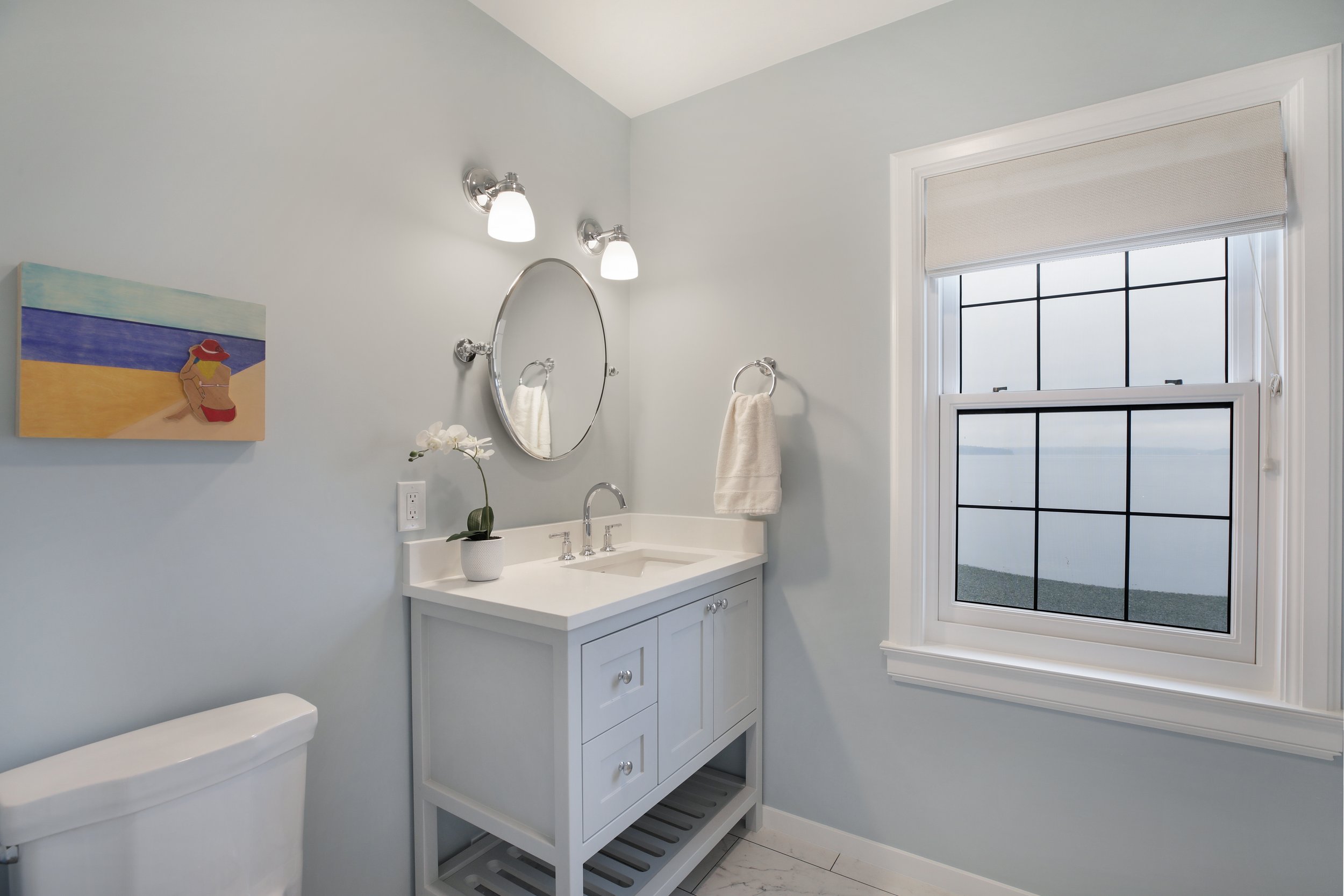
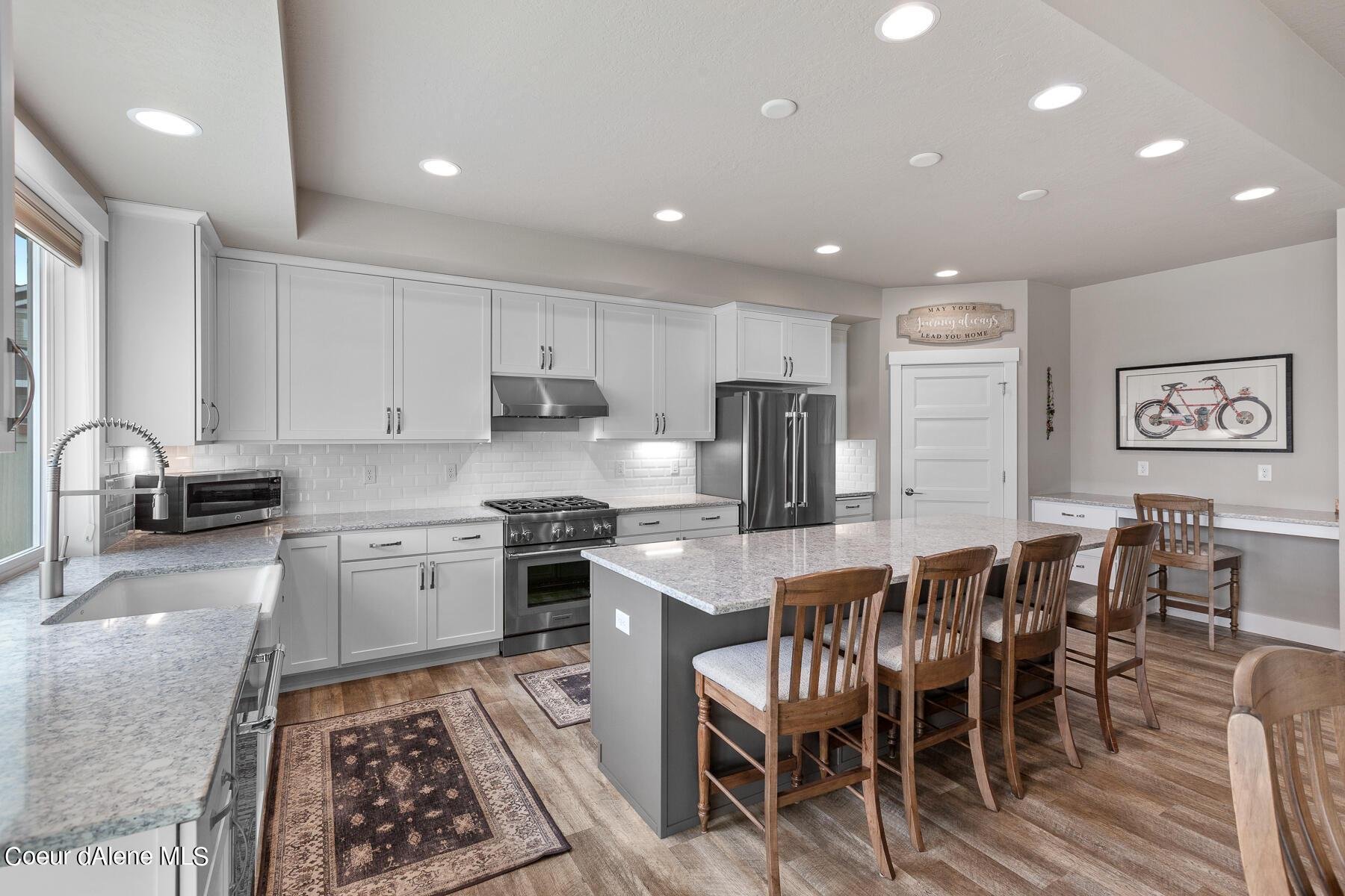
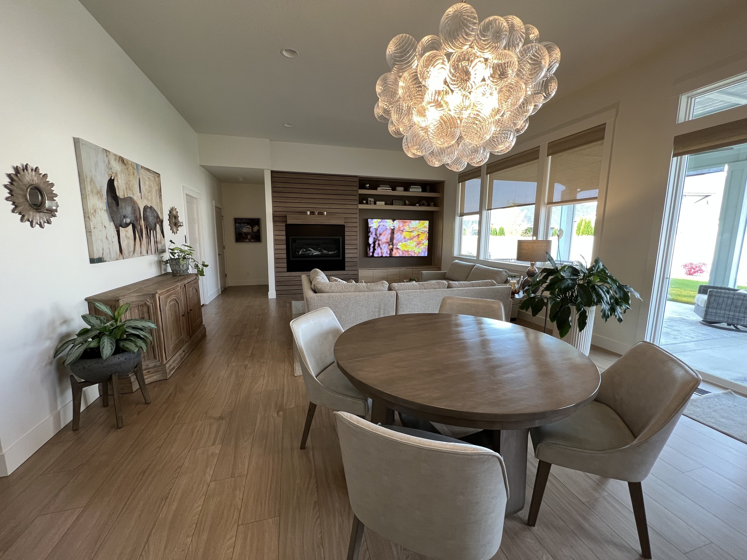
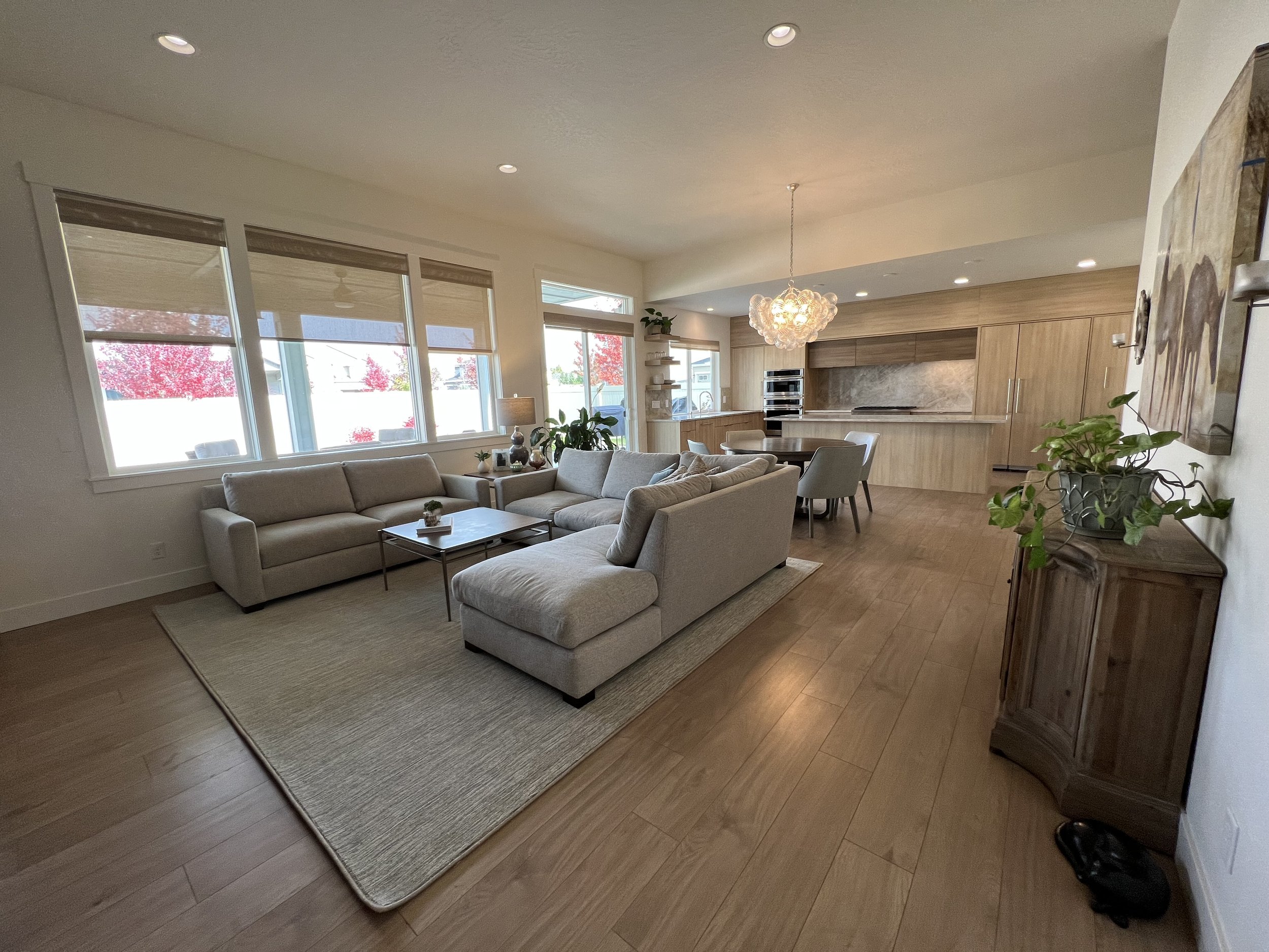
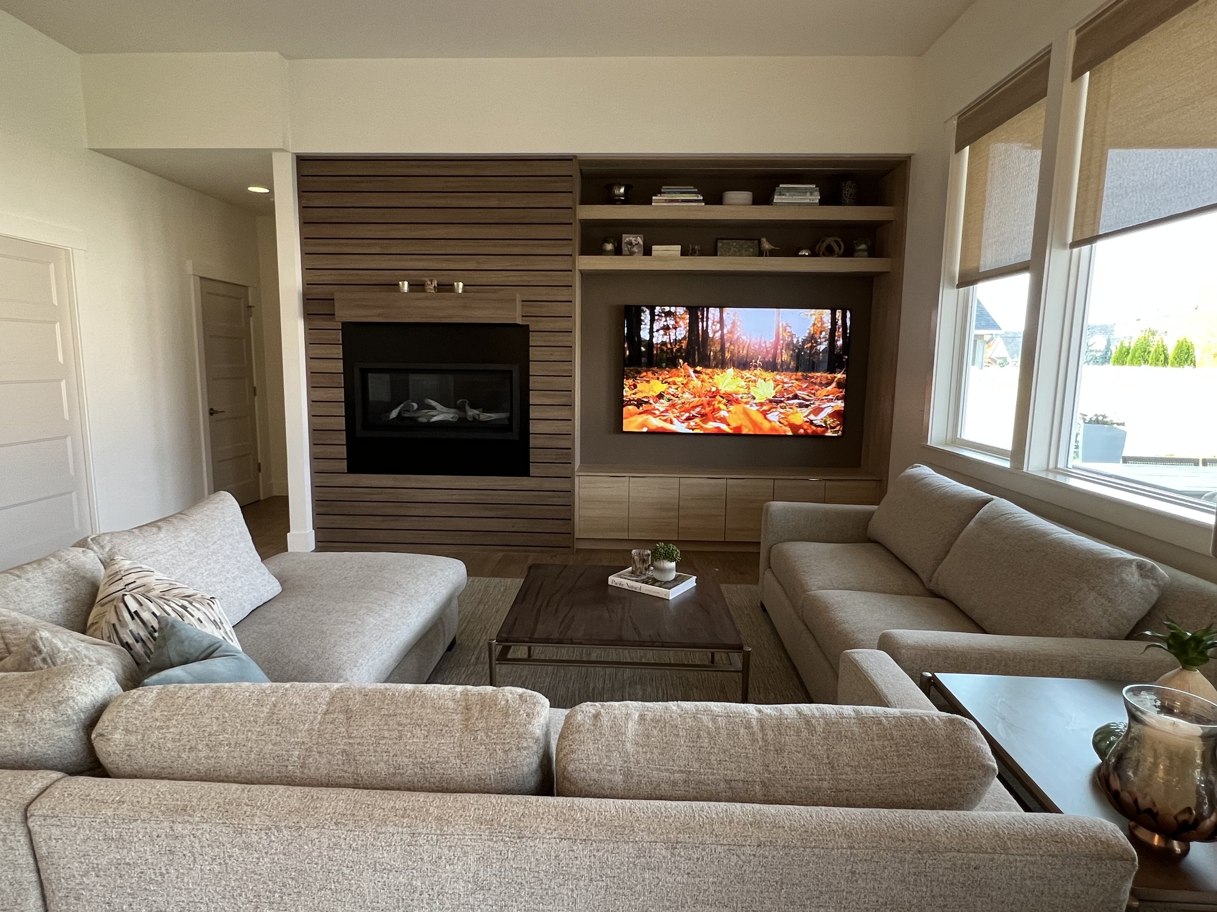
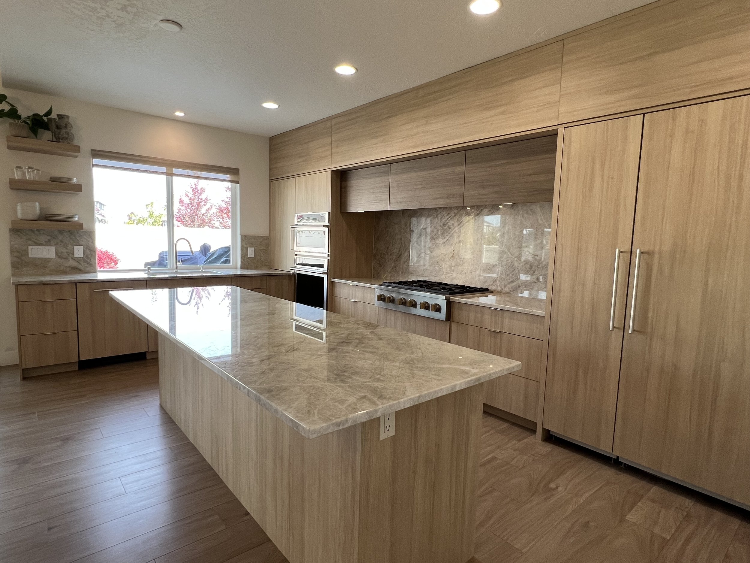
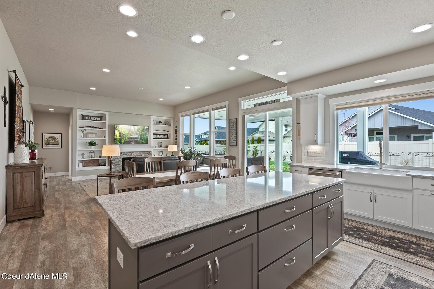
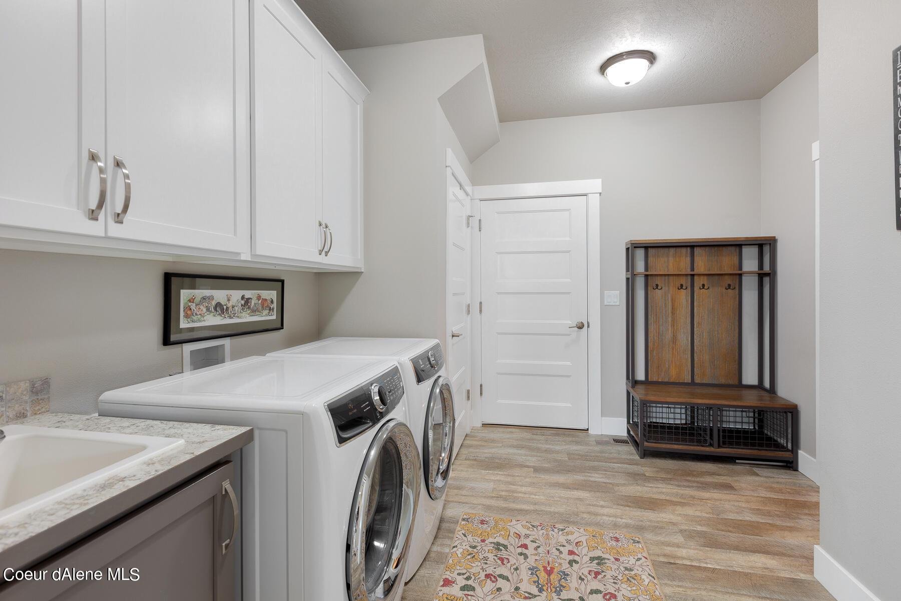
Unless you are remodeling and selecting new cabinetry, flooring and countertops, you most likely need to work with these existing elements and need to consider the undertone colors of each. Evaluate the undertone colors of each element for a guide in selecting the right paint color that will enhance all of these elements and not detract from them. A considerable part of any home remodeling budget is taken up with purchases of cabinetry, flooring and countertop materials so it is important to bring these elements to life and a cost effective way to do this is with the right paint color.
Another question to ask is “Who in the relationship is more afraid of color”? “Who in the relationship is afraid of change?” “Are you both ready for a transformation of your homes aesthetics and yourselves?” These answers will help uncover some blocks to creating your home of your dreams, your own Authentic Home.
For example if you have light colored oak cabinets in your kitchen it would not work to have a light yellow paint color on the wall. The wall color needs to emphasize the cabinet color. So in the light oak cabinet’s example imagine the paint color being a warm rust or brown color that would emphasize the oak knots in the wood grain and highlight the yellow cabinet color. And the same thing holds true for your flooring whether it is carpeting or hardwoods and for your countertops whether it is granite or Corian.
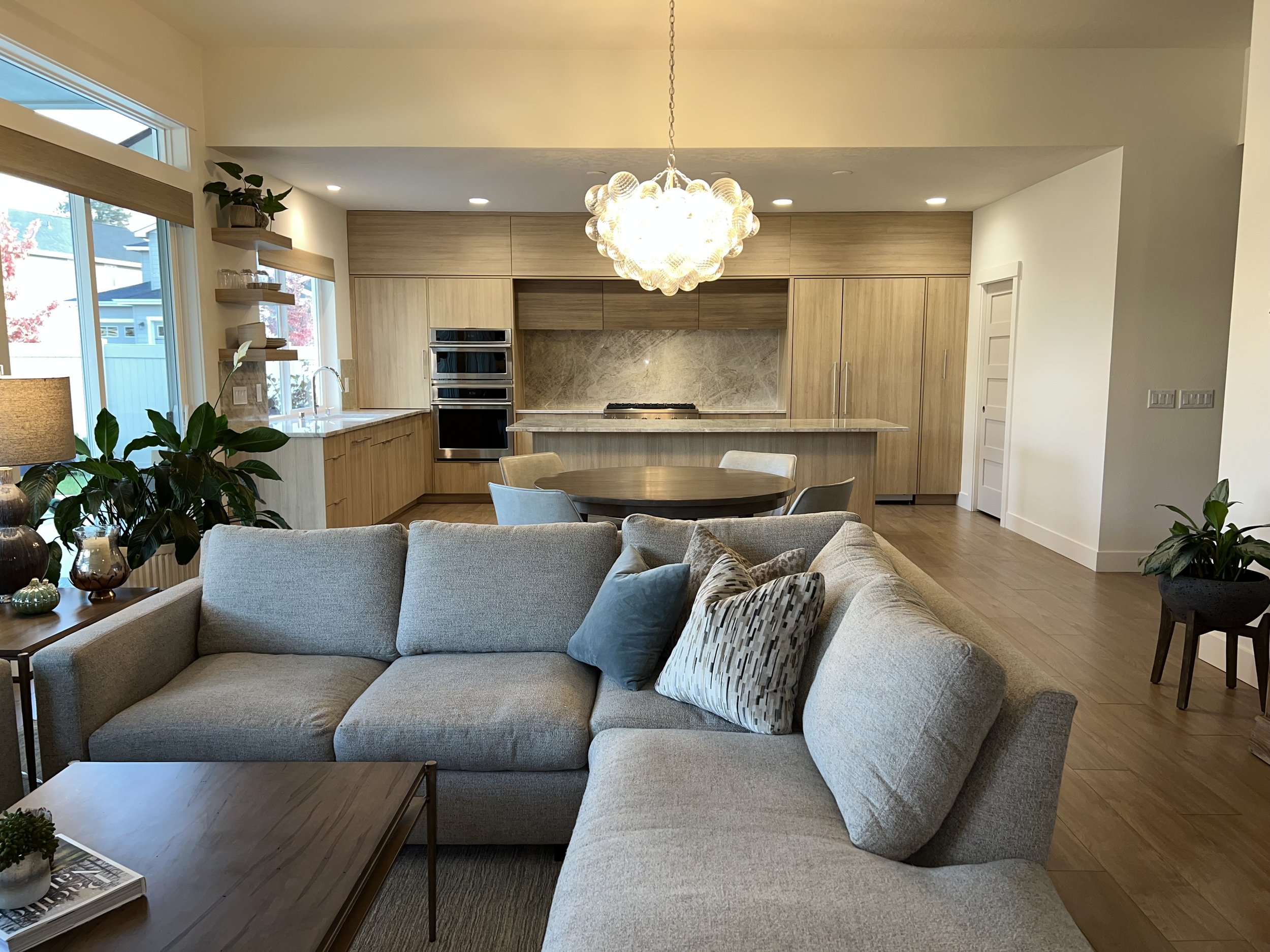
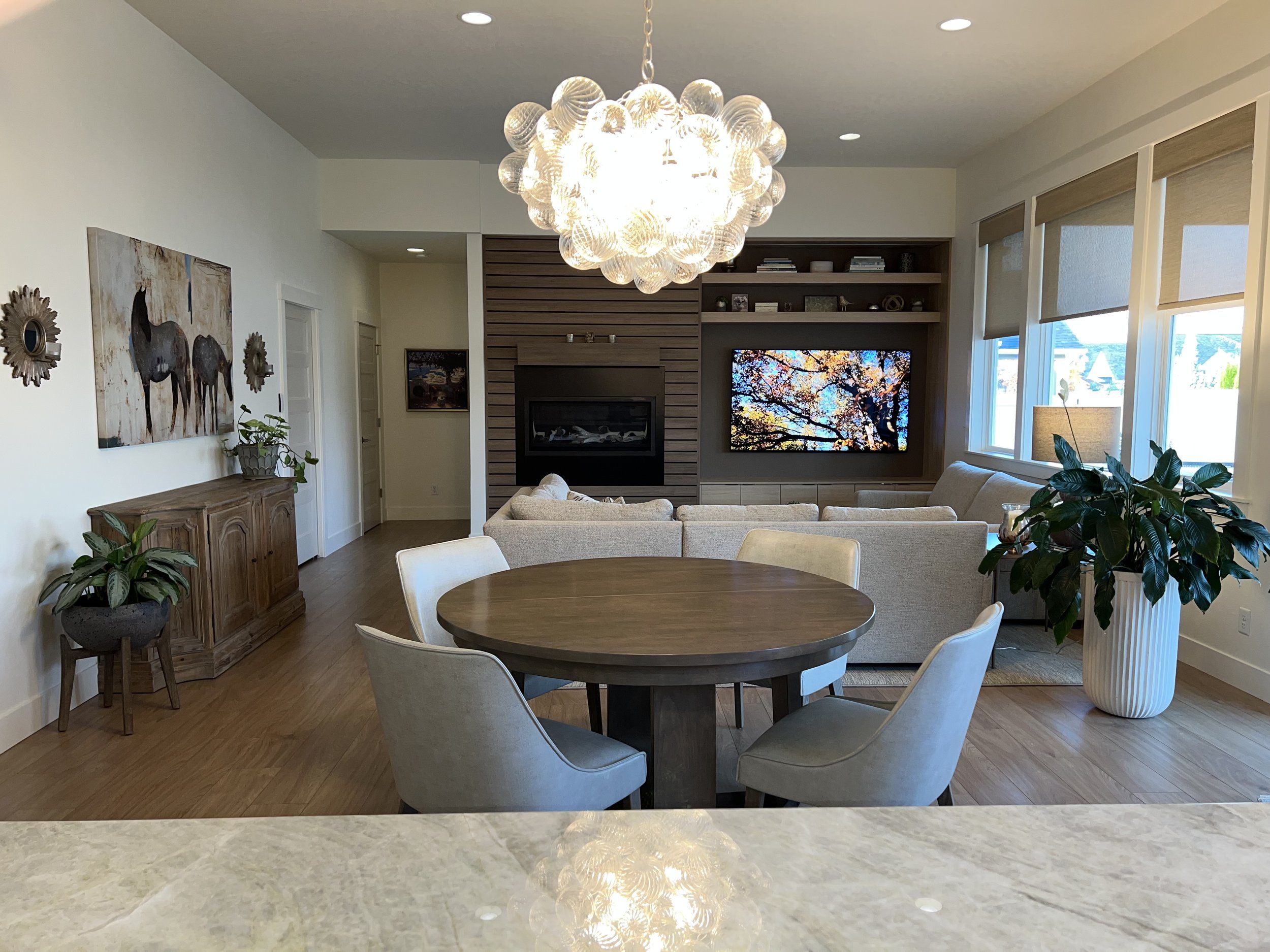
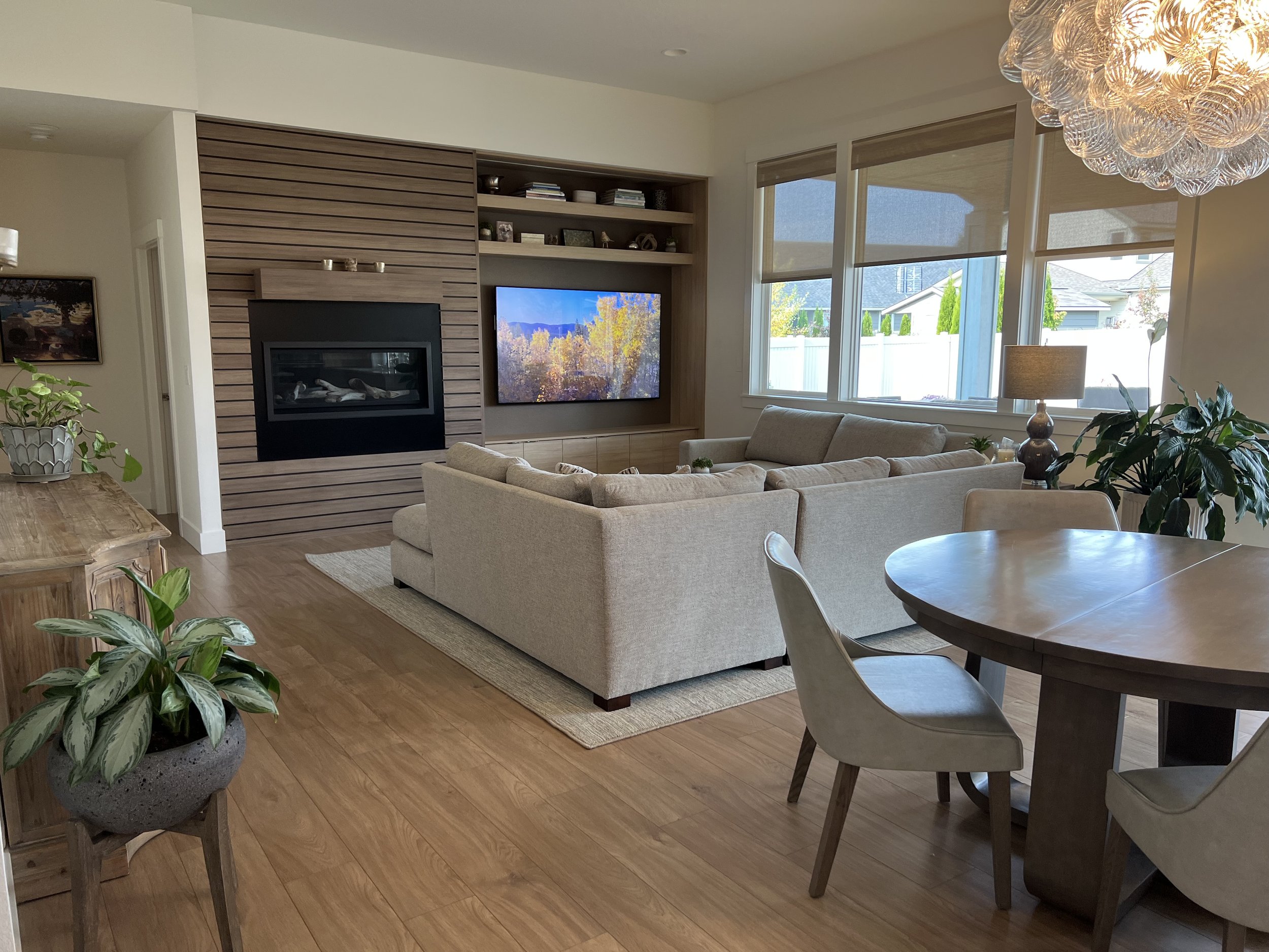
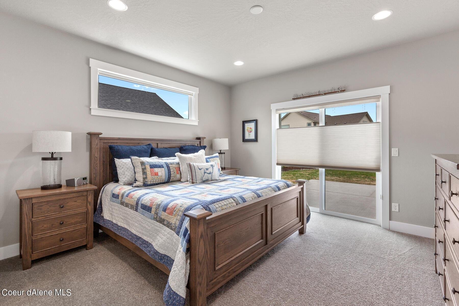
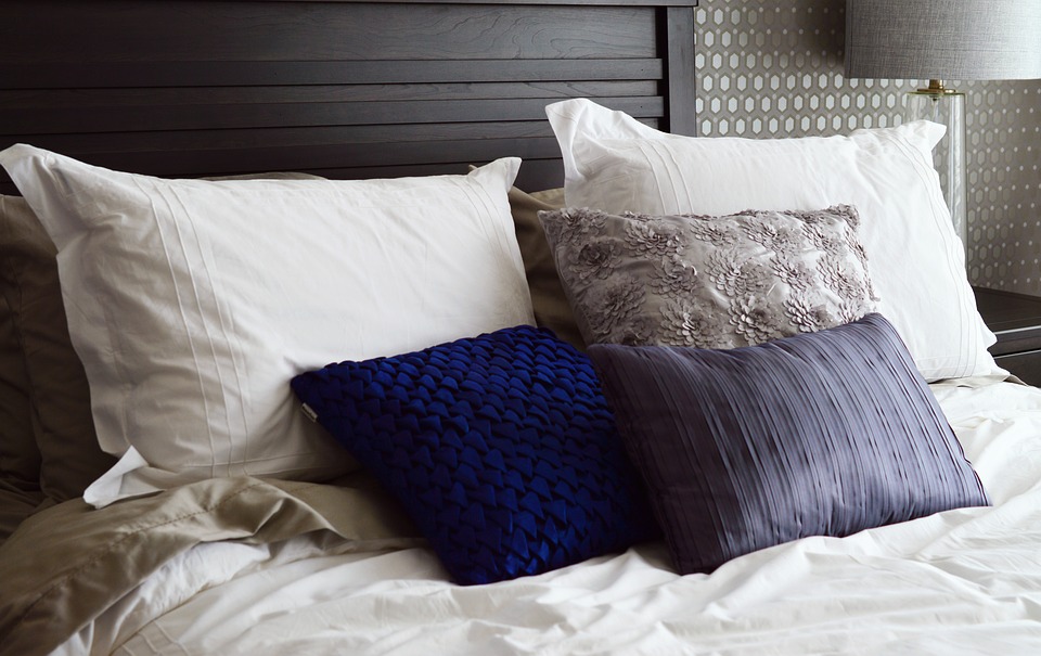
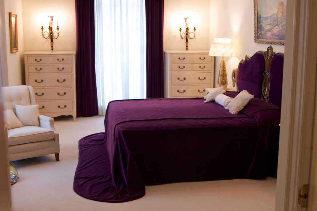
Most people cannot replace all of their furnishings when doing a remodel or painting project. So it is important to understand the colors in your furnishings fabrics as well as colors of your accessories. Is your sofa a neutral grey color that can be highlighted with a cool blue paint color on the walls? Can you pull out a Persimmon color in an antique art piece and paint the wall the Persimmon color so the entire wall is “a work of art”? Closely evaluate all of your fabrics and accessories colors that will remain in the room you are about to paint.
3. Select a foundation color
I like to use the analogy of selecting paint colors with women selecting a foundation makeup for their skin type. You need to find the right color that works with your skin type and it’s the same thing with selecting the right foundation paint color for your home.
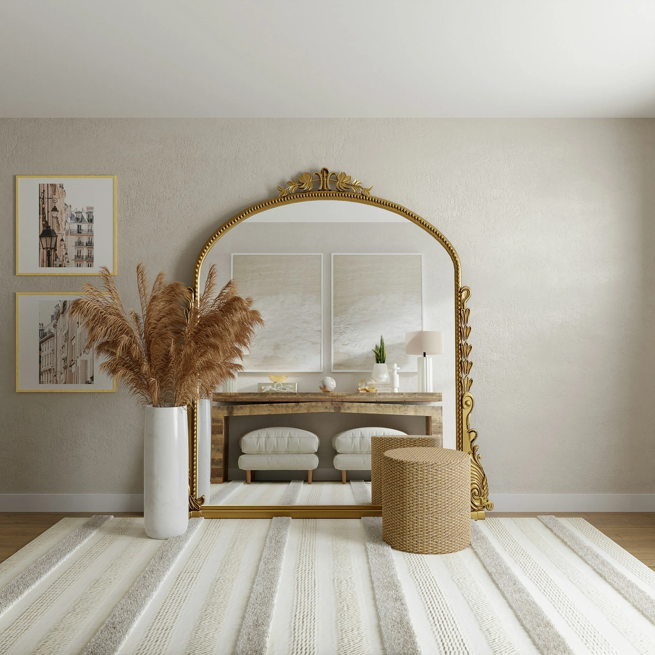
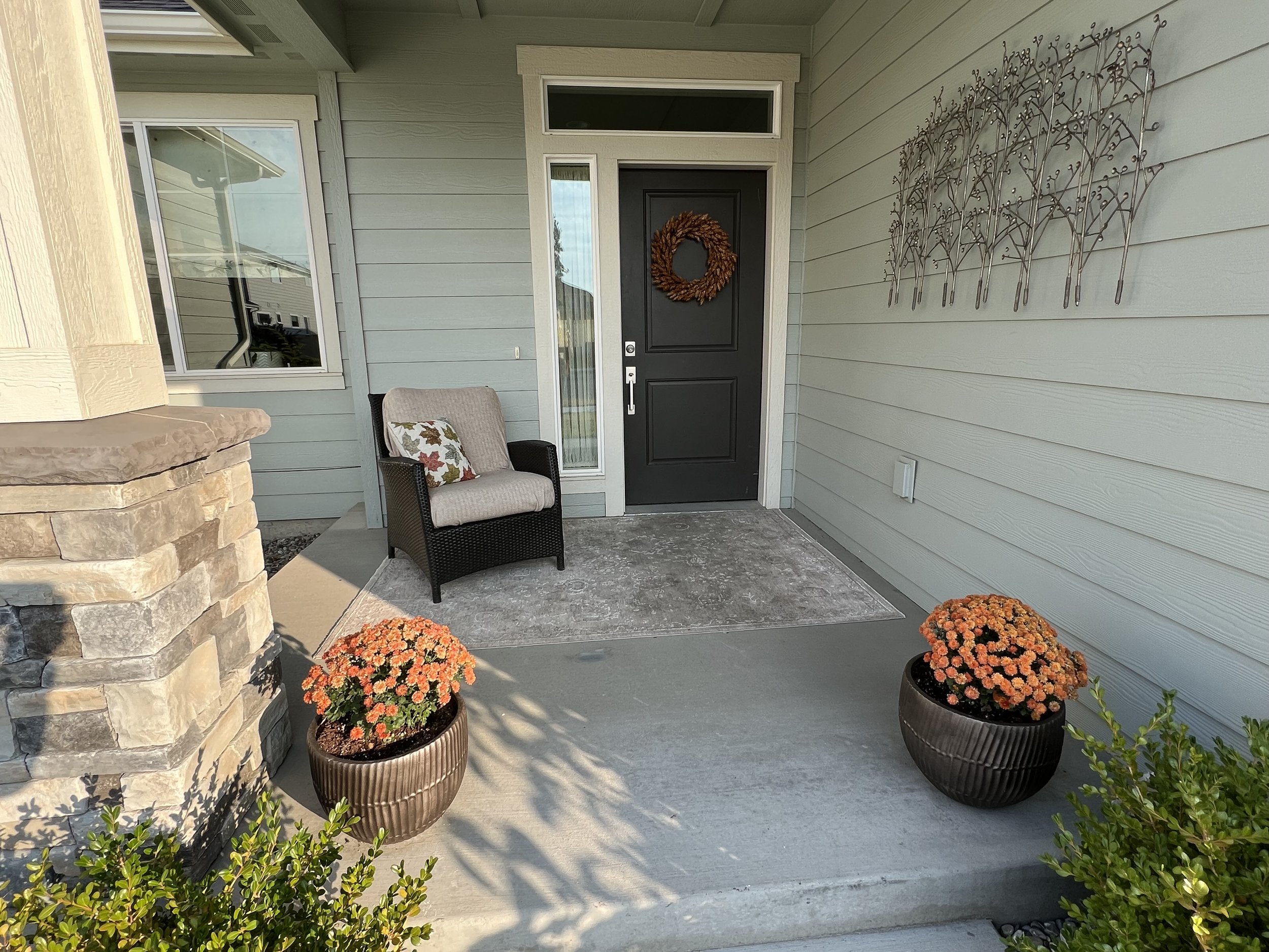
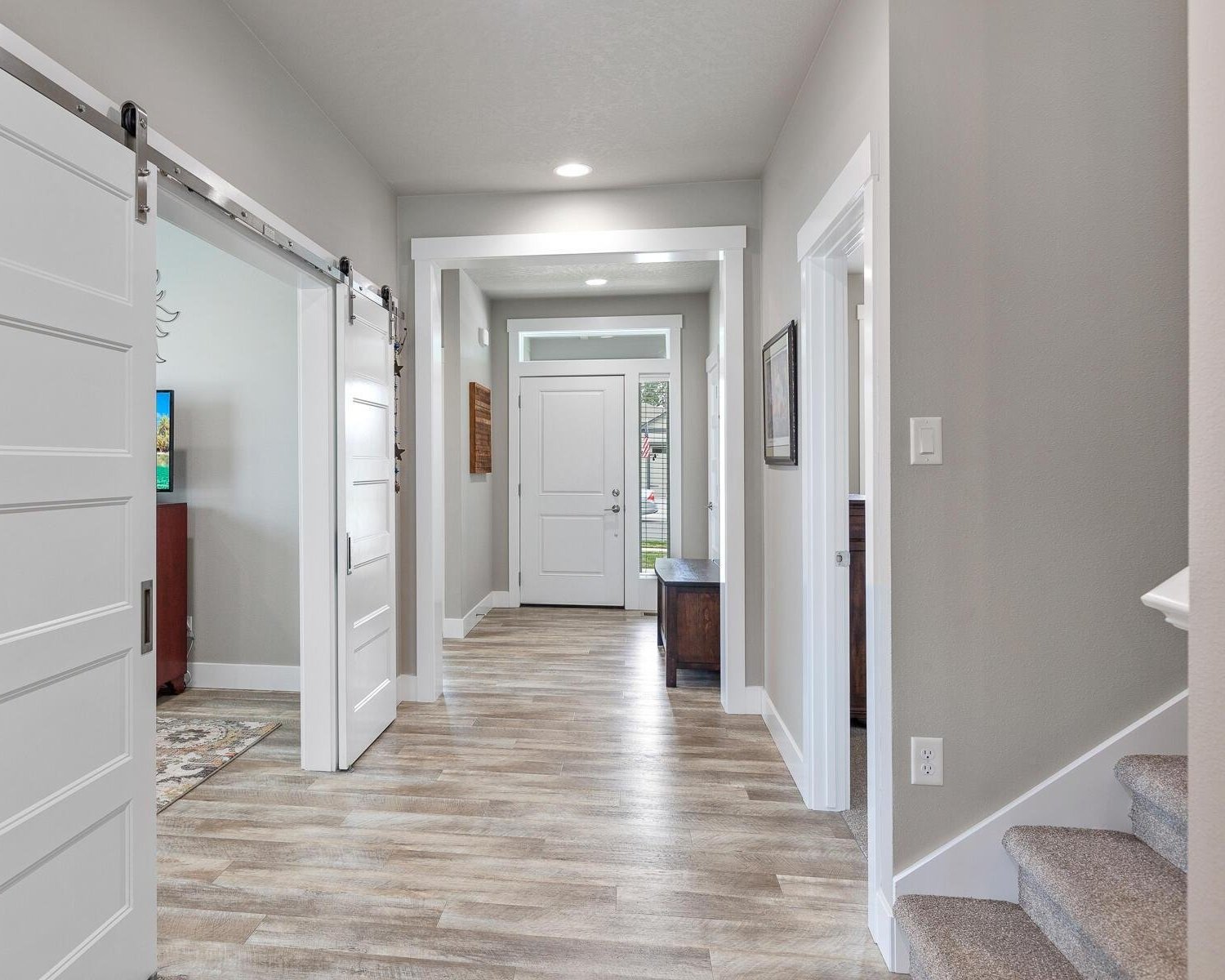
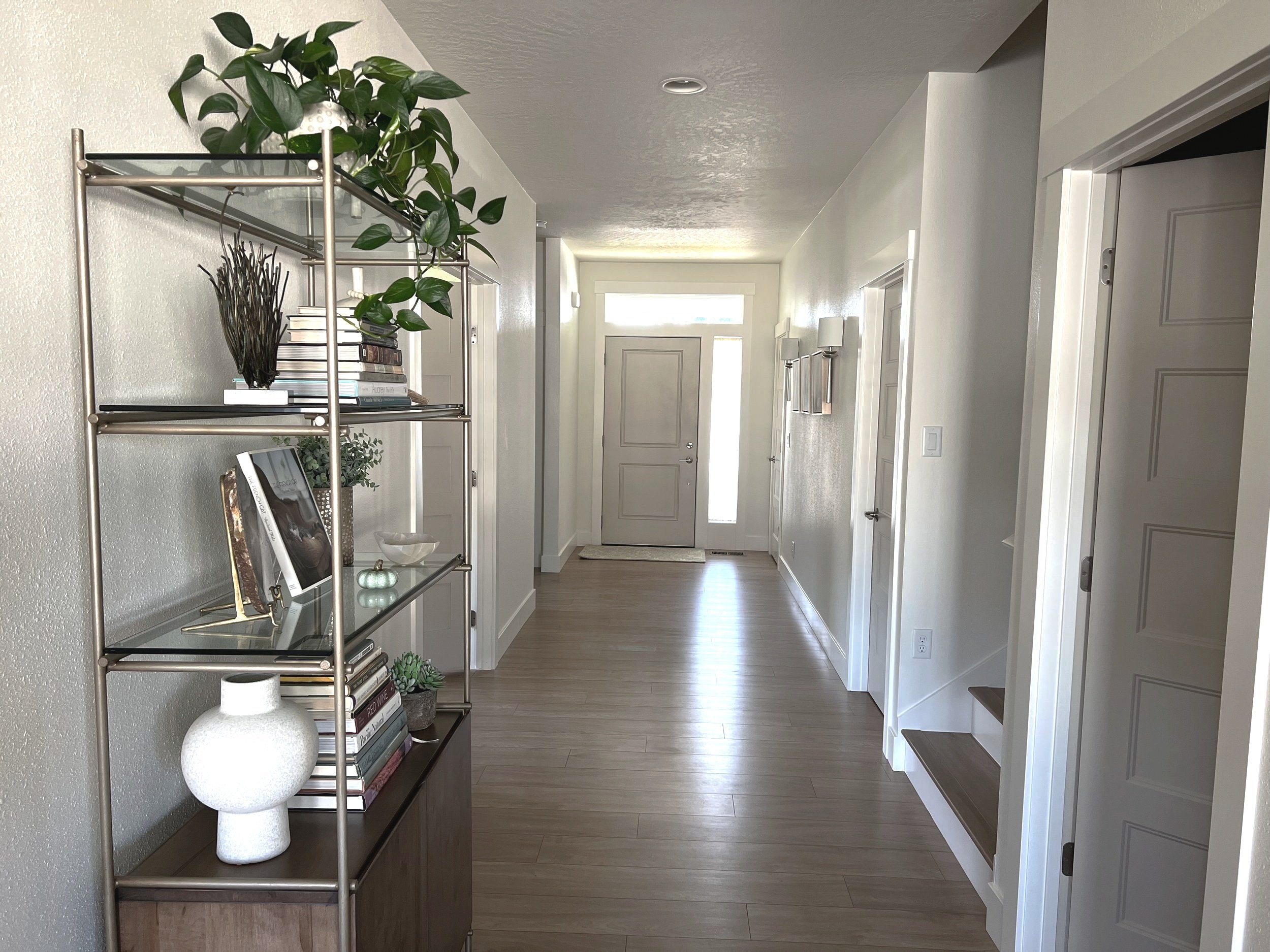
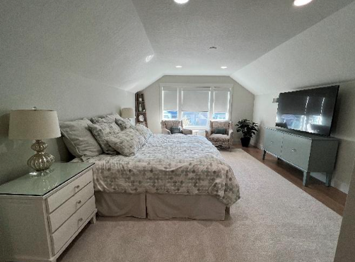
I consider the foundation paint color the color that is going to move us from room to room so to create a nice flow throughout your home. A trick I like to use with clients is to have them stand at the front door and pretend they are a guest in their own home. Close your eyes for 10 seconds and then open your eyes. What do you see? This little trick with help you get in touch with what your guests see as they enter you home. Do you see a closet door and should we bring attention to that closet door with a paint color? Or does your eye go directly from the front door, through the living room, through the kitchen and straight out the kitchen window? If so how can paint color help us detract this energy to stay in each space? It is best to select a neutral foundation color that will move you from space to space which often times are the hallways and that work with your existing floor color. And neutrals don’t just have to be taupe color. A warm green or soft blue can also be neutral foundation color.
4. Select paint colors of similar undertones
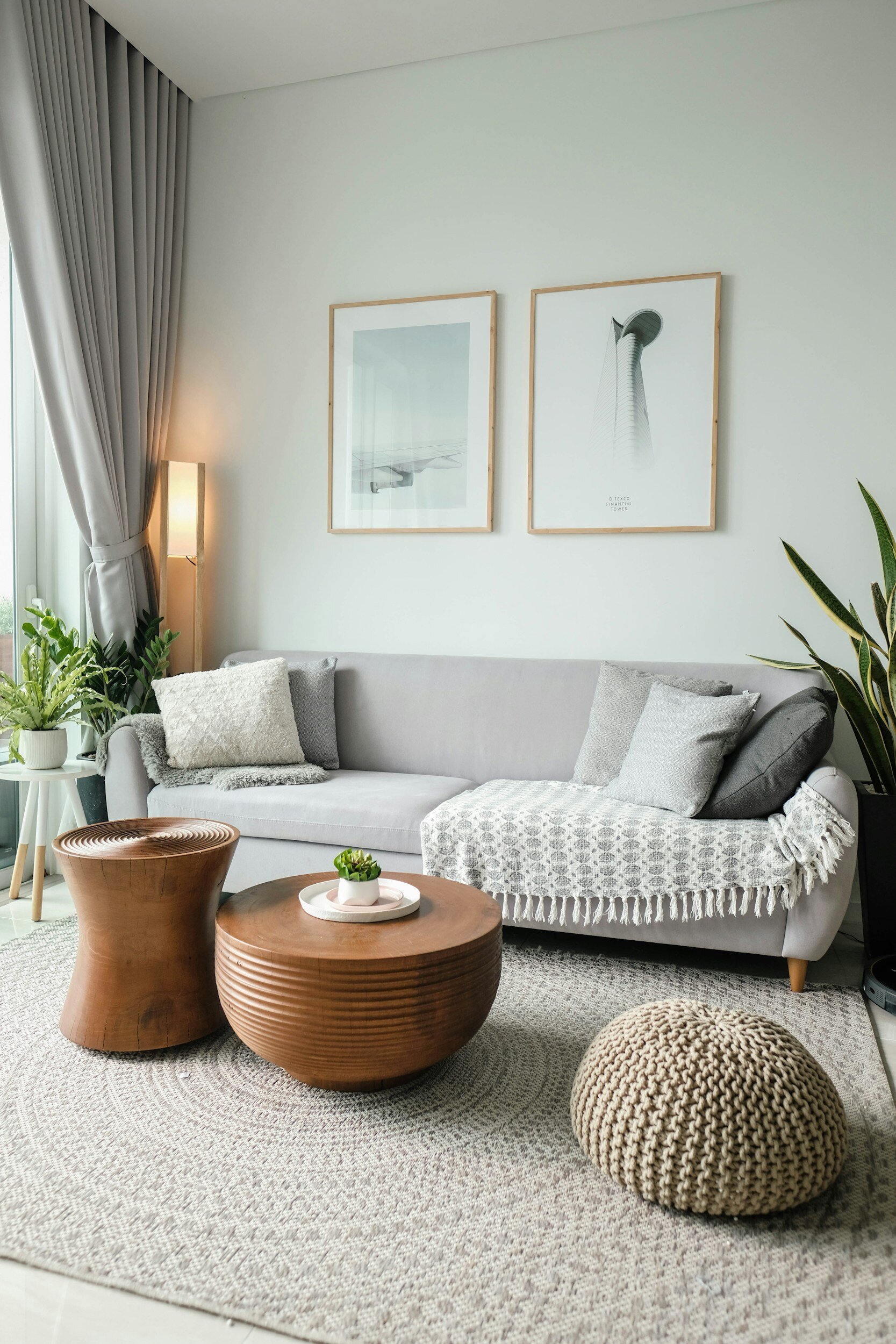
Once you have the foundation paint color decided, you can then select each room paint color that is of similar undertone. A colors undertone is the colorant that is predominate. For example the color green can have a blue undertone, which would give a cooler effect to the room, or a yellow undertone, which would give a warmer effect to the room. Having the same undertone of colors throughout your home creates an even flow to each space and is very appealing to the eye.
I also feel that it is important to have paint colors of similar shades or tones throughout a home. We have all been in people’s homes where the paint colors didn’t make any sense and the bold bright colors are right next to softer tones or bright whites, Yikes! Choose colors of similar shades or tones for a consistent pleasing flow.
5. Sample the paint colors in your own home
Often times when you are ready to select paint colors, you are looking at small paint chips or a fan deck at a paint or big box store. Looking at paint colors in the stores is the first mistake since the lighting is often fluorescent and not the same type of lighting you live with in your own home.
I prefer to use large sample cards painted with each paint color on them. Color is affected by the colors used next to them so when you paint color samples on a wall, the new color will be affected by the existing wall color. Your existing wall paint color can distort the way you see the sample or prevent you from recognizing the new color’s undertones. It’s also easy to make a mistake in value and intensity.
Another reason to adhere paint sample cards is it usually takes 2-3 coats of paint to see the true color of the sample. That creates a paint build-up on the test area, which often remains noticeable after the walls are painted. If you paint sample colors on the walls and do not feather out the edges properly, you may see the paint swatches as relief marks. If the wall is porous, or if you use interior paint samples in a different sheen than your current wall paint, you may see the paint swatches showing through the new paint coat as dull or shiny blotches.
Also make sure you review and sample the paint in your own home, on several different walls & ceiling locations over a period of a number of days. The natural light will shift the paint colors and the experience will be different throughout the day and evening.
The goal is to create a paint color palette to love, to represent your true authentic self and to build upon for all future home décor and remodeling projects. I hope these steps help you in your paint selecting process. Relax and take your time selecting the paint colors that reflect you and your own Authentic Home. Enjoy the process and watch the transformation unfold!