Beachy Keen: 6 Beautiful Coastal Interiors


This time of year is the best, isn’t it? There is something so refreshing about the sunshine coming into our windows early in the morning, and  still having sunsets until late in the evening. This time of year inspires us to seek out surroundings reminiscent of days at the beach, family vacations, and true serene calmness. Which is why we are posting our design theme nostalgic to these times.

Beachy Keen: Our Six Favorite Coastal Interiors


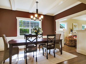
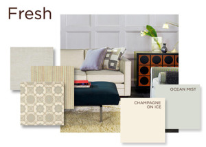
1. Tailored, Bright and Airy. This beautiful living room brings a touch of the outdoors inside with gorgeous wicker accents, coral decor and coastal inspired paint. Authentic Home’s Powder Greenpaint color from the Fresh Paint Palette is the perfect choice to get this look.


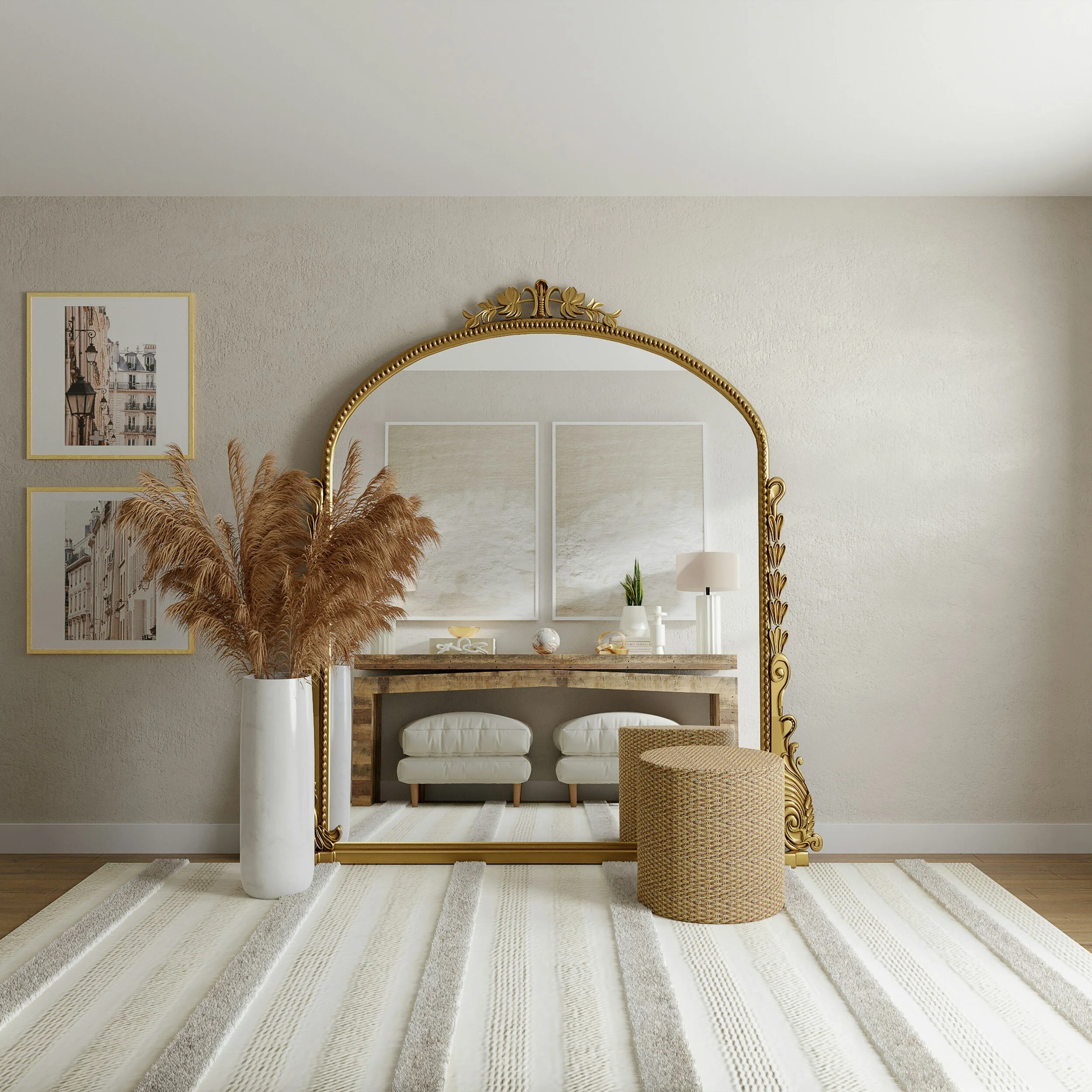
2. Elegant, Calming. The perfect first impression! It’s all in the details when it comes to implementing a coastal look in your interior. The straw hat and woven beach bag are the perfect added touch. Authentic Home’s London Fog Paint Color from the Elegant Paint Palette brings a rich, saturated feel to any space while inspiring the perfect beach look.


3. Cape Cod Comfort. The use of a woven natural fiber flooring paired with a bright, sunny color palette and palm leaves bring the beach inside. The comfortable chairs and extra upholstered accents make it feel like home.

Image Source: Pexels

Image Source: Pexels


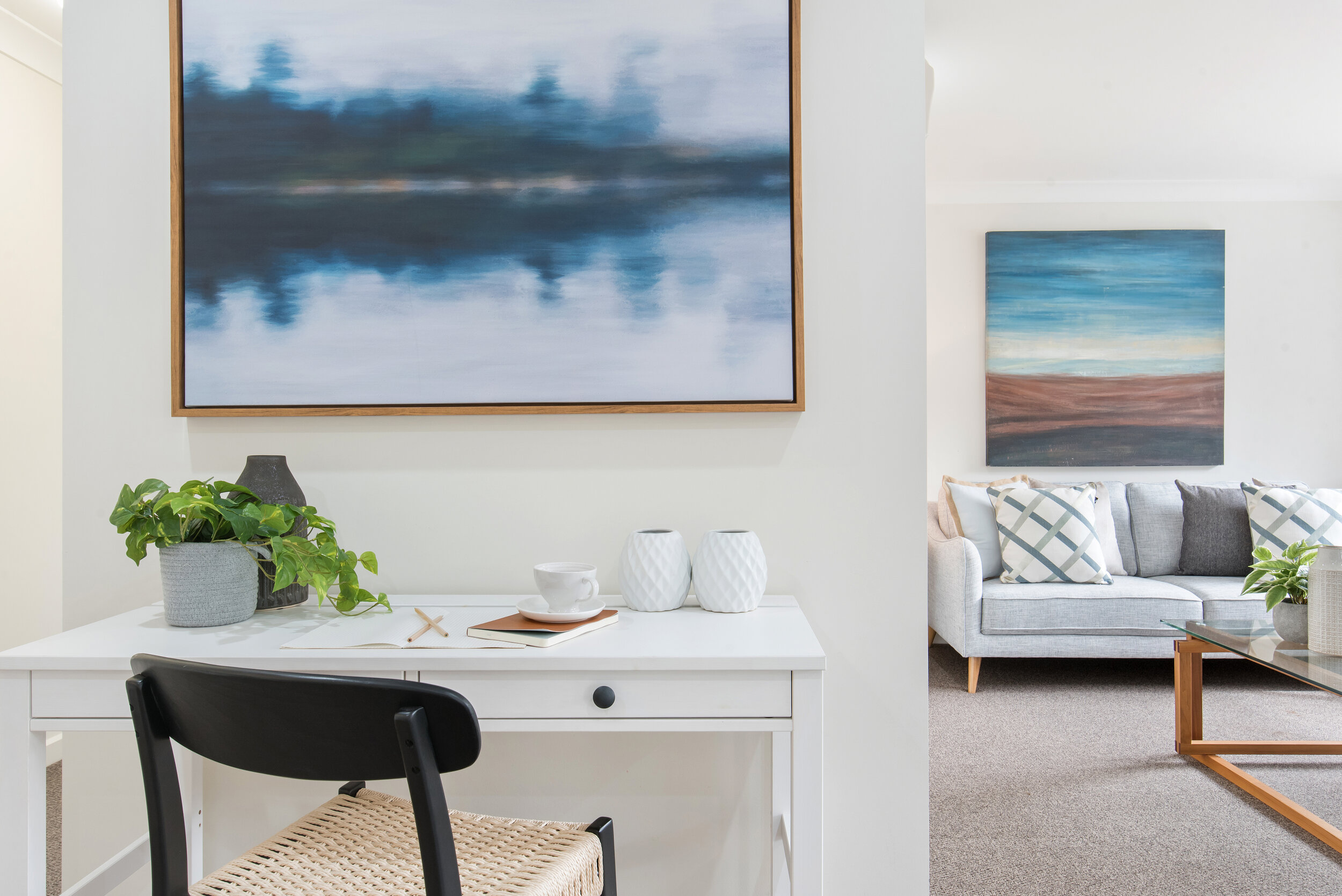
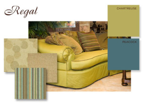
4. Colorful Eclectic. Mixing and matching patterns and bright colors works best in climates with more sunlight. This beautiful room is a mix of fun and colorful paired with sophistication and comfort. 


5. Sophisticated Chic. This beautiful room is as chic as it gets. The subtle beach accents and cool color palette are softened by the natural fiber rug and upholstered chairs. The use of decorative coffee table candles always adds extra class.


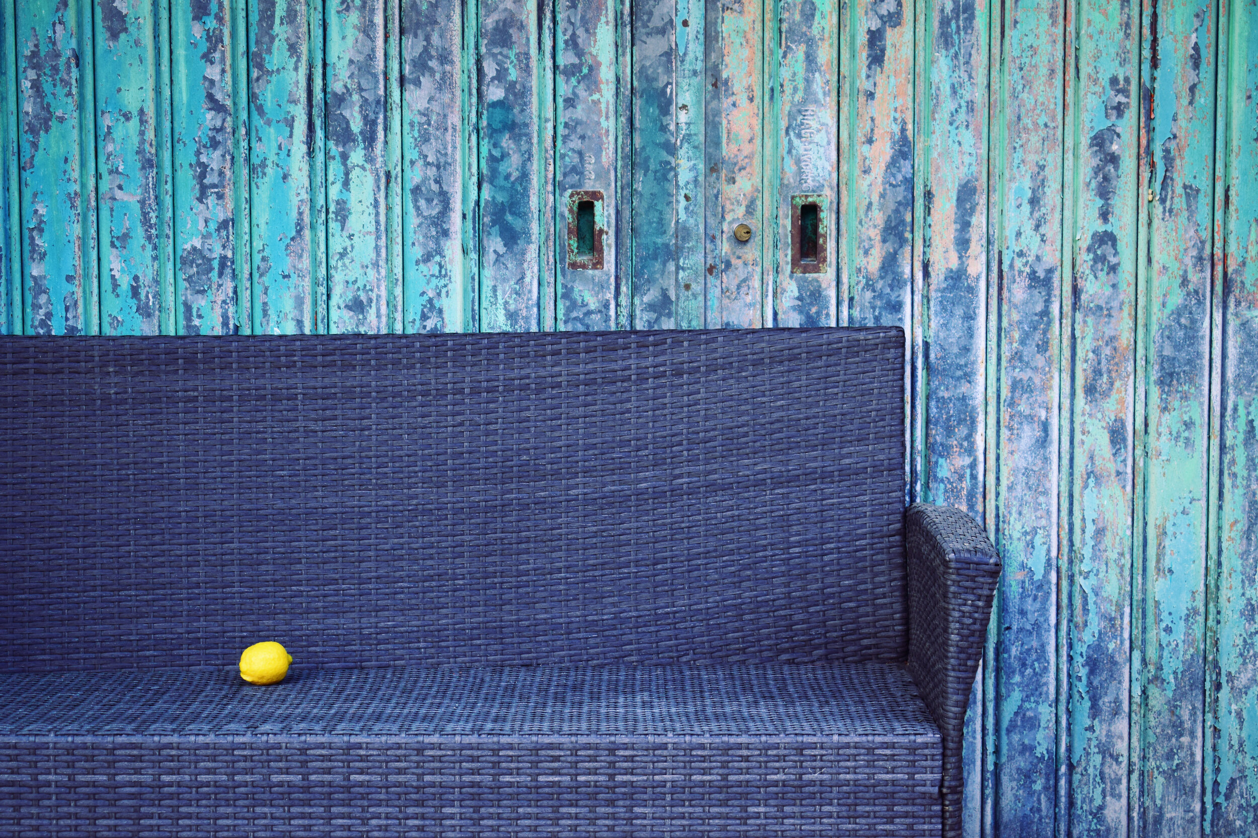
6. Martha’s Vineyard Nautical. The use of navy blue and white is as nautical as it gets. This beautiful vignette shows us how it’s in the small things when it comes to beachy decor. The beautiful coral artwork and calm color palette make you feel like you’re truly on vacation.


Curb Appeal- Get Summer Ready!


You have probably been preparing for the summer since January. Summer brings a lot of goodness. Things change when summers approach and the change should be incorporated in your home too!

If you are looking to change things up in summer, here are some ideas that can help:

Add A Touch of Color

Summer means bright, sunny days, which means your house can appear dull in contrast.  To revamp your home’s curb appeal, plant seasonal plants in colorful pots, or line your entryway with fresh flowers. Adding a touch of color really can make a difference!


Spruce Up the Front Door
Try to probe the summer by sprucing up the front door. Chalk out any post winter gaps if there are and let things loose. Focus on the front door and keep the temperatures in check before the summer approaches. A unique color always makes a statement!


Re-Do The Driveway
On the other hand, you should also try to re-do the drive away. Try to get rid of the debris or any patch cracks. Try to use a squeegee in order to apply to a decent sealer. You can try many different products in order to re-do the driveway.  Generally, the idea is to clean the drive way and this can be done with different options in mind.


Fill The Grass
Another common summer preparation is to fill the grass. Try to get rid of the leaves and twigs and de-thatch the dead grass using a metal rake. Try to ask for help if you want the right seed. You should try to hire a gardener if you want some extra work to be done. Moreover, you can even apply bald patches on your lawn to fill grass. Grass looks beautiful in the summer and should be taken care of if you want to improve the look of your home. The idea is to improve the look of your home and the first step towards doing this is to fill the grass. It also keeps your house green which is another huge benefit.


Fix  Your Sprinklers
It seems almost yearly that your sprinkler may not have lasted through the winter chill! Check for any winter damage if there is any including cracked pipes and broken heads. You should try to run the sprinkler one zone at a time. Moreover, if anything needs repair, get it repaired.


Unclutter Your Patio or Deck
Lastly, you should try to clean and clear the deck & patio areas. Use a deck brush or a decent deck cleaning solution to remove the dirt or mold. Reseal it if you need some smoothness on there.


There are many other things you can do to prepare your house in the summer, but these are just a few of our favorites!

Authentic Home COLOR Paint


Choosing the perfect paint color is essential to creating spaces that speak to ones’ spirit. Once the paint COLOR foundation is in place, the other interior design and home décor accents easily come into focus. Selecting the right paint color can be an overwhelming process due to the unlimited number of paint color choices available.


Kathy recognized the  need to simplify the paint color selection process and created a fine-tuned selection of 75 home paint colors grouped by “mood” palette – FreshElegantSereneRegal, & Playful. Simply select the mood that speaks to you, then mix and match paint colors within that palette for fail proof results.


Need help selecting paint or creating your own Authentic Home?
Schedule your interior design or color consultation today!

CONTACT KATHY

Eclectic Decor- Get the Look!

 Images Source: Pexels

We’re seeing it everywhere- eclectic design is the bee’s knees in 2016! A mix-match of randomness that somehow seems to all pull together. Ever wondered how designers can take a variety of seemingly unrelated items and make them work together in a beautiful yet cohesive way? Well, here’s how!

Eclectic Decor- Get the Look!


1. Stick with a color palette. It’s true! If you have a variety of decor that is completely unrelated, you can get a designer look by keeping them within the same general color palette. Color is one of the easiest ways to pull an otherwise mismatched space together.


2. Group like items together.  It’s a “psychological thing.” Our minds desire to see like things placed together. When several similar items are placed in a grouping like the sconces, books and pillows in this room, our minds categorize them, making it appear less busy. If you have a lot of something, display it together! This will surprisingly make your space feel less cluttered, and well, eclectic.


3. Be Selective. When purchasing decor for your space, choose items that are unique- this will truly give you that eclectic look.


4. Let the architecture do the work. Whether you live in a rustic old or streamlined modern building, the key is to let the beauty of the architecture stand out. Bring in key pieces that mean something to you. Keep a neutral palette. Mix old and new, and let the sunlight in! This will naturally highlight the beauty of your space.


Looking for a design consultation? Contact Kathy Banak today!

Bringing the Outdoors In: Organic Touches


I am sure you have experienced a time when you walked into a space and thought to yourself, “I am not sure what it is, but this space just feels fresh and organic.” Well, maybe not in those words, but you get my drift. Sometimes it is just the little things that make a world of difference in a space; the small touches that pull it all together. Many times, these details can be found on your evening walk, or better yet, visit to a local beach or park.

Bringing the Outdoors In: 6 Small Organic Touches that Make a Difference

1.Eucalyptus. This beautifully scented plant grows naturally in most regions. Many people use it for its aromatherapy healing properties, but it also is a beautiful soft green color that doesn’t fade as it dries. The beauty of this plant is that its versatility. Because it grows in long, bendable stalks, you can make wreaths, table runners, and candle holders (pictured below) easily for an elegant touch.


2. Branches. You see branches used in designer showrooms all the time. Reminiscent of a simpler time, branches can really bring a touch of sophistication to any space. I often find myself walking through my neighborhood, thinking, “wow, those branches would make the perfect accent piece!”


3.Wheat. Neutral in color, wheat adds a bit of texture and country to an interior space. It is plentiful- you can find it on a farm road growing abundantly. Perfectly groomed wheat arrangements are all the rage in the design world. Simply bunch together the perfect wheat stalks, tie with twine, and cut the bottom off in one clean swipe. The arrangement should be able to stand on its own.


4. Rocks & Stones. We all enjoy a day at the beach or the mountains. We tend to collect shells, or stones only to find ourselves with a pocket full of them when we get home, and no where to put them. Next time you’re out in the sunshine, seek out treasures that you can use in your decor. Large white stones work beautifully as bookends as pictured here.


5.Rustic Pieces of Wood. Oftentimes you will come across old, worn out pieces of painted or not painted wood. You may think nothing of it, but these finds are so unique, they are sure to make a stunning conversation piece within your home.  Pictured here, simple hooks and mason jars complete the look for beautiful candle wall sconces.


6.Hydrangeas. These beautiful flowers have been popular since the beginning of time. The pale pastel colors they take on as they dry out add a softness and femininity to a space like no other flower. Hydrangeas grow abundantly in the Pacific Northwest. You can enjoy them while they’re fresh and vibrant in color, then hang them up to dry and enjoy them for years to come..

Orange-October Paint Color of the Month


Orange is an obvious choice for October but there are other reasons why orange is a great color. Orange is associated with stability, reassurance, warmth, and is thought to aid digestion which is why it is great in a dining room.

Image Source: Pexels 

The color orange also radiates warmth and happiness, combining the physical energy and stimulation of red with the cheerfulness of yellow. Orange brings spontaneity and a positive outlook on life and relates to social communication, stimulating two way conversations. A warm and inviting color in a living room, it is both physically and mentally stimulating, so it gets people thinking and talking!


Simply painting your front door orange will let anyone know that your home is a happy and cheerful one. Orange is probably the most under-used color in decorating but young people do respond well to it as it has a degree of youthful to it. Painting a chair or table is another way to add that pop of color without going overboard.


Authentic Home COLOR Paint has three different shades of orange that will fit any project you decide to tackle in October. Email us at info@authentic-home.com or call (206)937-3070 to order your shade of orange today.

Brown-November Paint Color of the Month

The world of interior design is filled with lots of colors trends that change every year but there is always at least one color that fits the season. Brown is a color I most associate with November because it gives an excellent warming and cozy effect as the weather is definitely colder.


Here at Authentic Home we are not afraid to put brown in any room as we have painted living rooms, bedrooms, bathroom, kitchens and entry ways in brown shades. Perhaps that is why we have so many different shades of brown. With our 12 shades of brown you will find the best one for any project in your home. Brown is the color equivalent to a warm hug, it’s inviting and welcome in every kind of room, from modern to the most traditional.

And of course, it’s a soothing color to paint a bathroom, especially if you have a soaking tub to relax!


Contact Kathy Banak for your color consultation and let her pick out the best brown colors for your Authentic Home!

Radiant Orchid-Still the COLOR of the Year

 Images Source: Pexels

Radiant Orchid is the 2014 Color of the Year as announced by Pantone early this year. We’re still enjoying the color very much and think it’s a perfect color for spring.  We wanted to show you how to incorporate it into your home easily without making too much of a commitment.


As always, pillows are the easiest thing to change at home but adding some curtains and/or stools creates a beautiful living room.   This regal living room in purple adds some brightness with Radiant Orchid poufs.      

Simply add a lamp to a blue living room for an instant trendiness factor.Pillows and throws look perfect in a grey, pink and red living room.   This trendy living room of muted colors emphasizes Radiant Orchid with a lovely placed blanket.Add Radiant Orchid to the bedroom for an instant update.

Weekend Project – Painted Ceiling


It’s going to be a wet weekend with rain in the forecast. Why not use this time to do an indoor project. We think that painting your ceiling is a great way to spend the weekend! It’s a simple thing you can do but will completely change your space.

If your walls are white, why not choose a dark color to contrast. We love this dark blue above, very close to Authentic Home COLOR Paint’s Parisian Blue.

Image Source: Unsplash

Image Source: Unsplash


You can’t go wrong with a grey ceiling. Grey is that neutral that goes with everything. Oyster and Greystone are perfect from Authentic Home COLOR Paint.


If you’re looking to keep it light for the Spring, these pretty blues are nice and airy! Try Authentic Home COLOR Paint in London Fog, Power Blue or Glacier.


If you’re ready to start painting and want to give use Authentic Home COLOR Paint a try, callKathy to set up your paint order today!

April Color of the Month – Light Green

The weather is definitely starting to feel like Spring! The rains having been bringing in new fresh grass and flowers. That is why we think this Light Green is the perfect color for April. Bring the beauty of the outdoor inside as we prepare for the wonderful nature Spring will bring to us!


In the bedroom or in the living room, Light Green looks beautiful wherever you want to paint or accessorize!

Image Source: Pexels


Choose one of Authentic Home COLOR Paint for your next project. Contact Kathy for help to choose your perfect color or to order Authentic Home COLOR Paint today!

2015 Pantone Color of the Year: Marsala

It’s official, Pantone has announced the 2015 Color of the Year. Marsalaa muted burgundy with hints of earthy brown and soft reds has recently been showcasing itself in fashion, home decor, weddings, and architecture. This beautiful and spicy pigment can bring a classic elegance to any look.


From fashion and photography to interiors, Marsala has a timeless feel that can bring sophistication to any space- reminiscent of many times past. At Authentic Home, we researched our favorite beautiful interiors that reflect the richness of this gorgeous color.

Here are Our Favorite Six Marsala-Rich Interiors.

1. Subtle Meets Bold. This sitting room really exhibits the beautiful color of Marsala by pairing classic elegance with old world charm. 


2.Urban Glam. This gorgeous grass cloth wallpaper in a Marsala tone brings texture and warmth to this luxurious bedroom. Gold accents pair beautifully with the piquant backdrop.

3. Just a Pop. Give your space a whole new feel with the addition of these elegant Marsala club chairs. Accenting your space with this rich tone can truly make a statement.

Image Source: Overstock.com

Image Source: Overstock.com


4. Marsala and Blues. The seating in this space truly showcases a saturated Marsala tone. Pairing this rich color with a soft blue really makes it stand out.


5. Eclectic Chic. One of the most elegant ways to showcase any vibrant color is to place it in a mostly white interior. The beautiful Marsala window treatments make a true statement in this charming bedroom.


6. Classic Elegance. There is something so timeless about a rich wall color paired with old world decor. The lavishness of this hallway design speaks volumes.

Are you considering bringing Marsala into your space? Authentic Home’s Regal, Serene and Playful color palettes feature this gorgeous color in many variations. Not sure which colors to pair it with? We have taken the guess-work out of that process as well.

Fresh Color Palettes

 Images Source: Pexels

There are no more vibrant, saturated colors than the ones created in nature. With the amazing paint technology today, you can replicate the color of an old growth oak tree’s moss in your backyard. You can bring in the vibrance of those daffodils you planted in the spring. You can well, pretty much paint your home in any of the  colors you see everyday. This brought us to thinking, what are our favorite natural color palettes?

Fresh Color Palettes- Bringing the Outdoors In

1.Spring is in the Air. This gorgeous, feminine palette is so calming and rich. It would work beautifully in a sunroom overlooking a garden, a little girl’s bedroom, or even a dining or living room. When you put soft color palettes into your space, you create harmony that reduces stress from the every day. And, this color palette is Pantone’s pick for 2016! Authentic Home’s Playful Palette has the perfect selection to achieve this look!


2. Organic Bliss.  Keeping a clean, bright and nature-inspired palette will truly give your space a freshness like no other palette. This beautiful neutral palette works beautifully in large, airy spaces as it allows the architecture to stand out. Typically seen in the Northwest, a paint palette like this works best in cloudier climates as its warmth balances out the wet dreary weather. You may find Authentic Home's Fresh Palette perfect if you’re going for this look!


3. Southbeach Charm. This bold, bright, and cheery palette is perfect for smaller spaces, preferably in brighter, warmer climates. These cheerful citrus tones stand out in sunlight while blending in with organic colors found in outdoor surroundings. We love this palette for a powder room or a dining nook-reminiscent of sunny spring mornings.


4.  Zen Garden. The perfect combination of cool tones meet warm. Soft and airy, this palette brings forth a sense of calmness into your space. The gorgeous lavender and green tones would work beautifully as an accent color- an arm chair or throw pillows would really “pop” against the remaining colors in the palette.  The more neutral colors are perfect for wall paint and larger accessories such as furniture. See Authentic Home’s Elegant Palette if this is the look you desire.


5. Bright and Cheery. So rich and delightful, this palette is perfect for someone looking to bring a little cheer into their home. These tertiary colors are close friends on the color wheel and can be applied to any space, working beautifully in harmony. If you are seeking a bright, saturated palette like this one, we recommend allowing the brightest colors to “pop” as accessories, and setting the more neutral colors to stand as a backdrop. If you like bright and cheery, you will love Authentic Home’s Playful Palette.


Love color, but can’t decide? Contact Kathy Banak for a consultation!

We’re Feeling Blue- And It’s A Good Thing


I am sure you have noticed blues making a strong debut in the design world. After the past couple of years implementing gray palettes, blue just made sense. Blue and gray as a team, are the perfect combination. We are seeing blue patterns in rich fabrics, blue interior and exterior paint palettes, and blue wall coverings and decorative accents everywhere… and this is just the beginning of this newly rediscovered color’s comeback. 

Images Source: Pexels & Pixabay

If you are familiar with Authentic Home’s Kathy Banak’s style, you know that she uses a lot of soft blue hues in her designs. Blue is such a universal, approachable, and peaceful accent that it’s a no wonder that all of Kathy’s designs have an overwhelming calm and serene vibe.

We’re Feeling Blue: Our Favorite Design Elements


Kitchen_2_large.jpg

Pictured Above: A Mercer Island Home’s Kitchen Remodeled by Authentic Home uses gorgeous blue hues in both the paint and fabrics.

Blue Fabrics. The use of beautiful patterned blue fabrics in throw pillows, window treatments, and other linens can really pull a space together. Geometric and artisan patterns are making their debut currently, but you often see beautiful floral prints and more traditional patterns in award winning interiors.


The beautiful Robert Allen Blue La Palma upholstery pictured below is reminiscent of Eastern ancient patterns seen often in Polynesian and Asian designs in the past- the rich pattern and texture is classic, timeless, and rich. You could implement this pattern into your throw pillows, drapes, or even wall coverings.


Blue Wallcoverings. The gorgeous natural grass blue wall paper pictured below brings forth a sense of grandeur and richness into this space. Mixing several patterns and textures of blue in your interior give it a cohesiveness and peaceful feel visually.


The beautiful blue Kravet wallpaper from their Heirloom India collection pictured below is classic, timeless, and sophisticated. You could specify this pattern in a powder room or a room smaller in size, or pair it with less patterned furnishings in a larger space.


Blue Paint. There is psychology in the color of paint you use. Spaces painted in cooler colors such as blues and grays tend to give the occupant a sense of calm, peace, and serenity. Warmer tones such as beiges, reds, and browns will give your space a warm, welcoming feel. We are seeing beautiful saturated color palettes in design trends currently, and rich navy hues are a sophisticated, rich option for your interior.


This Persian Blue color, from the Authentic Home Playful Color Palette is rich, saturated, and will truly make a statement.


Persian Blue

Blue Decorative Pieces. When you mix and match various color patterns, hues, and textures, you create a visually beautiful design that is both cohesive and elegant.


Pindler fabrics have beautiful selections, such as the Nebula Sapphire pictured here. This would be absolutely gorgeous on a side chair or window treatments.


Blue Exterior Accents. There is nothing more elegant and classic than the application of blue in your home’s exterior. We are now seeing gorgeous blue entry doors and paint trim in design, but one of the easiest ways to implement this gorgeous color is through the use of throw pillows, upholstery, and pottery.


The beautiful door and matching bench pictured below, was selected by Kathy Banak using Authentic Home’s Glacier paint color,  to give an extra pop of color to their newly refreshed exterior.


If you’re looking for assistance with your home’s design, contact Kathy Banak today!

Jewel Color Velvet Trend from High Point Market

High Point Market is the largest home furnishings industry trade show in the world. It happens twice a year in High Point, North Carolina and the fall show just ended last week. One interesting trend that emerged, just in time for winter this year, was Jewel Color Velvet used on sofas, chairs and headboards. This is a great trend for fall and winter as colorful velvet is warm and inviting when the days start to get cold and grey.

Images Source: Pexels


Do you need help decorating with this new trend? Email Authentic Home or call (206)937-3070 for all of your decorating and design needs.

Brown-November Paint Color of the Month


The world of interior design is filled with lots of colors trends that change every year but there is always at least one color that fits the season. Brown is a color I most associate with November because it gives an excellent warming and cozy effect as the weather is definitely colder.

(Images Source: Pexels)


Here at Authentic Home we are not afraid to put brown in any room as we have painted living rooms, bedrooms, bathroom, kitchens and entry ways in brown shades. Perhaps that is why we have so many different shades of brown. With our 12 shades of brown you will find the best one for any project in your home.


Brown is the color equivalent to a warm hug, it’s inviting and welcome in every kind of room, from modern to the most traditional.


Brown in the bedroom creates a warm and cozy sleeping space.


Brown is also a great earthy color to paint your dining room.


And of course, it’s a soothing color to paint a bathroom, especially if you have a soaking tub to relax!


Contact Kathy Banak for your color consultation and let her pick out the best brown colors for your Authentic Home!

Thanksgiving Jewel Color Tablescape


Jewel colors are still very trendy this fall. An easy way to incorporate this into your holiday season is to design your Thanksgiving table with the rich colors of emerald, topaz, ruby, sapphire and amethyst.


Adding cloth napkins is the easiest way to incorporate jewel colors like emerald on your table.


Blue glasses add a bright and interesting color to a traditional table.


This fun table incorporates several jewel colors. Mix and match colors to create a beautiful atmosphere your guest will enjoy.


Flowers are always a nice touch to a dining table. These bright bouquets bring lots of color to the table!

Do you need help decorating your table for Thanksgiving? Email Kathy for color advise and for your consultation today!